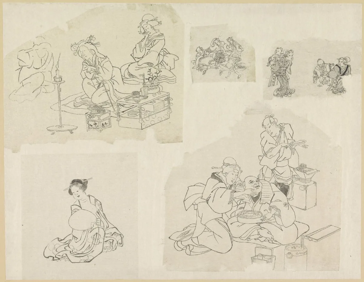
Scale in art is one of those concepts that quietly runs every composition. When a painting makes you feel small in front of it, or pulls your eye straight to one figure, or creates a sudden sense of open space — scale is usually the reason. This post breaks down exactly what scale means, how painters have used it deliberately, and how you can start diagnosing and using it in your own work.
If your compositions have felt flat or strangely inert lately, scale is one of the first things worth checking. More often than not, everything in the picture is the same size, and that sameness is what's draining the life out of it.
What Is Scale in Art?
Scale in art refers to the size of one object or figure in relation to another, or in relation to the picture plane itself. It is a relational measurement — there is no such thing as "large" or "small" in absolute terms in a composition. A figure is large because something nearby is smaller. A mountain reads as vast because a human being stands at its foot.
This is the essential distinction: scale is always comparative. The moment you put two elements of different sizes in the same picture, you have created a scale relationship, and that relationship carries meaning whether you intend it to or not.
Scale is closely related to proportion in art, but they are not the same thing. Proportion describes the size relationships within a single object — the ratio of a head to a torso, for instance. Scale describes the size relationships between separate objects in a composition. Both matter; for now, we are focused on scale.
What Is Scale in Art Used For?
Artists reach for scale to do several distinct jobs. Understanding those jobs is what makes it a tool rather than an accident.
Establishing Hierarchy
The oldest use of scale in Western and Eastern art is hierarchical — the most important figure is rendered the largest, regardless of where they physically stand in the depicted space. In medieval altarpieces, the Virgin and the Christ child dwarf the donor figures kneeling nearby, not because the donors were children, but because importance was made visible through size.
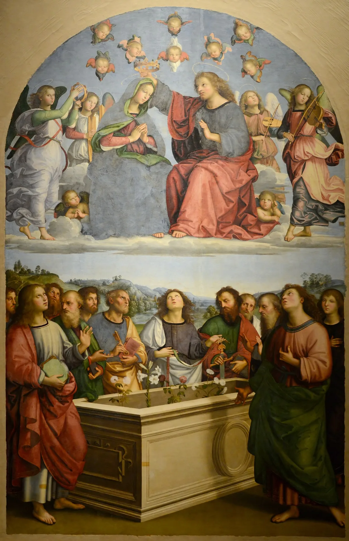
Raphael's Oddi Altarpiece (1502–04) shows what happened as painters moved toward naturalistic space: the size hierarchy fell away, but the ranking didn't. Christ and the Virgin in the upper register are drawn at roughly the same size as the apostles below — no figure is inflated. Raphael establishes priority by placement instead. The coronation happens above everyone else, centered and framed by angels, and several of the apostles turn their faces upward toward it. Hierarchy still communicates priority before the viewer reads a single symbol; it has simply moved from size to position.
This principle is still alive in contemporary painting. Any time you make your subject larger than supporting elements — even slightly — you are deploying hierarchical scale.
Creating a Sense of Space and Depth
Scale is one of the primary cues the eye uses to read depth on a flat surface. Objects we understand to be similar in real size appear smaller as they recede — that diminution is what we call linear perspective. But painters can exaggerate or compress that effect for expressive ends.
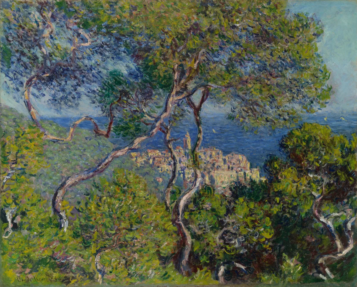
In Monet's Bordighera (1884), the foreground trees are enormous — they fill a substantial portion of the canvas. The town in the distance is tiny in comparison. That scale contrast is doing most of the work of creating depth. The eye doesn't need elaborate perspective construction; the size difference alone reads as distance. This is scale used as a spatial tool, creating the sensation of moving through the picture plane rather than looking at a flat surface.
Controlling Emphasis and Focus
Size draws the eye. When one element is noticeably larger than everything around it, it becomes the focal point almost automatically. This overlaps directly with emphasis in art — scale is one of the most reliable ways to tell your viewer where to look.
But the reverse is also true and worth remembering: a very small figure in a large, open field of sky or water can draw the eye just as powerfully, because the contrast between the tiny mark and the surrounding emptiness is itself an act of emphasis. Smallness against vastness creates a different kind of pull from largeness against medium-sized things, but it is no less deliberate.
Conveying Emotion and Meaning
Scale carries emotional weight that goes beyond spatial logic. A figure who fills nearly the entire picture plane feels immediate, confrontational, present. A figure who occupies only a fraction of the canvas — surrounded by sky or water or architecture — feels isolated, overwhelmed, contemplative. Neither is inherently better. Each produces a specific feeling in the viewer, and that feeling is part of the painting's meaning.
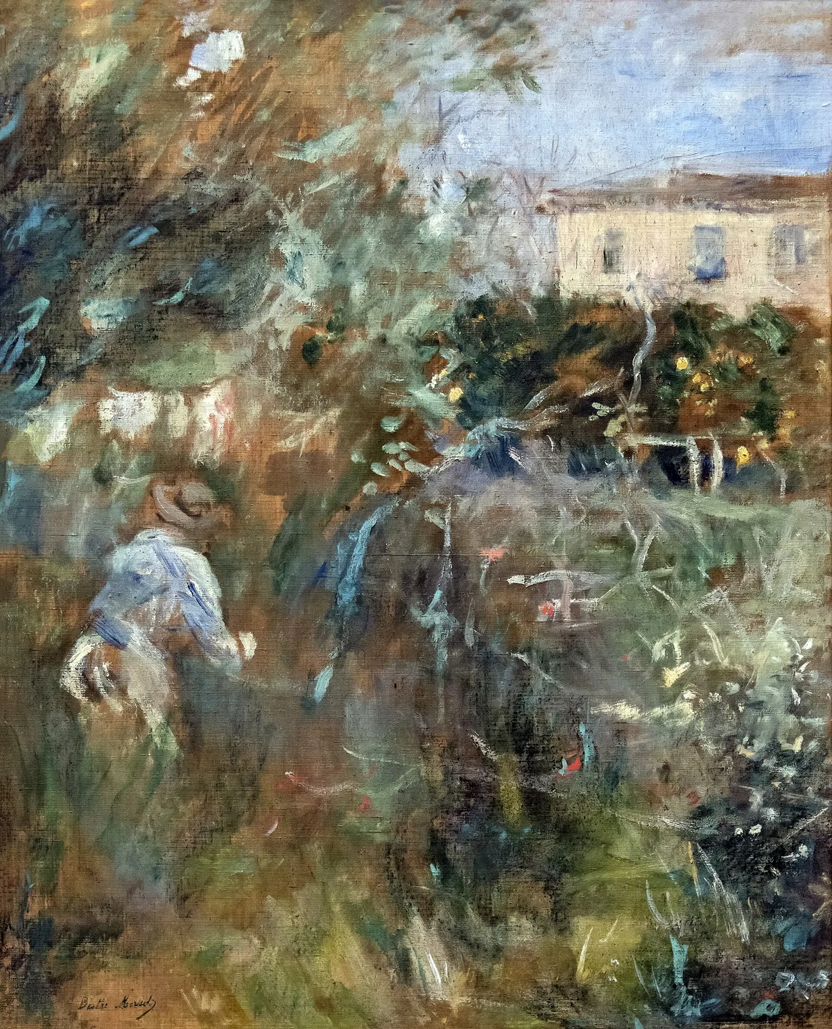
Berthe Morisot's Femme au jardin (Villa Arnulphi à Nice) (1882) is a good illustration. The figure does not dominate the picture plane; the garden envelops her. That choice communicates something about absorption, privacy, the relationship between a person and a place. If Morisot had made the figure twice as large, the feeling of the painting would change entirely. Scale is a carrier of meaning, not just a spatial fact.
Scale vs. Proportion: The Distinction That Matters
Since the two terms are often conflated, it is worth being precise. Proportion is the internal size relationship within a single object — a face where the eyes are too large for the head is out of proportion. Scale is the size relationship between separate elements in a composition.
You can have correct proportions and still have a scale problem. A figure may be drawn with accurate anatomical proportions and yet sit in a landscape at completely the wrong scale — too large to read as distant, too small to read as the subject. Getting proportion right does not automatically solve scale, and vice versa. Both require deliberate decisions. Competitors often conflate these two terms; keeping them distinct in your thinking will sharpen your compositional decisions considerably.
Types of Scale in Art
Painters tend to work with a handful of scale approaches, sometimes in combination.
Monumental scale — the work itself is physically large. The painting commands physical space and the viewer's body is implicated. Many of the great history paintings (Géricault's Raft of the Medusa, roughly 16 by 23 feet) use physical scale to create an overwhelming presence that smaller reproductions simply cannot replicate.
Hierarchical scale — within the picture, significance is made visible through size. Common in pre-Renaissance art, but still a live option whenever you want to make a compositional argument about importance.
Relative scale — objects that are understood to be similar in actual size are depicted at different sizes to imply depth or distance. This is the naturalistic default in most landscape and still-life work.
Heroic scale — a figure or object is depicted larger than it would appear in natural observation, not to imply distance or hierarchy, but to create a sense of power, grandeur, or awe. Sculptors use it too; painters use it when a portrait subject nearly fills the canvas.
Intimate scale — small paintings, or figures that occupy only a small portion of a larger composition. The intimacy is the point. Cabinet paintings by Dutch masters, thumbnail oil sketches, and small plein-air panels all trade on the emotional register that modest scale creates.
Diagnose Your Own Work
When a painting feels off and you can't immediately say why, run through these scale checks before reaching for color or value adjustments.
Is everything roughly the same size? This is the most common scale problem. When every tree, rock, and figure occupies approximately the same area in the picture, the composition goes flat. Force yourself to introduce at least one element that is dramatically larger or dramatically smaller than the others.
Does your main subject have scale dominance? The subject should generally occupy more of the picture plane than supporting elements — not always, but it should be a conscious choice when it does not. If your focal area is the same size as everything around it, consider why your eye should go there. For more on directing the eye, the post on focal point in painting covers the full toolkit.
Do your scale relationships read as spatially logical? If you intend depth, are foreground elements noticeably larger than midground and background elements? Even loose, expressive work benefits from a scale gradient that implies recession.
Are you using scale to carry any emotional meaning? A figure at the same scale as the objects around it is compositionally neutral — neither intimate nor heroic, neither absorbed nor dominant. If the figure's emotional relationship to its environment matters to what you are painting, scale is one of the primary ways to express it.
Does the scale structure support your value and edge decisions? Scale, value, and edges work together. A large area of high contrast will still overpower a small subject if the scale relationship is wrong. Drop your painting into Critico and check whether the spatial and tonal structure are reinforcing each other or working against each other.
Master Examples: Scale Doing Real Work
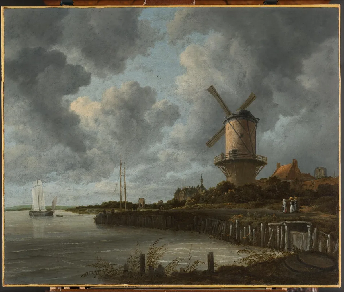
Jacob van Ruisdael, The Windmill at Wijk bij Duurstede (c. 1668–70, Rijksmuseum) — The mill towers over the tiny figures near its base. Ruisdael uses scale to make an argument: this mill is the subject, the landscape and human activity exist in relation to it, and it is not merely large — it is powerful. The low horizon reinforces the mill's dominance by giving it the entire sky to push against.
Hokusai, Vijf voorstellingen van mensen (brush drawings, Rijksmuseum) — This sheet puts figures at very different scales side by side — separate brush sketches pasted onto one mount — and still reads as one page, a reminder that scale relationships in a two-dimensional composition can operate independently of represented space.
Raphael, Pala degli Oddi (c. 1502–04, Pinacoteca Vaticana) — Hierarchy without hierarchical scale: the figures in both registers are roughly the same size, and the coronation is ranked by its place above everyone else. Raphael threads this together with sophisticated spatial construction so the hierarchy feels earned rather than arbitrary.
Monet, Bordighera (1884, Art Institute of Chicago) — Relative scale creates depth. Large foreground trees push the middle and background back with no need for elaborate perspective construction. The scale gradient is the space.
Morisot, Femme au jardin (1882) — Intimate scale communicates emotional content. The figure is small relative to the garden not because she is distant, but because the painting is about her absorption in the space around her. Scale as feeling rather than statement.
Try It: Check Scale in Your Own Painting
One of the fastest ways to audit a composition's scale relationships is to squint at it — or, better, to look at a reduced or tonal version where surface detail drops away and the underlying size relationships become clearer. Drop your painting into Critico and use the value view to see the raw distribution of large and small shapes. If most shapes in the value view are similar in area, that is your diagnosis: the scale structure needs more contrast, regardless of how well-drawn or beautifully colored the individual passages are.
The rule of thirds grid and the golden spiral both assume that you have already made a decision about scale — about which element is dominant. They are tools for placing the dominant element, not for deciding what it is. Scale comes first.
Frequently Asked Questions
- What is scale in art, exactly? Scale in art is the size of one element in a composition relative to another element, or relative to the picture plane as a whole. It is always a relational measurement — large and small only exist in comparison to each other within the same composition.
- What is the difference between scale and proportion in art? Proportion describes size relationships within a single object (the ratio of head to body, for instance). Scale describes size relationships between separate objects or figures in a composition. A figure can have correct proportions and still sit at the wrong scale relative to its environment.
- What is hierarchical scale in art? Hierarchical scale is the practice of making the most important figure or element in a composition the largest, regardless of its position in the depicted space. It was common in medieval and early Renaissance painting and remains a useful compositional tool whenever you want size to communicate significance.
- How do I create a sense of scale in a landscape painting? Make foreground elements noticeably larger than midground elements, and midground elements larger than background elements. Even a small figure or object in the foreground — a fence post, a figure — dramatically increases the sense of depth by giving the viewer a human reference point against which everything else is measured.
- Does scale affect the emotional feeling of a painting? Yes, directly. A subject that fills much of the picture plane feels immediate and confrontational. A small figure in a large field of sky or water reads as isolated, contemplative, or overwhelmed. These are not accidental effects — they are scale decisions, and they carry as much expressive weight as color or mark-making.
Scale is one of those fundamentals that rewards close attention precisely because it operates before the viewer consciously notices it. By the time someone says a painting feels "powerful" or "intimate" or "spacious," scale has already done most of the work. Getting deliberate about it — asking yourself, in every composition, which element should dominate, and by how much — is one of the clearer paths from competent to compelling.
If you want to take the analysis further, the posts on value structure and notan pair naturally with this one: all three are about the underlying architecture of a composition before color enters the conversation.