When I look at a painting that isn't working, composition in art is usually the first place I look — before color, before brushwork, before anything else. The arrangement of shapes, lines, and masses on the canvas either pulls a viewer in or quietly repels them, and it does this before anyone consciously notices. That's what composition is: the silent argument your painting makes about where to look and why it matters.
This post covers what composition actually is, why its rules exist (and when to ignore them), how painters from Degas to Homer have used it, and how to start diagnosing it in your own work today.
What Is Composition in Art?
Composition in art is the deliberate arrangement of visual elements — figures, shapes, lines, values, and negative space — within the picture plane. It is the underlying architecture of a painting: invisible if done well, glaring if done poorly.
A cleaner way to put it: composition is every decision about where something sits relative to everything else. The subject matter is what a painting is about; the composition is how the painting works. You can paint the most interesting subject in the world and kill it with a weak arrangement, just as a simple motif — a boat, a figure, a jar — can hold its own through structural confidence alone.
Composition is not a single rule. It is a toolkit. The tools include: the placement of the horizon, the direction of leading lines, the balance of light and dark masses (often studied as notan — the two-value relationship of a design), the placement of the focal point, and the rhythm created by repeating shapes. Different paintings call for different tools, and the masters rarely used just one.
Art 101: The Building Blocks of Composition
Before getting into rules and systems, it helps to name the raw materials composition works with. These are the elements that have positions — the things you're actually arranging.
The Picture Plane and Format
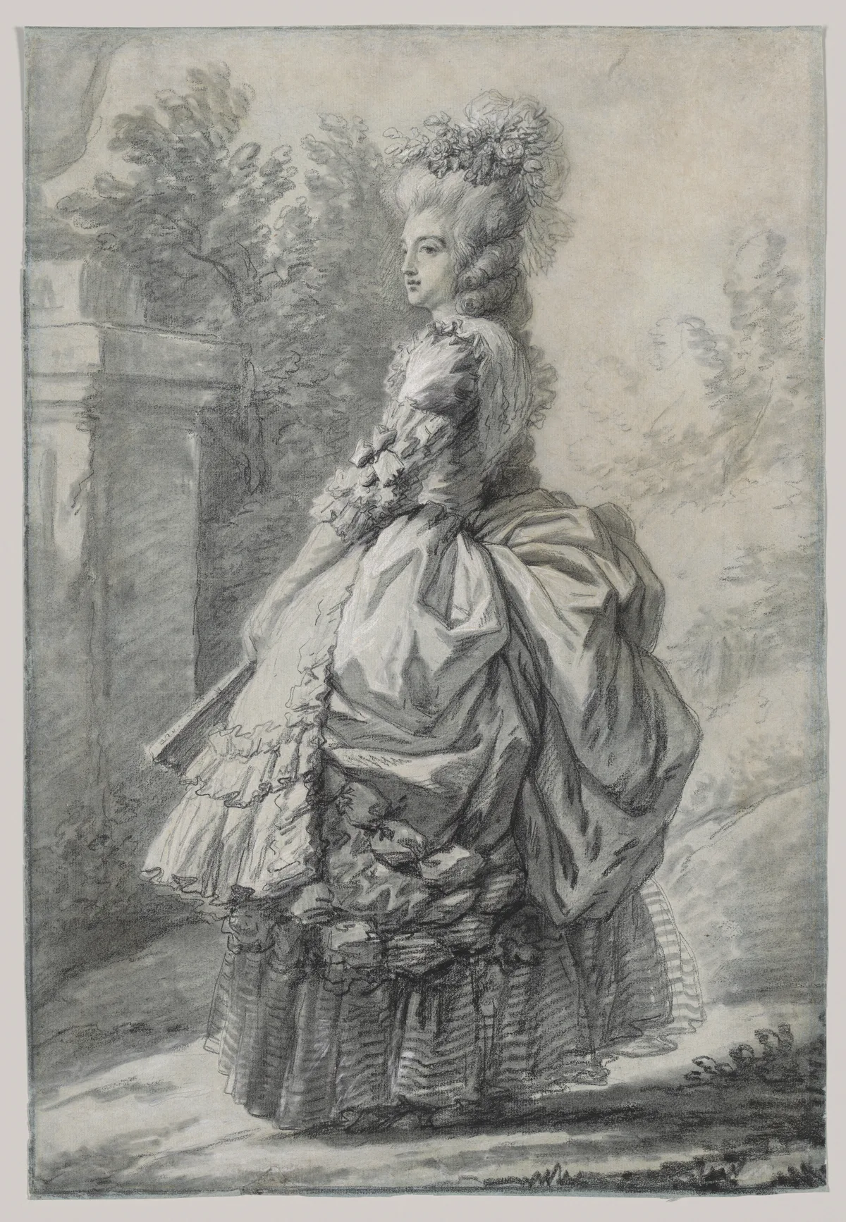
Every composition begins with a decision that often gets skipped: the shape of the canvas itself. A tall rectangle invites vertical rhythms and a sense of elevation or intimacy. A wide horizontal encourages panorama and narrative. A square creates a tension all its own, since there's no dominant axis to lean on. Vigée Le Brun's portrait above uses the vertical format intelligently — the upright canvas reinforces the queen's posture and gives the garden recession room to breathe behind her.
Lines and Direction
Lines do two things in a composition: they describe edges, and they direct attention. A diagonal line carries energy; a horizontal line reads as rest; a vertical line suggests stability or aspiration. When lines converge — roads meeting at a horizon, a figure's arm pointing toward another — they create a focal point whether you plan one or not. Every painting has lines, even if none of them are literally drawn.
Shapes and Masses
Before worrying about detail, experienced painters think in big shapes. The large dark mass of a tree, the broad light shape of a sky, the silhouette of a figure: these are the compositional units that the viewer's eye reads first, from ten feet away. If those shapes don't balance — if they're all crowded to one side, or all the same size — the painting will feel restless or monotonous before anyone gets close enough to see the brushwork.
Value Structure
Value (how light or dark a passage is) is arguably the most powerful compositional force because the eye is pulled toward contrast first. A single area of strong light-against-dark reads as the primary statement of the painting; everything else becomes supporting material. This is why value in art deserves its own serious study — you can compose a painting perfectly by shape and line and still flatten it by distributing your lights and darks without intention. Edgar Degas understood this completely, as we'll see below.
Negative Space
The areas of a painting not occupied by the main subject are compositional elements too. A figure pressed to one side of the canvas creates negative space on the other, and that emptiness has weight. It can suggest isolation, motion (the figure seems to be moving into the space), or simply breathing room. Painters who neglect negative space tend to fill every inch of the canvas and wonder why their work feels crowded.
What Are the Rules for Good Composition in Art?
The word "rules" is a bit misleading here. These are more like tested frameworks — patterns that work reliably because of how human vision operates, not because a committee decided them. Every one of them can be broken productively by someone who understands why it exists.
The Rule of Thirds
Divide the picture plane into a three-by-three grid. The intersections of those lines — four points in total — are where the eye naturally expects to find the main event. Placing your focal point dead center tends to produce a static, portrait-ID-photo feeling unless you're after that stability deliberately (Flemish portraiture often wants exactly that). Placing it near one of the four intersections instead creates a subtle dynamism. For a fuller treatment with canon examples, see Rule of Thirds Examples: How Master Painters Actually Used the Grid.
The Golden Ratio and the Fibonacci Spiral
The golden ratio (approximately 1:1.618) is a proportion that appears throughout natural growth — in the spiral of a nautilus shell, in the branching of tree limbs. The Fibonacci sequence (1, 1, 2, 3, 5, 8, 13, 21…) turns into this ratio as the numbers get larger: divide any number in the sequence by the one before it and you approach 1.618. To turn Fibonacci numbers into a usable compositional guide, painters use the golden spiral — a curve constructed from Fibonacci rectangles that leads the eye through the painting in a natural arc.
It's worth being honest about this one: whether Renaissance masters consciously used the golden ratio or arrived at similar proportions through trained intuition is genuinely contested. The ratio gets overclaimed. What's real is that the spiral offers a useful way to think about flow in a composition — how the eye enters, where it lingers, and where it rests. Critico's golden spiral overlay tool lets you drop the spiral directly onto your image to check whether your arrangement follows or fights that flow. For a careful look at the evidence and the myths, see The Golden Spiral in Art: What Painters Actually Need to Know.
Dominance and the Rule of Odds
A composition in which every element competes equally for attention has no hierarchy — and no hierarchy means no story. Dominance means one thing is clearly the most important. This can be achieved through size (the largest shape wins), value contrast (the brightest light wins), color temperature, or sharpest edges. Related: the rule of odds suggests that odd numbers of primary elements (three trees, five figures, one boat flanked by two) tend to feel more natural than even groupings, which the eye tends to split into competing pairs. For more on how painters establish visual priority, Emphasis in Art: How Painters Tell You Where to Look goes deeper.
Balance: Symmetry and Asymmetry
Symmetrical compositions feel formal, stable, sometimes monumental — think of the way altarpieces center the Virgin to signal sacred authority. Asymmetrical compositions feel alive, candid, in motion. Most paintings since the Impressionists have preferred asymmetry, because it allows for a weighted balance rather than a mirrored one: a large, quiet shape on the left can balance a small, intense one on the right because visual weight is about contrast and intensity, not just size.
Leading Lines
Any line in a painting — a riverbank, a railing, a shadow edge, a row of figures — will function as a guide if the viewer's eye picks it up. The best compositions plant several of these lines and aim them at the focal point from different angles, so the viewer keeps being redirected back to what matters. Diagonal lines are especially effective because they carry a sense of movement; horizontal lines let the eye rest.
How Can Composition Vary? Approaches Across Styles and Periods
One of the things that surprises painters who start studying composition seriously is how much it varies by period, purpose, and cultural context — not in arbitrary ways, but in direct response to what a painting was for.
Classical and Renaissance Composition
Renaissance painters working in Florence and Rome were making devotional images for specific architectural spaces: altarpieces, fresco cycles, chapel walls. Their compositions needed to be legible from a distance, hierarchically clear (Christ larger, angels smaller, donors smallest), and stable enough to anchor a building. The result was a preference for triangular and pyramidal groupings — think of Raphael's Madonna of the Meadow, where the Virgin, Christ child, and young John the Baptist form a stable triangle that feels as solid as architecture. Symmetry was a tool for expressing the divine order.
Baroque Drama
Caravaggio and his successors used diagonal compositions and extreme value contrasts (chiaroscuro) to inject urgency into religious subjects. The composition tilted; the light slashed in from one side; figures lunged out of darkness. This was intentional destabilization — the paintings were meant to grip the viewer, not reassure them. The eye follows the diagonal from shadow into light, and the story unfolds along that path.
Impressionist and Post-Impressionist Fragmentation
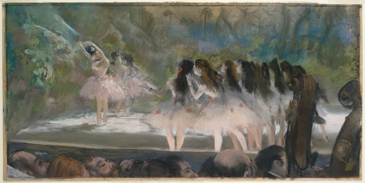
The Impressionists were deeply influenced by Japanese ukiyo-e woodblock prints, which arrived in Paris in quantity from the 1860s onward. Those prints used bold flat shapes, high viewpoints, radical cropping, and asymmetry that felt almost aggressive to Western eyes — figures cut by the frame, foregrounds treated as flat pattern, horizon lines pushed very high or eliminated entirely. Degas absorbed all of this. In Ballet at the Paris Opéra, the orchestra musicians occupy the bottom third of the painting as a dark, flat zone; the stage — with its bright dancers — is visible only at the top. The composition is frankly strange by classical standards. It feels like a glimpse, an overhead moment of candid observation, and it works precisely because of that strangeness.
Modernist Reduction
As painting moved into the twentieth century, composition became increasingly the subject — not just the vehicle for subject matter. In Mondrian's mature work, the grid itself is the painting. In Matisse, color areas function as compositional shapes with equal weight to representational forms. The lessons for figurative painters here are quieter but real: sometimes a shape or a value mass is doing compositional work that has nothing to do with what it depicts.
How Has Composition Changed Over the Years?
The short answer is that it has expanded — the vocabulary has grown, not replaced itself. Academic painters of the 1800s were trained on Raphael and Poussin; the Impressionists raided Japan; the early Moderns flattened everything they could find; and today, painters have access to all of it simultaneously. There is no "current" rule of composition in the way there was in 1680. There is, instead, a much larger set of tested strategies.
What has remained constant is the underlying perceptual reality: the human eye still seeks contrast first, still follows lines, still expects some hierarchy of importance. The means by which painters exploit those perceptual facts have diversified, but the facts haven't changed.
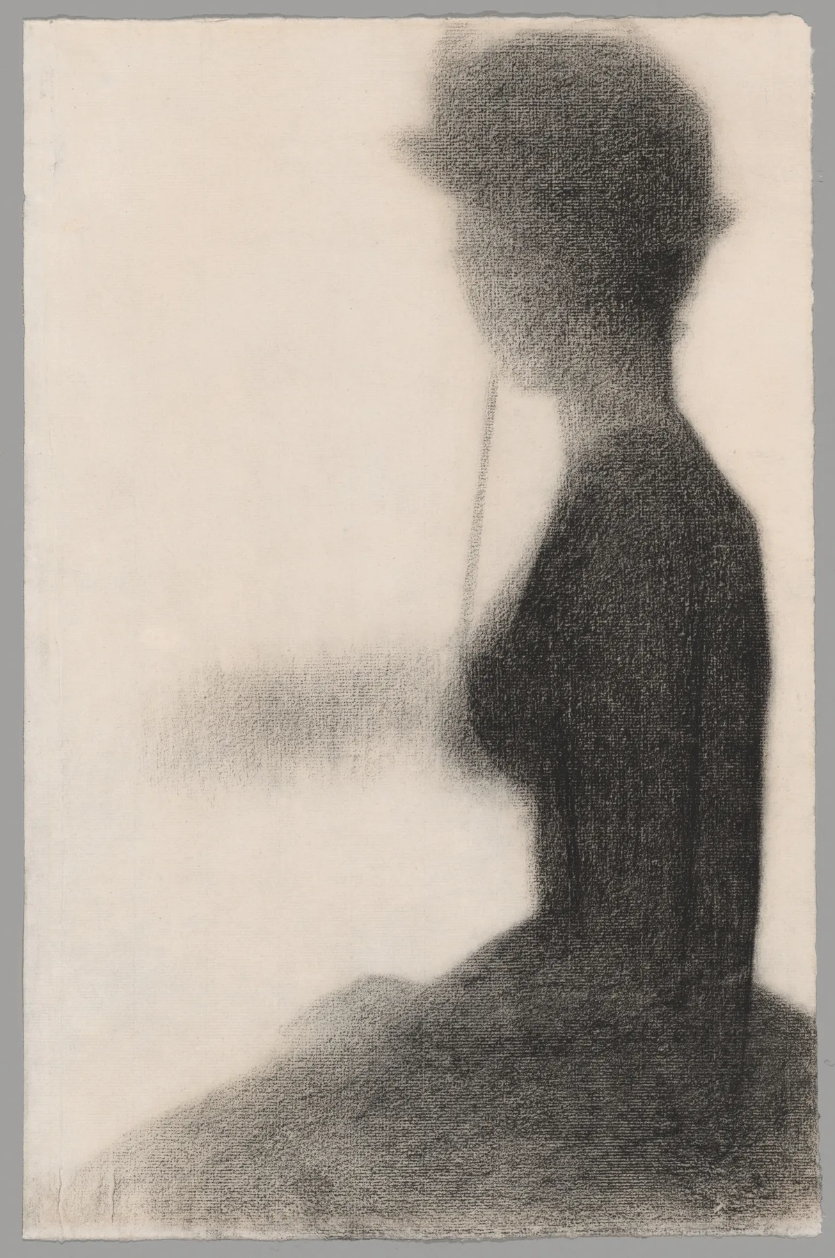
Seurat's preparatory study above illustrates this transition beautifully. The figure is reduced to an almost heraldic silhouette — a bold dark shape against a lighter ground. The internal detail is suppressed; the shape is doing all the compositional work. This is classical notan thinking (the study of dark-and-light pattern as composition) applied with modernist discipline. The study looks ahead to what the twentieth century will do with shape, even though Seurat was working in 1884.
Diagnose Your Own Work: Is Your Composition Holding Together?
These are the checks I run on my own paintings when something feels off but I can't name it. Go through them with your current piece in mind.
Squint test. Squint until the painting blurs into large shapes and you can no longer read detail. What do you see? If the large shapes feel balanced and lead your eye somewhere, the composition has a skeleton. If everything collapses into a muddy tangle with no clear structure, the arrangement is the problem — not the color, not the drawing.
Check the entry point. Where does your eye go first? If it's not going where you intend it to, trace why. Is there an unintentional value contrast somewhere in a corner pulling focus? Is a strong line pointing out of the frame instead of into it?
The thumbnail check. Reduce your painting to a thumbnail — literally photograph it and look at the image at postage-stamp scale on your phone. The thumbnail strips out detail and forces you to see the composition as pure shape and value arrangement. Problems that were invisible at full scale become obvious.
Count your value zones. A strong composition usually works in three to five value zones — not twenty. If your painting has patches of many different values scattered randomly, the structure is likely to feel restless. Try grouping lights together and darks together before worrying about anything in between.
Look for accidental tangents. A tangent is when two edges just barely touch — a figure's elbow grazing the canvas edge, a horizon line running directly through a figure's head. These create small visual jams that the eye can't resolve. Scan all the edges in your painting for unintentional alignments.
Ask: does the negative space have shape? The empty areas in your painting are compositional elements. If your negative space is shapeless — just "whatever's left over" — the composition will feel unresolved. Strong negative shapes feel as intentional as the positive ones.
Turn it upside down. Seriously. Rotating a painting 180 degrees strips away your familiarity with the subject and lets you see the abstract arrangement of shapes and values cold. Weaknesses in the geometry become much easier to spot.
Master Examples: Composition in Practice
Here are five specific paintings — each demonstrating a different compositional principle at work. The goal isn't admiration; it's analysis.
Vigée Le Brun, Marie Antoinette in a Park, ca. 1780–81 (Met). The portrait anchors the queen as a strong vertical slightly left of center, with the garden path receding diagonally to the right. That diagonal creates depth and keeps the background from being merely decorative wallpaper. The trees frame the figure without trapping her. The composition is asymmetrical but weighted — the occupied space on the left and the breathing garden on the right are in genuine dialogue. View at the Met.
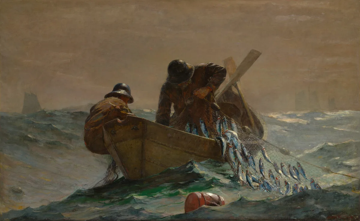
Winslow Homer, The Herring Net, 1885 (AIC). Homer uses the diagonal of the net — running from lower left to upper right — to anchor two fishermen against a wide, unstable sea. The composition is essentially a wedge shape: the net and its load form a dark, heavy diagonal that stabilizes what could otherwise be a disorienting expanse of grey water and sky. The boat is cropped by the left edge, reinforcing the sense of extension beyond the frame. The focal point (the fisherman's face, brightly lit against the dark water) sits near the upper-left third intersection. View at the AIC.
Degas, Ballet at the Paris Opéra, 1877 (AIC). As discussed above, the radical split — dark orchestra below, bright dancers above — creates a two-tier composition that mirrors the social structure of the Opéra itself. Degas places no single dancer at an obvious focal point; the composition is about the phenomenon of the ballet, not a single performer. That deliberate diffusion of attention is itself a compositional choice. View at the AIC.
Seurat, Seated Woman with a Parasol (study for La Grande Jatte), 1884/85 (AIC). The bold silhouette locks the figure against the ground as a two-value pattern — dark shape on lighter ground — with no internal modeling to distract from the shape's authority. Seurat is practicing a kind of compositional abstraction: the figure matters compositionally as a mass, not as a person. This is a lesson about working in large shapes first. View at the AIC.
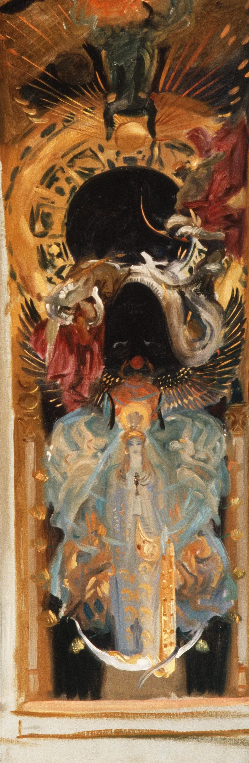
Sargent, Astarte, ca. 1890–95 (Met). Sargent compresses the figure against a highly ornamented background, creating a compositional tension between the three-dimensional figure and the flat decorative plane behind it. The figure's verticality is absolute — it divides the canvas almost symmetrically, which in classical terms risks being static. Sargent avoids that by making the background so richly textured that the eye has competing interests; the symmetry holds the figure in place while the background keeps moving. It is a highly controlled piece of compositional daring. View at the Met.
See Your Own Composition Clearly with Critico
Reading about composition is useful. Seeing it in your own painting is another matter entirely — the familiarity with your own work makes it genuinely hard to see the abstract shape structure underneath the subject.
Critico's value view converts your painting to a simplified tonal map, which lets you check whether your lights and darks are doing compositional work or just sitting wherever the subject happened to fall. You can also overlay a rule-of-thirds grid or a golden spiral directly on your image — not to force compliance, but to see where your arrangement sits relative to those frameworks and decide whether the distance is intentional. The rule of thirds overlay tool takes ten seconds to use and has a way of making the problem immediately obvious when the focal point has drifted somewhere unintended.
Frequently Asked Questions
- What is composition in art, in simple terms? Composition in art is the arrangement of visual elements — shapes, lines, values, and space — within the picture frame. It determines where the viewer's eye travels, what it finds important, and whether the painting holds together as a coherent statement.
- What are the main rules of composition in art? The most widely used frameworks are the rule of thirds (placing key elements near grid intersections rather than dead center), the golden ratio (a proportion of approximately 1:1.618 that produces naturally pleasing divisions), dominance (one element clearly more important than the rest), balance (visual weight distributed across the canvas), and leading lines (edges and shapes that guide the eye toward the focal point). These are frameworks, not laws — each can be broken when a painter understands why it works.
- Does composition in art have to follow strict rules? No. The frameworks exist because they correspond to real patterns in human visual perception, but every one of them has been productively violated by painters who understood what they were doing. Degas's radical cropping in his ballet paintings breaks most classical composition rules; it works because he replaced the old logic with a new, equally considered one.
- How do Fibonacci numbers relate to composition in art? The Fibonacci sequence (1, 1, 2, 3, 5, 8, 13…) produces a ratio that approaches 1.618 — the golden ratio — as the numbers grow. Painters use this to construct the golden spiral, a curve that can be overlaid on a canvas to guide the flow of the composition. Whether the Old Masters consciously used it or arrived at similar proportions by trained intuition is a genuinely open question, but the spiral remains a useful diagnostic tool for checking whether a composition has a coherent visual path through it.
- How can I improve the composition of my own paintings? The most reliable starting point is learning to see your painting in large shapes rather than in detail. Squinting, viewing thumbnails, and converting to a value map all help with this. From there, check your focal point placement, audit your negative shapes, and look for any unintentional tangents along the edges. For a systematic method, a tool like Critico can overlay compositional frameworks directly on your image — which shows you where your arrangement sits relative to the grid, not just in theory.
Composition isn't a checklist to complete before the real painting begins — it is the painting, at the level of structure. Everything else — color, brushwork, surface — is built on top of it. Get the arrangement wrong and there is no amount of beautiful paint that will fix the feeling that something is off. Get it right and the painting will hold its own even before the color goes on.
If you take one thing from this post, make it the squint test. Put down the brush, step back, squint until the detail disappears, and look at what's left. Those large shapes and their relationships to each other are your composition. If they're not working in abstract, they won't work in detail.