Every painting is a negotiation between the artist and the viewer's wandering eye. Left to itself, that eye will roam — skimming over edges, catching bright spots, resting wherever it lands. Emphasis in art is the painter's way of ending that negotiation decisively: it says look here first.
Understanding emphasis doesn't just help you critique other people's work. It helps you diagnose why your own paintings sometimes feel scattered or flat — and gives you specific tools to fix them.
What Is Emphasis in Art?
Emphasis is the principle of design that creates a dominant focal point within a composition. It controls visual hierarchy: the order in which a viewer reads a painting, from the most important area to the least. Without it, every element in a picture demands equal attention, and the result is exhausting — the visual equivalent of everyone in a room shouting at once.
In painting, emphasis is almost always linked to the focal point: the area where the artist most wants the eye to settle first. The two terms are closely related but not identical. Emphasis is the principle — the intentional act of making one thing stand out. The focal point is the result — the spot where that emphasis lands. (For a deeper look at focal points specifically, see Focal Point in Painting: Guiding the Viewer's Eye.)
Paintings can have more than one focal point, but they almost never have more than one point of primary emphasis. Secondary areas of interest support and guide the eye toward the main event — they don't compete with it.
The Five Tools Painters Use to Create Emphasis
Emphasis never just happens. It's built from specific, learnable techniques. Master painters generally reach for these five, often in combination.
1. Value Contrast
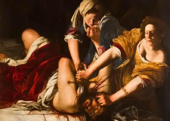
This is the strongest tool available. The human eye is drawn almost involuntarily to the highest value contrast in a composition — the place where the lightest light meets the darkest dark. Artemisia Gentileschi built the entire drama of Judith Slaying Holofernes on this fact. The lit arms and faces emerge from near-total shadow with such force that the eye has no choice but to go there first.
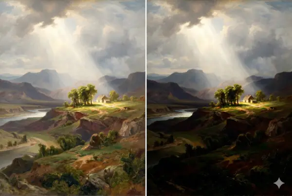
A practical test: squint at your painting until it blurs. Whatever survives the squint — whatever still jumps out — is where your value contrast is highest. If it isn't where you intended the focal point to be, you have a value problem, not a drawing problem. Critico's Squint view does exactly this digitally — see The Value Scale in Art for a deeper discussion of why value contrast drives everything.
2. Color Temperature and Saturation
Warm colors advance; cool colors recede. A single warm, saturated note in a field of cool, muted tones will pull the eye with surprising force. Saturation works the same way: one vivid passage in an otherwise neutralized painting creates instant emphasis. The danger is overuse — if everything is vivid, nothing is emphasized.
3. Edge Quality
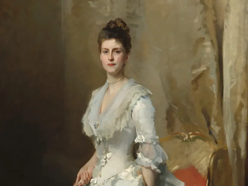
Hard edges create emphasis. Soft edges subordinate. In a portrait, a sharply defined eye against a softly lost cheek tells the viewer exactly where to look. This is one of the subtler tools and one of the most powerful. John Singer Sargent was a master of it — he would render the face of a sitter with crisp, decisive edges while losing the background into soft passages, then re-engage viewer attention with a sharp cuff or collar at just the right moment.
4. Isolation and Space
An element surrounded by empty space commands attention even without contrast or color. A single figure in an open field becomes the focal point simply because negative space amplifies its visual weight. Edgar Payne used this throughout his landscape compositions — a small solitary figure against vast sky and terrain anchors an entire painting because the surrounding emptiness gives it authority it couldn't achieve through size alone.
Robert Henri captured the underlying principle in The Art Spirit: good composition is about giving each thing "its right place in the organization." Isolation is one way of assigning that place.
Good composition is like a suspension bridge — each line adds strength and takes none away.
5. Convergence of Lines
When multiple lines — actual or implied — point toward the same area, the eye follows. Raphael's School of Athens (1509–11) is the clearest possible demonstration of this principle at monumental scale. The arched vault of the architecture creates a literal tunnel of converging perspective lines that funnels every viewer's gaze directly toward the central figures of Plato and Aristotle — even in a fresco crowded with over fifty figures. Lines don't have to be drawn to converge: the gaze directions of figures, the tilt of objects, and the angle of shadows can all create implied lines pointing toward the focal area.
Five Paintings That Demonstrate Emphasis at Work
Raphael — School of Athens (1509–11)
The masterclass in convergence as emphasis. The architectural vault creates a single-point perspective system that makes every line in the fresco point toward Plato and Aristotle at center. Secondary figures radiate outward, but the hierarchy is unmistakable — the eye finds the center first, always. Raphael stacks two emphasis tools simultaneously: convergence and placement at the compositional center, which in this case earns its central position through deliberate architecture rather than lazy default.
Artemisia Gentileschi — Judith Slaying Holofernes (c. 1614–20)
Emphasis through value contrast, pushed to its Baroque extreme. The background is near-total darkness. The three figures emerge into a shaft of light that has no visible source. The hands — the point of maximum action — receive the sharpest edges and the highest light, making them the undeniable focal point. Gentileschi understood that drama in painting is largely a value problem: put your most important moment at the highest contrast point, and the story tells itself.
Pieter Bruegel the Elder — Hunters in the Snow (1565)
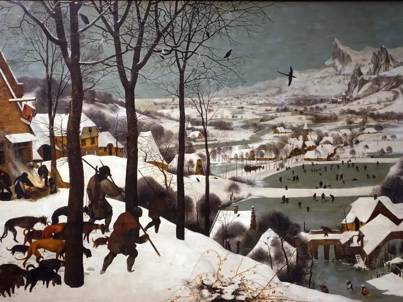
Hunters in the Snow uses emphasis through isolation and scale contrast. The dark silhouettes of the hunters and their dogs are the most saturated, highest-contrast elements in a painting that is otherwise an expanse of pale snow and gray sky. Their darkness against the white ground makes them the immediate focal point — and then the diagonal of the hillside releases the eye into the enormous valley below, which becomes a secondary area of interest. Bruegel balances emphasis with invitation: he tells you where to look first, then gives you a world to explore.
Géricault — The Raft of the Medusa (1818–19)
The Raft of the Medusa builds emphasis through a hierarchy of value and scale, woven into the composition's diagonal structure. The painting is organized around a line that rises from the lower-left (bodies, despair, death) to the upper-right (the waving survivors, a distant ship). The apex of that diagonal — the figure waving a cloth toward the horizon — receives the highest contrast: lightest skin against the darkest sky. That single figure, tiny relative to the mass of the raft below, is unmistakably where the eye arrives last and rests longest.
Velázquez — Las Meninas (1656)
Las Meninas is one of the most compositionally complex paintings ever made, and yet emphasis is absolutely clear: the Infanta Margarita, at center, lit most brightly against the darker figures flanking her, is the primary focal point. Velázquez surrounds her with secondary emphasis points — the reflected king and queen in the mirror, the artist himself — but the hierarchy is never in doubt. He achieves this through value (she is the lightest figure), placement (center of the canvas), and isolation (she has more space around her than any other figure). Three tools, perfectly stacked.
How Subordination Supports Emphasis
Emphasis only works when something else is subordinated. This is the part artists often neglect: they work hard to make the focal point sing, but leave the background and secondary areas at the same level of detail and color intensity as the main subject. The result is a painting where emphasis is attempted but not achieved.
Subordination means actively reducing the visual weight of non-focal areas: softening edges, neutralizing colors, lowering contrast, simplifying detail. Think of it as a budget. You have a fixed amount of visual attention from the viewer. Spend generously on the focal point; be frugal everywhere else.
Diagnosing Emphasis Problems in Your Own Work
If a painting feels scattered, diffuse, or busy, the problem is almost always weak or absent emphasis. Four questions to ask:
1. Where does my eye go first? Look at the painting fresh — or step away for twenty minutes and look again. Where does your eye land? If it wanders, emphasis is missing. If it goes somewhere other than your intended focal point, your emphasis tools are working for the wrong area.
2. What has the highest value contrast? Squint until the painting blurs. The area that remains most distinct is where your strongest value contrast lives. Is that where you want the focal point?
3. Are edges consistent everywhere? If every edge is equally hard or equally soft, you've lost one of your most powerful emphasis tools. Hard edges belong at the focal point; soft edges everywhere else.
4. Are there competing focal points? Two areas of equal emphasis create confusion rather than dialogue. If you intend two focal points, make sure one is clearly dominant and the other clearly secondary.
Drop your painting into Critico and run the focal-point heatmap. It maps where the eye is drawn — based on value contrast, edge quality, and color temperature — and overlays it directly on your image. If the hot zone matches your intended focal point, your emphasis is working. If it doesn't, you can see exactly which area is pulling attention away and why.
Emphasis Across Different Subjects
The tools are the same regardless of what you're painting, but where you apply them shifts.
Portraits: Emphasis almost always belongs on the eyes, or on one eye specifically. Every other decision — edge quality, value, color warmth — should direct attention there.
Landscapes: Emphasis belongs on whatever drew you to the scene: a lit break in storm clouds, a solitary structure, a reflective surface. A landscape without a clear point of dominance is a record of a place, not a painting of one.
Still life: Emphasis often belongs on the surface quality of a single object — light caught on glass, bloom on a plum. Everything else in the composition recedes to serve that moment.
Abstract work: Emphasis still applies. The eye still needs somewhere to go. Abstraction doesn't eliminate hierarchy — it changes what creates it.
Frequently Asked Questions
- What is emphasis in art? Emphasis in art is the principle of design that creates a dominant focal point within a composition. It controls where the viewer looks first by making one area stand out more than others, using techniques like value contrast, color saturation, edge quality, isolation, or the convergence of lines.
- What is the difference between emphasis and focal point in art? Emphasis is the principle — the deliberate act of making one area stand out. The focal point is the result — the specific area where that emphasis lands. A painting uses emphasis to create its focal point.
- What are examples of emphasis in art? Strong examples include Artemisia Gentileschi's Judith Slaying Holofernes (value contrast — lit figures from deep shadow), Raphael's School of Athens (convergence of architectural lines toward the central figures), and Bruegel's Hunters in the Snow (dark silhouettes isolated against snow). Each uses a different technique but achieves the same goal: one area commands the eye first.
- How do you create emphasis in a painting? The most reliable methods: create the highest value contrast at the focal point, use the warmest or most saturated color there, place hard edges at the focal point and soft edges everywhere else, surround the focal element with space, or direct lines — real or implied — toward it.
- Can a painting have more than one focal point? Yes, but there should be a clear hierarchy. One focal point is primary; others are secondary. Two focal points of equal weight create confusion rather than dialogue. In Velázquez's Las Meninas, the Infanta is clearly primary — the mirror with the king and queen is secondary. The viewer finds one, then the other.
Related reading:
- Focal Point in Painting: Guiding the Viewer's Eye
- The Value Scale in Art: The Foundation Painters Keep Coming Back To
- Rule of Thirds in Art: A Painter's Guide (Not a Photographer's)
- Composition in Art: The Painter's Field Guide (coming soon)