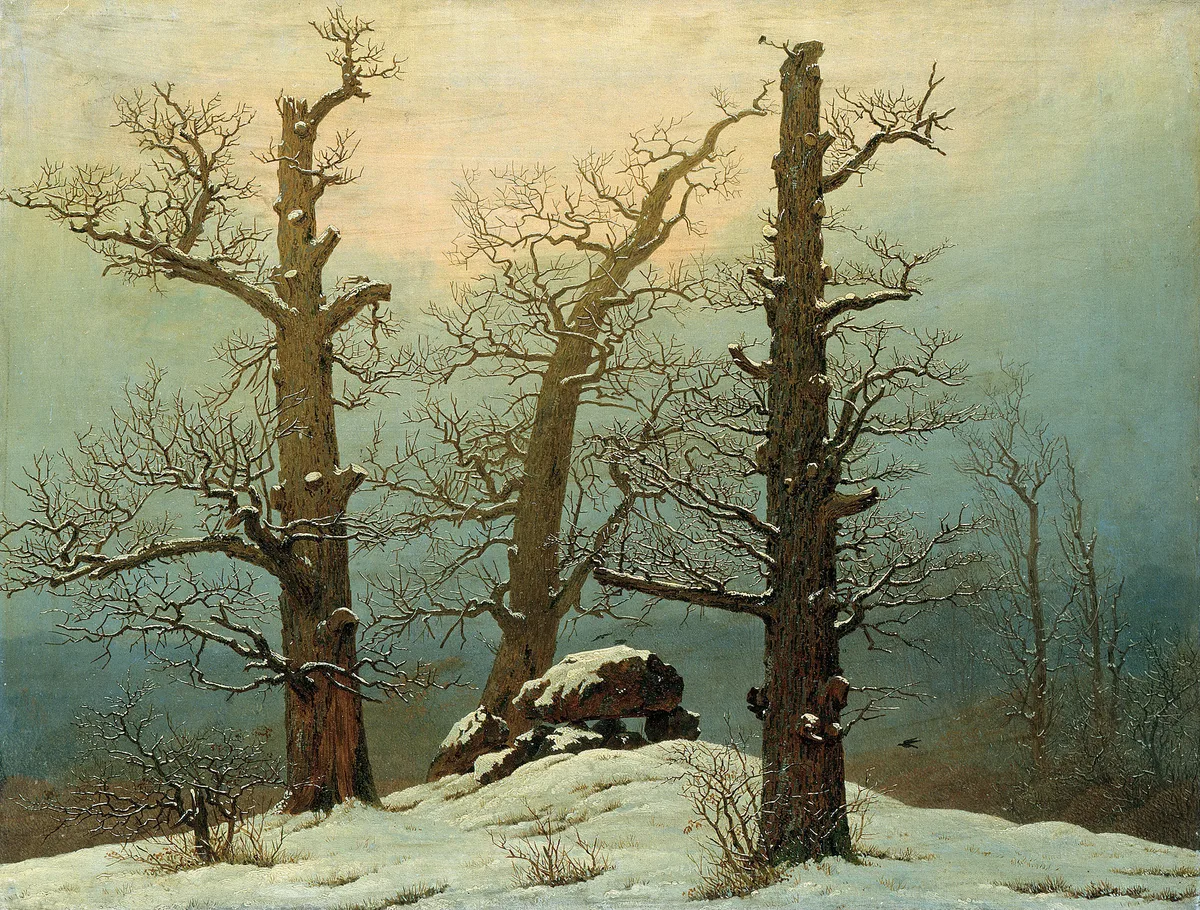
Value in art is the element that creates the illusion of light — and when it's off, nothing else rescues the painting. Color can be beautiful, composition can be inventive, edges can be handled with sensitivity, but if the value structure underneath those things is muddy or flat, the work reads as confused. Most painters who feel stuck in their development are, somewhere beneath the specific problem they've named, struggling with value.
This post unpacks what value actually is, how to use it deliberately, how to diagnose problems in your own work, and how five very different masters used it to solve very different pictorial problems.
What Is Value in Art?
Value (sometimes called tone) is how light or dark an area is on a continuous scale from pure white to pure black. It exists completely independently of color — a bright cadmium red and a dull forest green can sit at exactly the same value, making them tonally invisible against each other even though they look nothing alike.
Think of a black-and-white photograph. That photograph doesn't show you hue or saturation. What it shows you is pure value — and painters have known for centuries that the black-and-white reading of a painting is often more important than its color reading. A painting that looks strong in grayscale almost always looks strong in color. The reverse is rarely true.
The standard teaching tool for value is the value scale: a graduated strip running from white (value 10, or "lightest") through middle gray (value 5) to black (value 1, or "darkest"), with nine or ten distinct steps. It's a simple device, but learning to assign real passages of paint to specific positions on that scale — rather than working intuitively — is one of the exercises that separates painters who plateau from painters who keep improving. If you want to go deeper into how the scale works as a practice tool, The Value Scale: The Foundation Painters Keep Coming Back To covers it step by step.
The Value Scale and How It Works in Practice
Light and Dark Are Relative
The most important thing the value scale teaches is that values are always relative to their neighbors. A mid-gray patch next to white looks dark; the same mid-gray next to black looks light. This is not a trick or an optical illusion to be wary of — it is the mechanism by which painters create the sensation of luminosity. Vermeer's lit interiors feel almost blinding not because his lightest whites are physically brighter than another painter's lightest whites, but because the darks surrounding them are managed with particular care.
The Full Range — and When Not to Use It
A painting that uses the full value range — from near-black darks to near-white lights — reads as high contrast and typically feels dramatic or crisp. But many successful paintings deliberately compress the value range. A misty seascape, a quiet interior in overcast light, a field study done on a gray day — these work with a narrow band of mid-tones, and that narrowness is what creates their atmospheric quality. The mistake is using a compressed range when you want drama, or forcing the full range into a painting that should feel quiet. You get to choose which register the painting lives in; the trouble is when that choice is made accidentally rather than deliberately.
Value and Color: The Relationship You Can't Ignore
Every color has an intrinsic value. Yellow is a high-value color — even a deep, saturated yellow sits well above middle gray on the scale. Violet is a low-value color. Blue ranges widely depending on the specific pigment and how much it's lightened. Understanding this means you can predict, before you mix, roughly where a color will land on the scale.
The practical implication: when you want two colors to read as the same value (so they blend or shimmer together — a classic Impressionist move), you need to match their lightness, not just their hue. When you want strong separation — a focal point, an edge that reads across the room — you create a value contrast, not just a color contrast. Focal Point in Painting: Guiding the Viewer's Eye goes into this in detail, but the short version is that the eye goes to high value contrast first. Color contrast is a secondary signal.
Value Terms Worth Knowing
A few terms come up constantly in critiques and painting instruction. It's worth having a shared vocabulary:
High key — the painting's overall value range sits in the upper portion of the scale (lights and mid-lights). Think Berthe Morisot's plein-air sketches or many of Sargent's watercolors: airy, luminous, deliberately limited in their darks.
Low key — the range sits in the lower portion (mid-darks and blacks). Caravaggio, Rembrandt, and much of the Baroque tradition operate here. The emotional quality tends toward weight, intimacy, or drama.
Value contrast — the difference in lightness between two adjacent passages. High contrast = strong visual signal. Low contrast = quiet, atmospheric, recessive.
Massing — grouping multiple smaller shapes into larger shapes of approximately the same value. This is one of the most useful compositional moves available: instead of a painting full of small competing bits, you organize lights into one or two masses and darks into one or two masses, and the whole thing reads with more authority. The concept of Notan Art: The Value Study That Changes How You See is built on this principle — it's worth understanding before your next canvas.
Value pattern — the arrangement of value masses across the picture plane. Before any detail, before color, a painting is a value pattern. Getting the pattern right is what a thumbnail sketch or notan study is actually for.
Successful Artwork and Value Structure
It's not an exaggeration to say that a clear value structure is the single most reliable predictor of whether a painting will read from across a room. The specifics vary — some artists work with two or three large value masses, others with a more gradated approach — but they all have a plan for where the lights and darks go.
Richard Schmid, in his book Alla Prima, argued (to paraphrase) that value is the most important element of painting — that color mistakes can be forgiven if the values are right, but no amount of color sophistication rescues wrong values. Whether or not you take it that absolute, the working principle is sound.
The structure typically follows a logic: one area of the painting holds the lightest lights next to the darkest darks, creating the highest contrast and — not coincidentally — the emphasis. The rest of the painting is handled in closer, quieter value relationships that support rather than compete with that primary event. When a painting has three equally high-contrast areas, the eye doesn't know where to settle. That restlessness is often described as a composition problem, but it's almost always a value problem first.
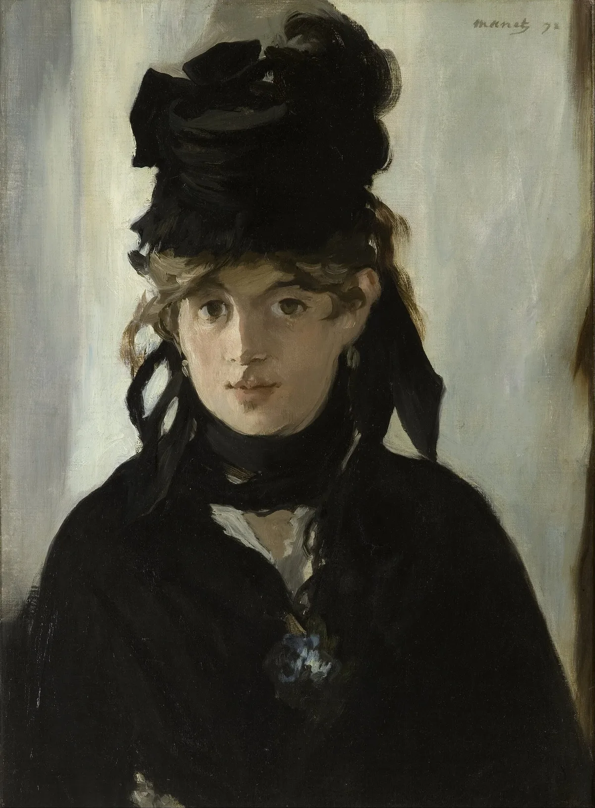
Manet's portrait of Berthe Morisot (1872) is a textbook demonstration of value structure used with confidence. The face — the only thing in the painting that genuinely matters — is the single passage where light and dark meet at their most extreme. The hat, the jacket, the background: almost all dark, almost no differentiation. He has given the value contrast budget entirely to the face and nowhere else. The result reads instantly from across a gallery.
Diagnose Your Own Work: Value Self-Checks
When a painting isn't working and you can't immediately name why, run through these checks before reaching for more paint.
1. Squint the painting down to a blur. This is the oldest trick in the room, and it works because blurring collapses all the small decisions into the underlying value masses. If the painting loses its structure when you squint — if it becomes a gray mush with no readable pattern — the value masses aren't clear enough.
2. Photograph it in black and white. Your phone's camera can do this in seconds. Looking at the grayscale version tells you whether the painting reads on structure or only on color. If the focal point disappears in the grayscale image, the color relationship is doing work that value should be doing — and that work will fail on any screen, in any reproduction, and in the memory of anyone who saw the painting.
3. Count your value masses. Most painters who struggle with "busy" paintings discover they have five, six, or more distinct value masses competing for attention. Try to identify whether you can merge any neighboring areas into one mass. Can two mid-tone passages be painted as a single mid-tone? Can two slightly different darks become one clean dark? Merging is almost always the right move.
4. Find your highest contrast. Where in the painting do the lightest light and darkest dark sit side by side? That point should be where you want the eye to go first. If the highest contrast lives in a corner, on a secondary object, or at an edge of the canvas, the eye is being led away from the painting's center of interest.
5. Check the lights. A common error is scattering small lights across the canvas — a bit of light on a rim, a sparkle on water, a pale note in the distance. Each individual highlight is defensible, but together they break up the light mass and flatten the sense of illumination. Ask whether small lights need to be lightened to the value of the main light, or darkened away from it and merged into a mid-tone.
Master Examples: Value in Painting
Utagawa Kuniyoshi — Vrouw bij een haven (c. 1825–1830)
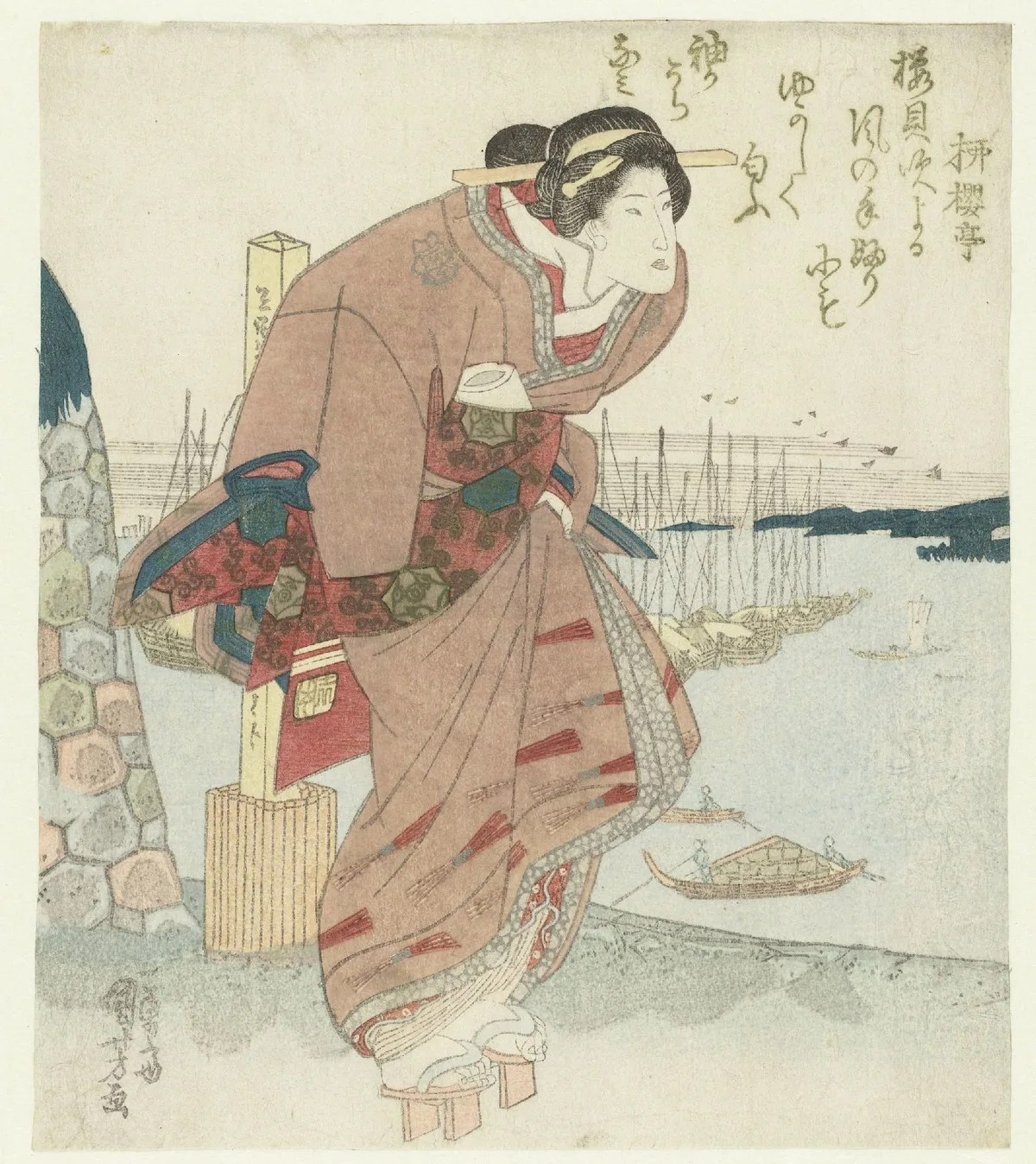
Kuniyoshi's woodblock prints make value structure visible in its most stripped-back form. Because the medium doesn't permit gradual tonal blending in the Western oil-painting sense, every design decision about light and dark is forced to be deliberate. The figure reads against the background because the two are assigned to clearly different value families. There's no middle ground where the eye gets confused. Western painters training their eye on value would do well to spend time with Ukiyo-e prints for exactly this reason: the value masses are unambiguous and the lesson is immediate. The Rijksmuseum's open access collection has extensive holdings for study.
Leonardo da Vinci — Lady with an Ermine (c. 1489–1490)
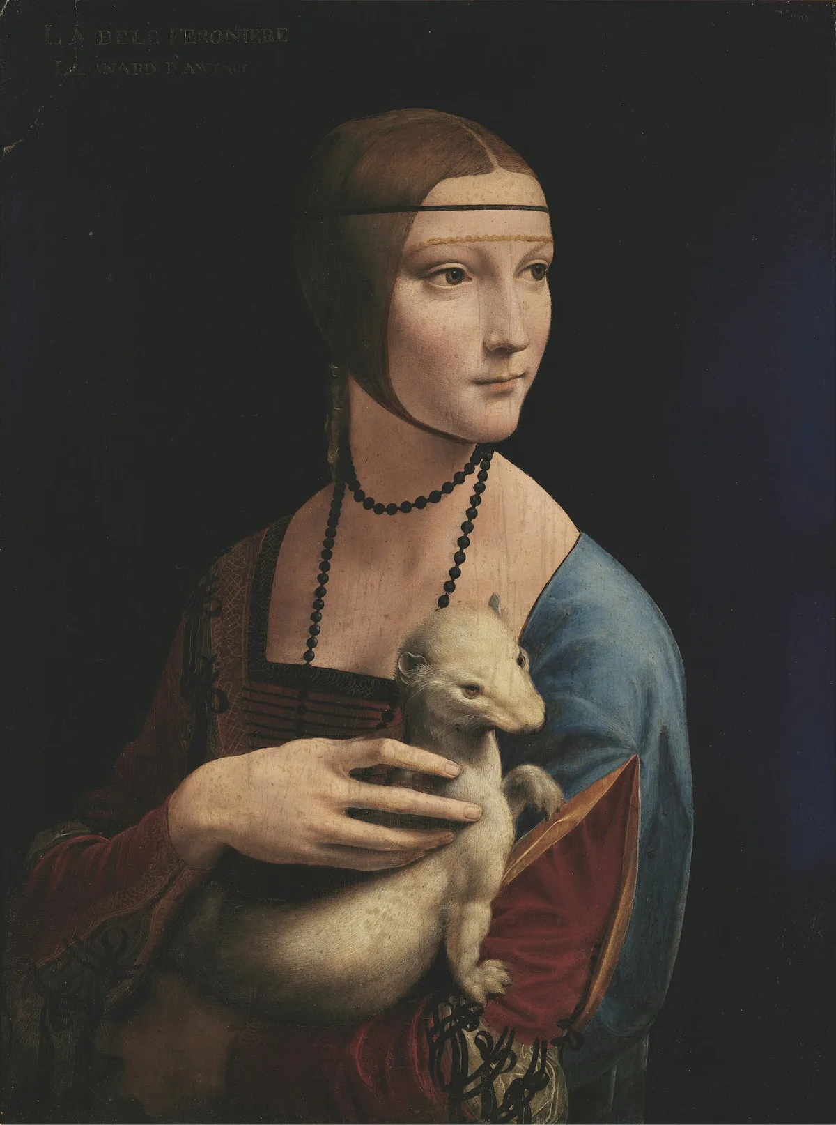
Leonardo's Lady with an Ermine (c. 1489–1490) shows the Renaissance understanding of value as a tool for describing volume. The face emerges from the dark ground through a continuous, almost imperceptible gradation — what he called sfumato, the soft blurring of edges between light and shadow. There are no hard lines separating the lit cheek from the shadow under the chin; the value transition does all the modeling. Notice too that the ermine — pale, luminous — is placed directly against the darkest part of the background, a device that gives the animal almost as much visual weight as the face. The Metropolitan Museum of Art has extensive resources on Leonardo's technique for anyone who wants to read further.
J.M.W. Turner — An April Shower (1842)
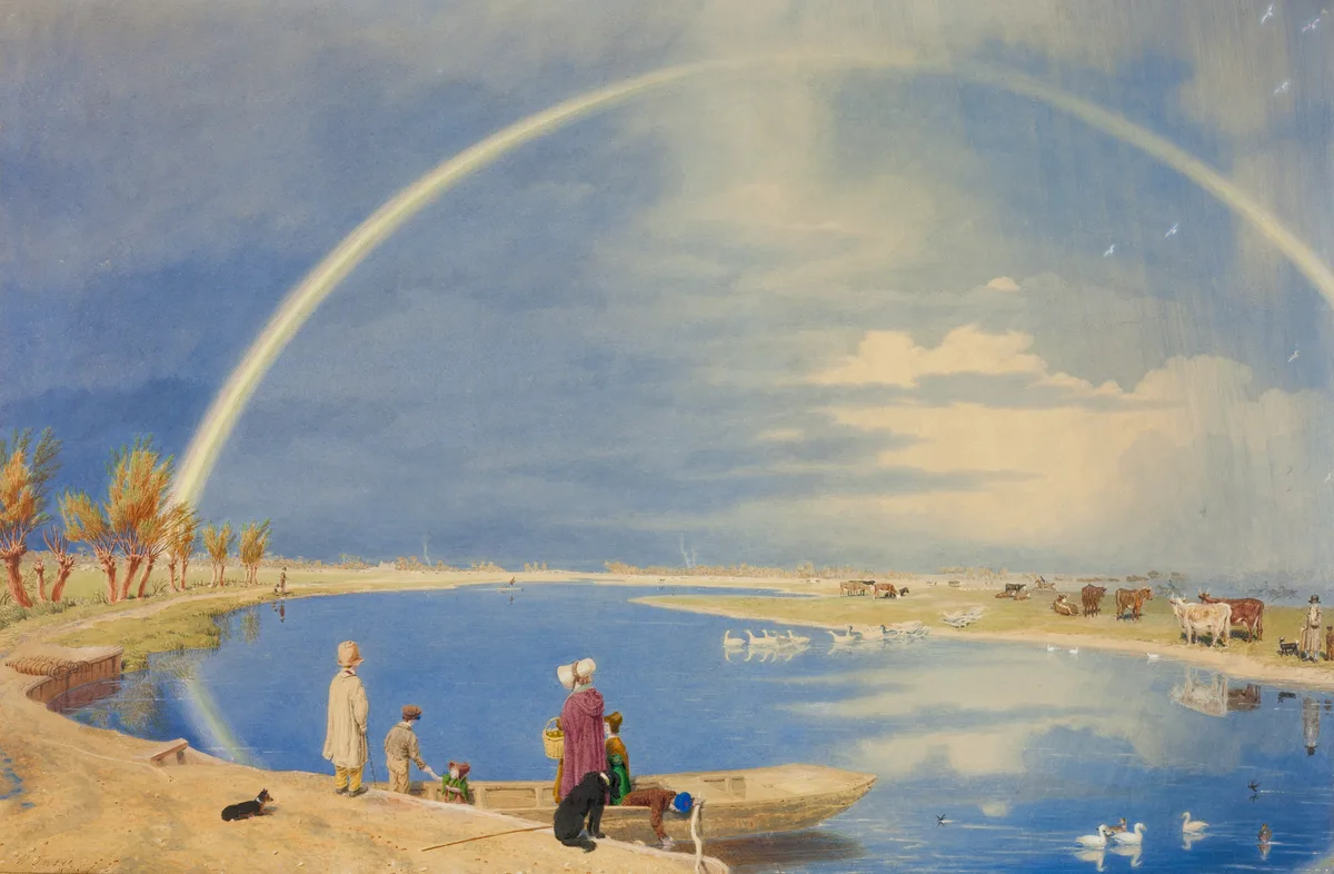
Turner's An April Shower (1842) is the argument for limited value ranges. Almost the entire watercolor lives in a compressed band of high-key values — pale washes of yellow-gray, light blue, soft ochre. Virtually no dark. The result isn't weakness; it's atmosphere. The painting feels like diffused, rain-washed light because the values support that sensation rather than contradicting it. Turner understood that choosing to work in a narrow value register wasn't a limitation — it was a pictorial decision with specific emotional consequences. You can study this work directly in the Art Institute of Chicago's open access collection.
See Value at Work With Critico
One of the most useful things Critico does is strip the color from your painting entirely, leaving only the value structure. Upload your own work and switch to the grayscale view: the question you're asking is simple — do you see two or three clear value masses, and does the highest contrast sit at your intended focal point? If the grayscale image looks flat or scattered, that's the diagnosis. From there, the fix is almost always about merging masses rather than adding more detail.
Frequently Asked Questions
-
What is value in art, in simple terms? Value is how light or dark an area is, on a scale from pure white to pure black. It exists independently of color — two completely different colors can share the same value, making them tonally identical even if they look nothing alike to the eye.
-
Why do artists say value is more important than color? Color is the surface; value is the structure underneath it. A painting with strong value organization reads clearly even in a black-and-white photograph. A painting with weak values looks muddy regardless of how beautiful the individual colors are. Most experienced painters learn, often the hard way, that fixing the values usually fixes the painting — while fixing the colors without addressing values rarely does.
-
What does "high key" mean in painting? A high-key painting works primarily in the lighter portion of the value scale — lots of lights and mid-lights, little or no deep shadow. The effect tends toward airiness, luminosity, or delicacy. Berthe Morisot's plein-air work and many Impressionist paintings are naturally high key because they were made in full, open daylight.
-
How can I practice seeing value in my own work? The two most reliable methods are squinting — which blurs detail and collapses everything into its underlying value masses — and photographing your work in black and white. Both methods force you to see the value pattern rather than the subject, which is where the structural problems are most visible. Working through notan studies in ink before painting is another exercise that builds this skill quickly.
-
What is a value scale and do I need one? A value scale is a graduated strip from white to black divided into roughly nine or ten steps. You can buy one, make one, or find one online. It's useful not as a rigid rule system but as a calibration tool — it teaches you to assign real passages in a painting to specific positions on the scale rather than working entirely by feel. The Value Scale: The Foundation Painters Keep Coming Back To walks through how to actually use one in practice.
Value is the element that experienced painters almost always wish they'd taken more seriously earlier. It doesn't photograph as dramatically as a complex color palette, and it doesn't make for easy conversation at an opening, but it is what makes a painting hold together when someone sees it from twenty feet away and wants to walk closer. Get the value structure right, and the painting earns that walk across the room.
If you want to see exactly what your own painting's value structure looks like — stripped of color, just the bones — Critico will show you in seconds.