Proportion is one of those principles that tends to work invisibly when it's right and loudly when it's wrong. When a figure's head sits too large on narrow shoulders, or a foreground tree dwarfs a cathedral that should dominate the scene, something nags — even before the viewer can name it. That nagging is your eye detecting a broken relationship. Understanding proportion in art examples from the canon is the fastest way I know to start hearing what your own eye is already telling you.
This post covers what proportion actually means as a compositional tool, walks through the main types with real paintings, and gives you concrete self-checks to run on your own work. We'll also look at where proportion shades into scale — and why keeping those two ideas distinct makes both of them more useful.
What Is Proportion in Art? A Plain-Language Definition
Proportion in art is the size relationship between the parts of a composition — or between a part and the whole. It is not about any single element being large or small in isolation. It is always relational: this figure relative to that doorway, this foreground mass relative to the sky above it, the eye relative to the nose.
When those relationships feel right, the painting reads as coherent. When they are off — even by a small margin — the viewer's eye keeps snagging on the discrepancy rather than moving through the picture.
Proportion shows up at every scale of picture-making. It governs the human figure (where do the knees fall in a standing pose?), the architecture of a still life (how much table to how much background?), and the broad compositional masses of a landscape (what fraction of the canvas is earth, what fraction is sky?).
Proportion vs. Scale in Art: Keeping the Terms Straight
These two words get tangled constantly, so it's worth separating them cleanly before going further.
Proportion describes the internal size relationships within a composition. Everything is measured against everything else. A figure's arm is too long relative to her torso; a jug is too squat relative to its own mouth — these are proportion problems.
Scale describes how large or small something is relative to a viewer or a real-world reference. A mountain painted small to suggest enormous distance is a scale decision. A figure painted tiny against a cathedral to emphasize the architecture is a scale decision.
In practice, the two are partners. You can read more about how painters exploit scale deliberately in Scale in Art. For now: if the problem is internal — the parts don't fit each other — it's proportion. If the problem is external — the thing doesn't feel like the right size for the world it inhabits — it's scale.
The Main Types of Proportion in Art (With Examples)
Standard Proportion
Standard proportion means the parts of a subject are rendered in roughly the sizes they would occupy in reality. This sounds like the safe choice, and in some sense it is — but "roughly realistic" requires careful observation and is harder than it sounds.
The classical standard for the human figure is approximately seven to seven-and-a-half head lengths from crown to sole. Leonardo da Vinci's Vitruvian Man (c. 1490, Gallerie dell'Accademia, Venice) is the most famous drawing of these classical proportions: the navel sits at the center of the circle and the wingspan equals the height. Artists from the Renaissance onward have used these proportional relationships as a scaffolding — not a straitjacket, but a reliable starting point from which expressive departures can be made deliberately.
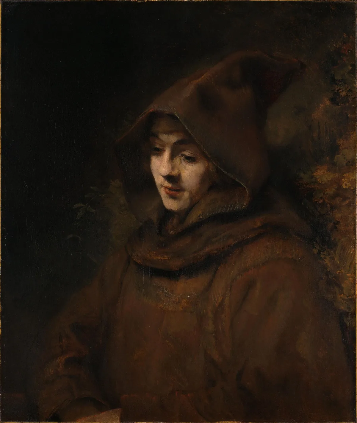
The risk with standard proportion is rigidity: mechanically correct relationships can produce a painting that feels stiff. In the hero painting above — his son Titus in a monk's habit — the massive draped robe takes up far more compositional area than a strict body-proportion study would assign to clothing. The face is comparatively small, intimate, even a little lost. That tipping of the proportional balance is what makes the painting feel humble rather than heroic.
Altered Proportion
Altered proportion means the artist has intentionally departed from observed reality. The departure carries meaning.
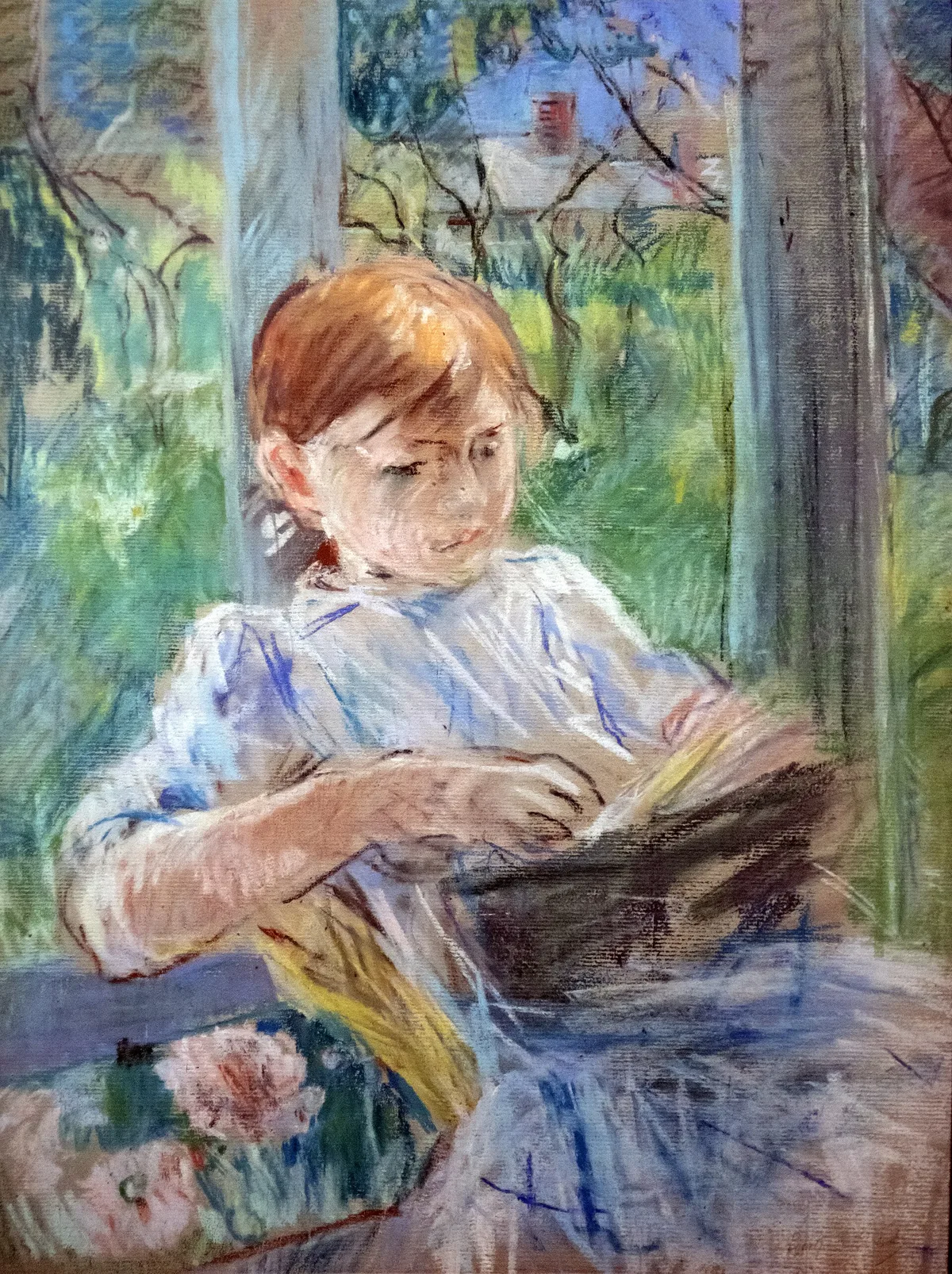
Berthe Morisot's Jeune fille lisant is a strong example at a quiet scale. The girl's dress and the atmospheric background occupy the great majority of the picture surface. Her face — the most descriptive passage — is turned down toward her book, caught in concentration. The composition is proportioned so that feeling outweighs description. The painting is not a portrait in the documentary sense; it is an impression of absorbed attention, and the proportion of loosely stated surface to the slightly firmer face is doing most of that work.
Altered proportion tends to be the territory where a painter's personal voice lives. When you see a painter consistently making heads slightly too large, or backgrounds proportionally more generous than the figures, you are usually looking at an intentional expressive system, not a mistake.
Hierarchical Proportion
Hierarchical proportion is among the oldest deliberate proportion decisions in art history: the most important figure is made the largest, regardless of where they stand in physical space.
Egyptian wall paintings are the obvious reference point, but the tradition runs through Byzantine icon painting and into the Renaissance. In Giovanni Cimabue's Maestà altarpieces (late 13th century, Uffizi), the Virgin and Child are scaled far above the surrounding angels not because they stand in front — all figures occupy a flattened, non-perspectival space — but because their importance demands size. Scale and status are synonymous.
This is useful to understand even if you paint landscapes. Any time you make a compositional decision that gives a certain element more space because it matters more — a wider sky than strict perspective would suggest, a closer crop on a figure than the scene's depth would normally allow — you are working in the spirit of hierarchical proportion, even if not its classical form.
Out-of-Proportion (Intentional Distortion)
Some painters fracture proportion deliberately to create unease, humor, or emphasis. El Greco's elongated figures — stretched to heights that no human body could sustain, as in The Burial of the Count of Orgaz (1586, Santo Tomé, Toledo) — have sometimes been explained away as an eye condition. The more useful reading for a painter is that elongation can convey spiritual aspiration in a way that correctly proportioned bodies cannot.
In a different register, caricature pushes cranial proportion to comic excess. The distortion is the point: an oversized head crammed with pretension, a chin jutting beyond all reason. When a viewer reacts to a cartoon with instant recognition of the target, proportion is almost always the lever being pulled.
For painters (as opposed to illustrators), deliberate distortion works best when it is consistent and purposeful. A figure with a too-large head in an otherwise realistically proportioned painting tends to read as an error. The same figure in a painting where every element is slightly exaggerated reads as a style.
Compositional Proportion: The Large-Scale Architecture of a Painting
Beyond how you proportion individual figures or objects, there is a second set of proportion decisions that governs the entire canvas: how do the large masses relate to each other?
Consider the division of sky to earth in a landscape. A 50/50 split — horizon exactly at center — produces a stable, static image. Giving the sky two-thirds of the canvas and the land one-third emphasizes atmosphere and light; reversing it emphasizes terrain and texture. Neither is inherently right. But the painter who arrives at that division by default, without asking the question, loses one of the most powerful structural choices available.
The rule of thirds is one formalized answer to this question — divide the canvas into thirds horizontally and vertically, and place primary relationships along those lines. The golden ratio is another, older answer. Both are aids to thinking about compositional proportion, not rules to follow mechanically. The question underneath both is the same: what proportion of this canvas do I give to each major element, and why?
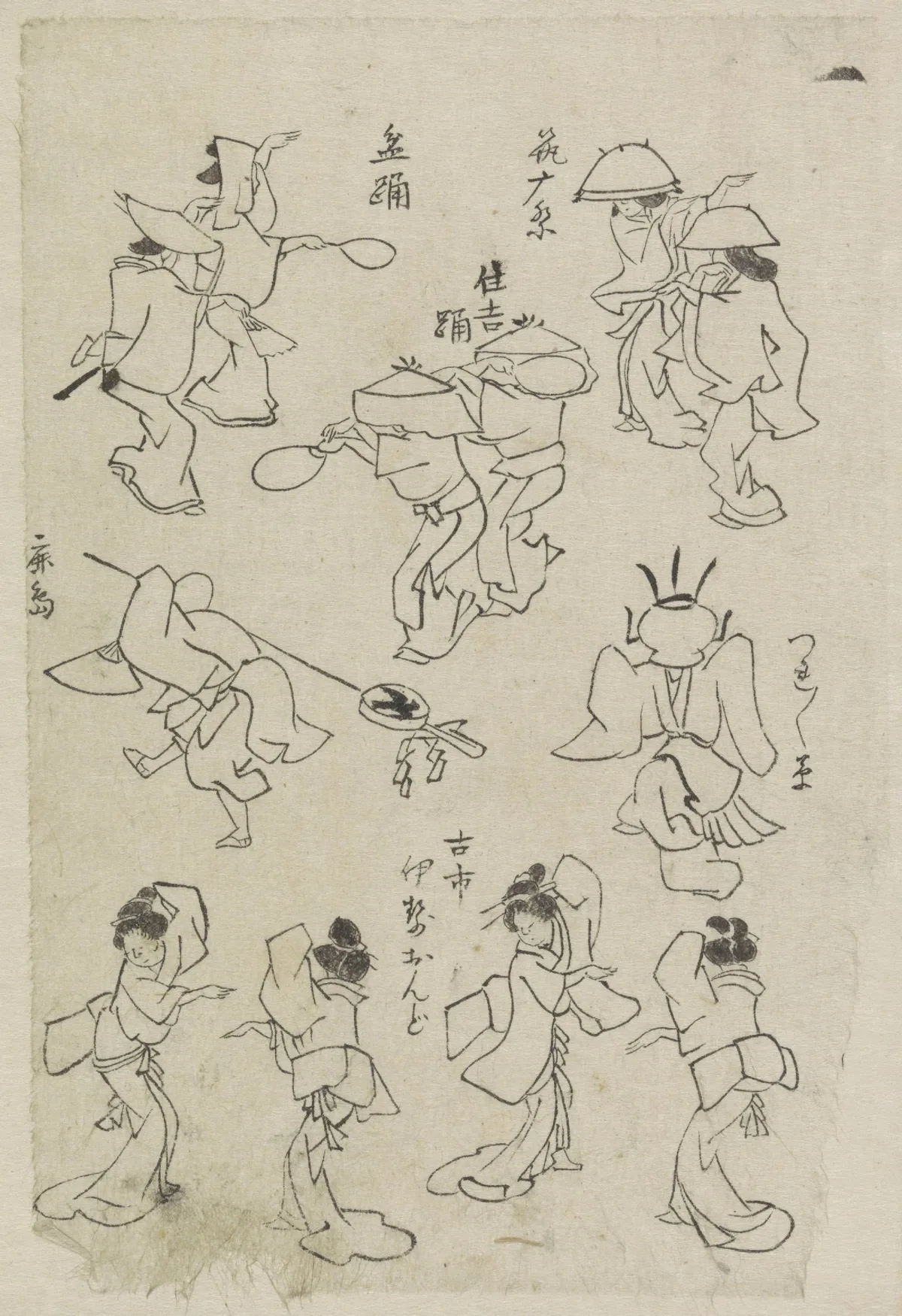
Hokusai's studies of dancing figures offer a useful model for thinking about compositional proportion across a picture surface. Hokusai keeps the dancers at roughly the same scale and varies the groupings instead — pairs, single figures, a row of four along the bottom — so the gaps between them create rhythm across the sheet. That orchestration of spacing is compositional proportion in action.
Proportion in Nature: Birds, Plants, and the Painted World
Proportion principles are not limited to the human figure. Still-life and natural-subject painters have to make proportion decisions constantly — how large is this leaf relative to this stem, this quail relative to the poppies it sits among?
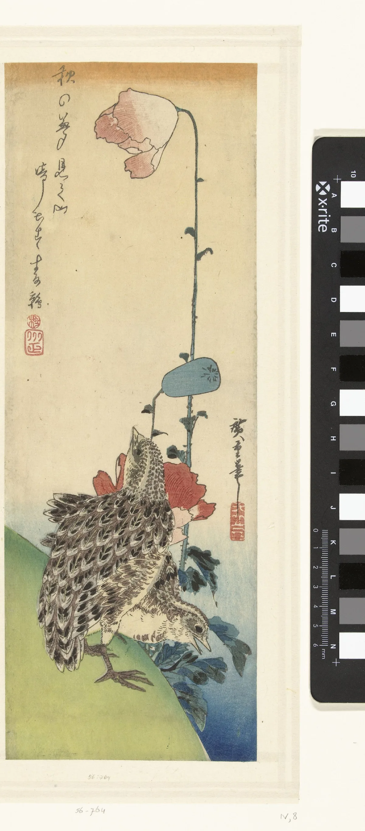
In Hiroshige's Kwartels en papavers (Quails and Poppies), the birds are compact, low, ground-hugging; the poppy stems are tall, vertical, nearly filling the picture height. The proportion of small rounded form against tall slender verticals is not incidentally beautiful — it is the compositional idea of the print. The quails' proportion to the plant creates tension and contrast that a more uniformly scaled arrangement would dissolve. Hiroshige makes this kind of proportion decision look inevitable, which is the mark of a proportion choice working at full strength.
Diagnose Your Own Work: Proportion Self-Checks
When a painting feels unsettled and you can't identify why, proportion is worth examining systematically. Here are the checks I work through:
1. Cover and compare. Isolate each major element with your hand or a scrap of paper and ask: if I changed nothing else in this painting but made this element 20% larger or smaller, would the composition improve? Sometimes the answer arrives immediately.
2. Measure head heights on figure work. If you're painting figures and something feels wrong about the body, count head lengths. A seven-and-a-half-head figure is a useful standard; many beginner errors cluster around making the torso too short or the legs too long. This is purely diagnostic — once you know what's off, the fix is observational.
3. Check the sky-to-ground ratio on landscapes. Hold a straightedge horizontally across your horizon line and see what percentage of the canvas it assigns to sky versus land. Ask whether that split was a decision or an accident. If it was an accident, consider whether a different split would strengthen the mood you're after.
4. Look for unintentional hierarchies. In a scene with multiple figures or objects, does the largest element carry the most narrative weight? If not — if the compositionally dominant element is, say, a background tree rather than your subject — you may have an accidental hierarchical proportion problem.
5. Step back and squint. At arm's length with soft focus, where does the eye land first? Does the largest or highest-contrast mass correspond to what you intended as the focal point? If not, proportion and emphasis are working against each other.
Master Examples: Proportion Doing Specific Work
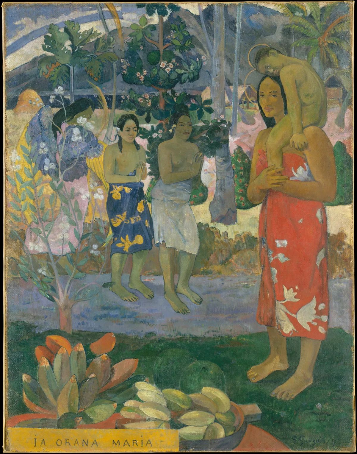
A few named works, and exactly what each one shows:
Paul Gauguin, Ia Orana Maria, 1891 (Metropolitan Museum of Art) — Gauguin gives his Madonna and Child the full height of the canvas: Mary stands in the foreground at the right, taller than the two worshippers set back in the middle ground. This is a classical hierarchical proportion decision translated into a Tahitian setting: importance is expressed through size, and here the size comes from placing her in front. You can examine the full painting at the Met's open-access collection.
Rembrandt, Titus in a Monk's Habit, 1660 (Rijksmuseum) — as noted in the introduction, the proportion of robe to face here is an expressive choice. The Rijksmuseum points to "the introspective gaze on the boy's gaunt face," and that introspection is partly structural: making the figure's clothing so proportionally dominant reduces the subject to something almost childlike and vulnerable. Proportion creates psychology.
Berthe Morisot, Jeune fille lisant (Bemberg Fondation, Toulouse) — the generous proportion of loosely handled surface to the slightly firmer face communicates absorption and calm. If the proportions were reversed — face dominant, background suppressed — the painting would become a portrait. As it stands, it is a mood. Proportion is doing the genre-defining work.
Utagawa Hiroshige, Quails and Poppies, 1830–35 (Rijksmuseum) — the proportion of the small, horizontal, rounded bird-forms against the tall vertical plant structure creates a visual tension that is the subject of the print. Hiroshige never resolves this tension into comfortable equivalence; the mismatch in proportion is the energy of the image.
Proportion decisions at this level — where getting the relationship right is the entire point of the painting — are worth studying in your own work. For more on how the eye moves through proportion-based compositions, the posts on focal point in painting and composition in art cover the underlying mechanics in detail.
One thing Critico does that I find immediately useful for proportion work: it reduces a painting to its flat compositional masses, stripping out color and texture. What you see then is essentially a map of size relationships — which areas the painter gave space to, and which they compressed. Running your own work through this view makes it much easier to ask, without sentiment, whether the proportions you intended are the proportions you actually painted. Often they aren't, and seeing the flat read is what finally makes the discrepancy visible.
Frequently Asked Questions
-
What is proportion in art, simply defined? Proportion in art is the size relationship between the parts of a composition — a figure's head relative to her body, a foreground tree relative to the sky behind it, or the amount of canvas given to a focal object versus its surroundings. It is always relational, never absolute.
-
What are the main types of proportion in art? The main types are standard proportion (sizes close to observed reality), altered proportion (deliberate departure for expressive effect), hierarchical proportion (most important element made largest regardless of spatial position), and out-of-proportion distortion (systematic exaggeration for meaning or humor).
-
What is the difference between proportion and scale in art? Proportion describes internal size relationships within a composition — how parts relate to each other. Scale describes how large or small something appears relative to an external reference, usually the viewer or the real world. A tiny figure in a vast landscape is a scale decision; a figure with a too-large head relative to her body is a proportion problem.
-
How do I fix proportion problems in my own paintings? The most direct method is measurement: count head lengths in figure work, check horizon placement in landscapes, and cover elements with your hand to assess whether changing their size would strengthen the composition. Stepping back and squinting to read the painting as flat shapes — or using a tool like Critico to flatten the value read — makes proportion relationships visible without color and detail pulling your attention.
-
Did the Old Masters follow fixed proportion rules? Some used classical canons as a starting point — Leonardo's Vitruvian proportions, for instance — but the most interesting cases are departures from those canons. Rembrandt's portrait of his son in a monk's habit, El Greco's elongated figures, and Morisot's Jeune fille lisant all depart from standard ratios in ways that produce specific emotional effects. The canons are useful as baselines precisely because knowing them makes your departures deliberate rather than accidental.
Proportion is one of those principles that rewards slow looking. The more time you spend asking why did this painter give so much space to that element in works you admire, the more instinctive your own proportion decisions become. It stops being a corrective checklist and starts being a first-order compositional question — one you're asking before you put paint down, not after you've noticed something is wrong.
If you want to build that habit on your own work, Critico's flat-value overlay is a useful companion. Drop a painting in at any stage and read the size relationships as masses. See whether what you've actually built matches what you intended.