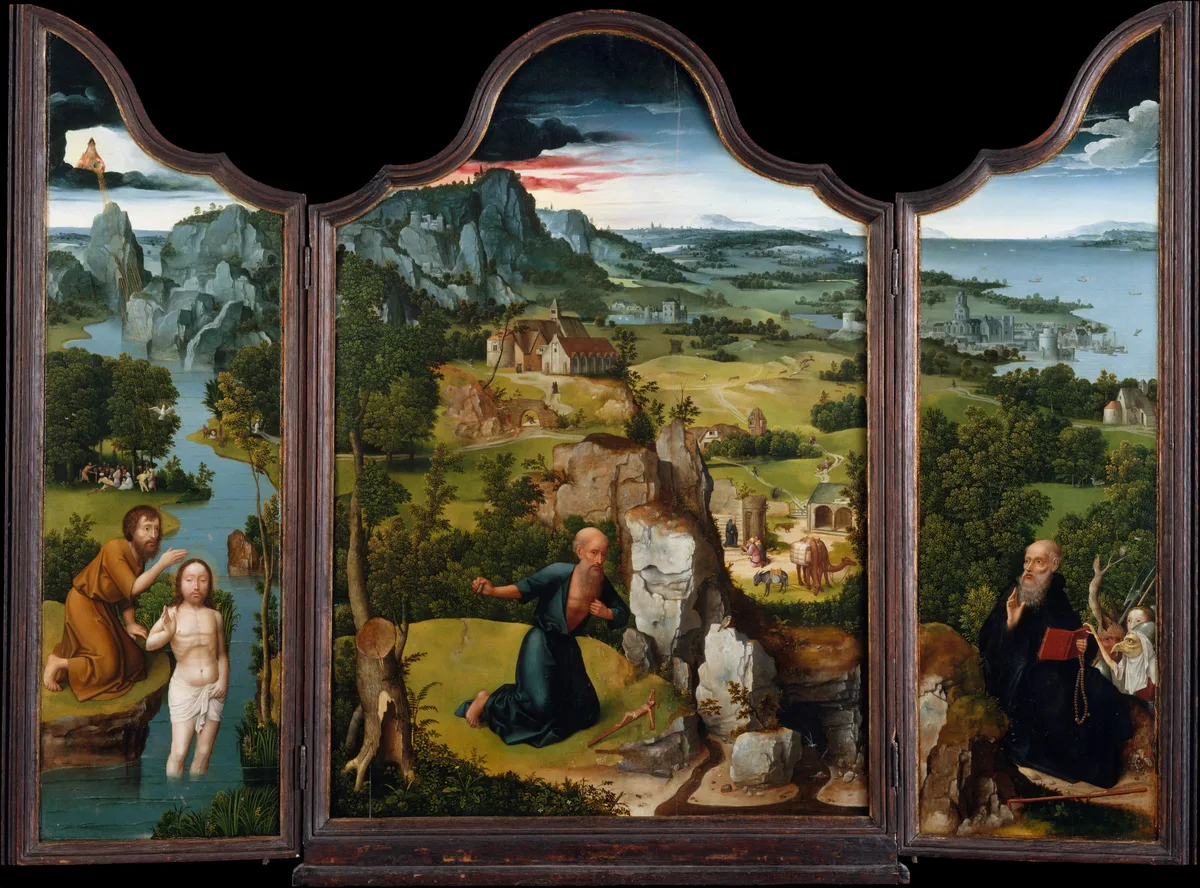
When a painting grabs you before you've even had a chance to think about it, the principles of art are doing their work. They're not rules handed down to make painting harder — they're the invisible framework that explains why one canvas feels resolved and another feels restless, why your eye moves through a composition easily or keeps snagging on the wrong corner.
Knowing what the principles are and, more importantly, knowing how to see them in your own work is the real shift. That's what this post is for.
What Are the Principles of Art?
The principles of art are a set of organizing strategies that artists use to arrange the visual elements — line, shape, value, color, texture, form, and space — into a coherent whole. If the elements of art are your raw materials, the principles are the decisions you make about how to use them.
The list varies slightly depending on your source, but the core seven are: balance, emphasis, movement, proportion, rhythm, unity, and variety. Some frameworks add contrast, pattern, and scale. None of this is doctrine. Think of the principles as a shared vocabulary for talking about why a painting works, not a checklist to tick off before signing your name.
The Seven Principles of Art and Design, Explained
Balance
Balance is about visual weight — how the masses, values, edges, and colors distribute across a canvas so that the painting doesn't tip over in any one direction. There are two main kinds.
Symmetrical balance places roughly equal weight on both sides of a central axis. It reads as calm, formal, sometimes ceremonial. You see it in altarpieces and official portraits.
Asymmetrical balance is more common in painting and more interesting to study. Here, a large soft area on one side might be counterweighted by a small sharp accent on the other — a dark doorway balanced against a bright window. Patinir's Penitence of Saint Jerome (above) is a textbook example: the towering rocky forms on the left push against the vast, airy blue distance on the right, and the painting holds.
Emphasis
Emphasis is the principle that says: one thing matters most. Every other decision in the painting — edge quality, value contrast, color temperature, detail — either adds to that one thing or quietly steps back.
Without emphasis, a painting becomes a crowd where everyone is shouting at the same volume. With it, your eye lands somewhere specific and the rest of the composition supports that landing.
In composition, emphasis usually lives at the focal point — the area of highest contrast, sharpest edges, or most saturated color. The deep dive on emphasis is worth reading alongside this post.
Movement
Movement is how a painting guides your eye from one area to another. The painter creates pathways — with leading lines, repeated shapes, a chain of value accents, or a series of gazes — so that you travel through the picture in a specific sequence.
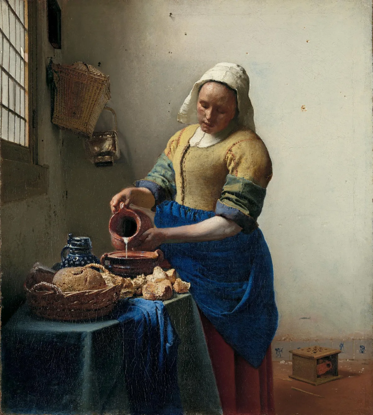
In Vermeer's Milkmaid, the stream of pouring milk is the most literal movement cue: your eye follows it down from the pitcher, across the table, and then lifts back to the figure's face along the diagonal of her arm. It's a closed loop, which keeps you inside the painting. The rule of thirds is one of the classic grids for planning where those movement paths begin and end.
Proportion
Proportion refers to the size relationships between parts — figure to background, object to object, foreground to sky. When proportion is off, something just feels wrong before you can name it. A head too large for a body, a tree that dwarfs a cathedral, a sky so thin it can't breathe — these are proportion problems.
Proportion isn't just about accuracy. It's expressive. Elongating a figure (as El Greco did, consistently) creates a spiritual otherworldliness. Shrinking a figure against a vast landscape (as Patinir does above) emphasizes solitude and the sublime scale of nature.
Rhythm
Rhythm in painting works much the way it does in music: repetition with variation. A repeated shape, color, or value interval creates a beat; changing its size, spacing, or intensity creates interest.
A row of identically spaced, identical-sized trees is repetition without rhythm — it flatters no one. Vary their heights, cluster two of them, leave a gap before the third, and you have rhythm. The key word is interval: it's the spacing and the change that make rhythm feel alive rather than mechanical.
Unity
Unity is the feeling that a painting belongs together — that all its parts are playing the same game. It comes from repeating colors across the canvas, maintaining a consistent edge quality throughout, keeping a dominant value family so that nothing sits in isolation.
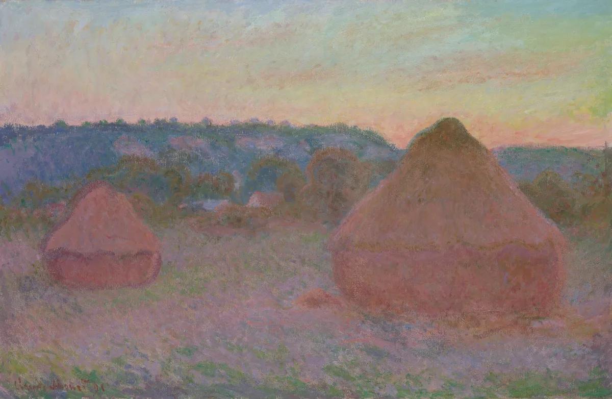
Monet's Stacks of Wheat series is an extended study in unity. The warm oranges of the stacks echo in the sky and field; the cool shadow on each stack relates to the cool distance behind them. Nothing is an accident. Every color was chosen to feel like part of the same envelope of light.
Unity is closely related to harmony — the sense that a painting's parts have been orchestrated rather than assembled.
Variety
Unity without variety is monotony. Variety is what introduces the exception — the one cool note in a warm painting, the single hard edge in a field of soft ones, the quiet accent that keeps your eye from going to sleep.
The tension between unity and variety is the central balancing act of composition. Push too far toward unity and the painting becomes flat. Push too far toward variety and it becomes chaos. Most good paintings live somewhere in the well-managed middle.
Diagnose Your Own Work
When a painting of yours isn't working but you can't say why, try running through the principles one at a time as a set of specific questions:
Balance: Cover one half of the painting with your hand. Does the remaining half feel complete on its own, or desperately empty? If one side is dramatically heavier, you have a balance problem — or an opportunity, if you can introduce a counterweight.
Emphasis: Squint until you can barely see the painting. Where does your eye go first? Is that where you want it to go? If the brightest or most contrasting spot is a secondary object (a background window, a piece of clothing), you've accidentally moved your focal point.
Movement: Trace your eye's path through the painting with your finger. Does it arrive somewhere interesting, or does it wander off the edge? Dead-end compositions often fail the movement test — the eye reaches the corner and there's nothing to bring it back.
Proportion: Step back farther than feels comfortable. From a distance, do the large shapes read clearly? Proportion problems often hide at close range and become obvious at ten feet.
Rhythm: Look for repeated shapes, colors, or value accents. Are they varied enough in size and spacing to feel alive? A perfect, evenly spaced repeat is the enemy of rhythm.
Unity: Pull a single color from your palette and look for it in at least three places across the canvas. If a color appears only once, it may be isolating itself. Repeating it — even subtly — can stitch a passage back into the whole.
Variety: Find the most dominant quality in your painting (the warmest note, the softest edge, the most muted color). Now find the one place where you have the exception to that quality. If there isn't one, your painting may be too uniform to hold attention.
Master Examples
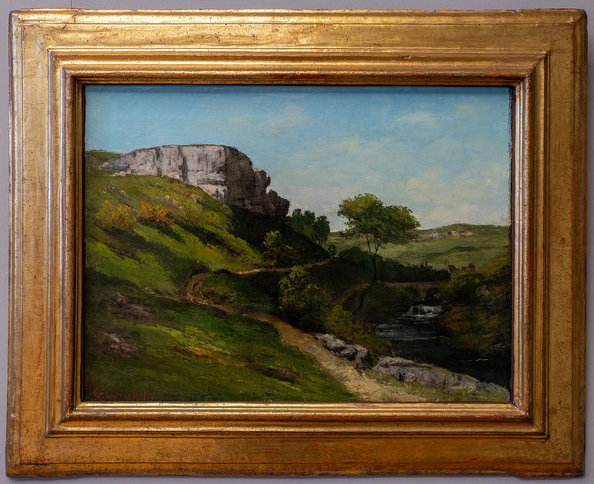
Gustave Courbet built his realist landscapes and figure paintings around aggressive proportion — massive foreground rocks, enormous waves, figures pressed close to the picture plane. His sense of proportion is almost confrontational, and it's a large part of why his canvases feel so physically present. The value scale he used, pushing deep darks against light sky, gave those proportional decisions their weight.
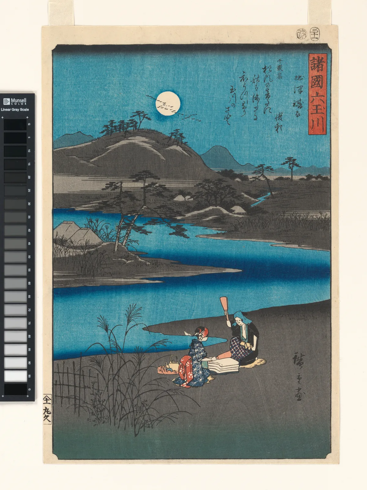
Utagawa Hiroshige treated rhythm and movement as near-synonyms. In Six Jewel Rivers from Various Provinces (1857, Metropolitan Museum), diagonal lines of reeds, water, and figures carry the eye across the picture in a single flowing motion, while the repeated flat color areas provide unity. The notan — the dark-light pattern beneath the color — is clean enough that you could reduce the print to two values and the design would still hold.
Vermeer, returning to The Milkmaid (Rijksmuseum): the genius is his variety within unity. The painting is predominantly warm ochres and cool whites, with every color related to every other. The single blue apron is the variety note — placed exactly where the emphasis needs a little push — and it reads as intentional, not accidental.
Patinir, in the hero image above, demonstrates balance and proportion at panoramic scale. The geological drama on the left — vertical, complex, close — is resolved against the spacious horizontal distance on the right. Neither half could stand alone. Together they make a world.
Try It on Your Own Work
Running through seven principles in your head while looking at your own painting is harder than it sounds. You know what you meant to do, which makes it difficult to see what's actually on the canvas. Critico strips away that familiarity. Drop a photo of your work in and Critico returns a reading of where the emphasis actually lands, how the value structure is distributing weight, and whether the composition is guiding the eye where you intend. It won't fix a painting, but it will tell you which principle to look at first.
Frequently Asked Questions
- What are the principles of art? The principles of art are the strategies artists use to organize visual elements — balance, emphasis, movement, proportion, rhythm, unity, and variety. They explain why a composition feels resolved or restless, and they apply across painting, drawing, design, and printmaking.
- What is the difference between the elements and the principles of art? The elements of art (line, shape, value, color, texture, form, space) are the raw materials of a work. The principles of art are the decisions about how to arrange those materials — balance governs how weight is distributed, emphasis determines what matters most, and so on.
- How many principles of art are there? Most sources list seven core principles: balance, emphasis, movement, proportion, rhythm, unity, and variety. Some frameworks extend this to ten or more by adding contrast, pattern, and scale. The number matters less than understanding what each principle does and being able to see it in actual paintings.
- How do I use the principles of art to improve my own paintings? The most direct method is to squint at your painting and ask one question per principle: Where does my eye go first? Does the visual weight feel even? Are my repeated shapes varied enough to create rhythm? Working through each principle as a specific question turns a vague feeling that "something's off" into a diagnosis you can act on.
- Are the principles of art the same as the principles of design? Largely yes. The vocabulary transferred from fine art into graphic and industrial design during the twentieth century. You'll sometimes see "principles of art and design" used as a single phrase, and the core concepts — balance, emphasis, unity, variety, rhythm — are consistent across both fields.
The principles of art are not a formula. They are, at bottom, a vocabulary for noticing — a set of lenses that let you see what a painting is doing and, just as importantly, what your own painting is not doing yet. Patinir didn't work through a checklist before picking up his brush. But he knew, by long practice, how to balance a world, how to lead an eye, how to make a vast and complicated canvas feel like one thing. That's what fluency with the principles builds.