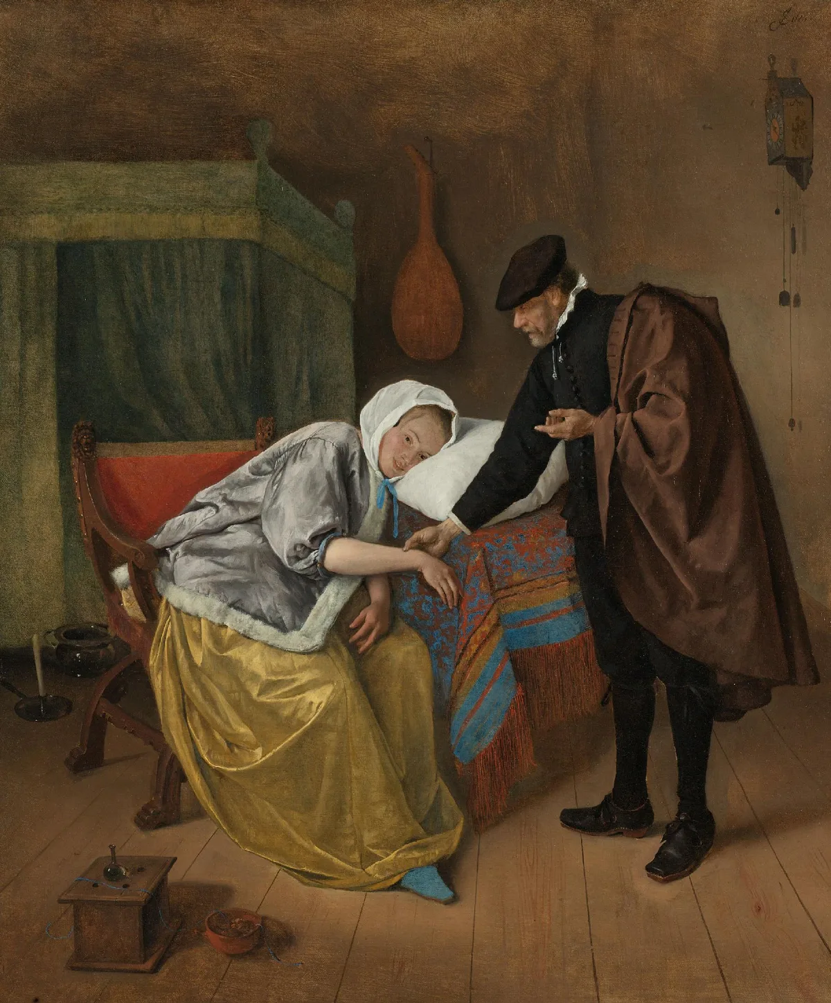
Every painting you have ever admired — or struggled to get right — is built from the same seven raw materials. The elements of art are line, shape, form, value, color, texture, and space. Master painters don't reach for some secret beyond these; they simply understand how each element behaves, and how to put them into conversation with one another. If a painting of yours feels flat, muddy, or directionless, the answer is almost always hiding in one of these seven places.
This post walks through each element in plain language, shows you what it looks like in named works from the canon, and gives you a set of practical checks you can run on your own work before you put another brushstroke down.
What Are the Elements of Art?
The elements of art are the fundamental visual properties that every two-dimensional or three-dimensional artwork is made from. Think of them as the nouns of visual language — the things that actually exist on the surface. They are distinct from the principles of art (balance, contrast, rhythm, emphasis, and so on), which describe how those nouns are arranged and relate to one another.
The seven elements are:
- Line — a point moving through space
- Shape — a two-dimensional, enclosed area
- Form — a three-dimensional volume, or the illusion of one
- Value — the lightness or darkness of a passage
- Color — hue, saturation, and the temperature relationships between passages
- Texture — the surface quality of a passage, actual or implied
- Space — the sense of depth and distance within or around a composition
None of these operates in isolation. In Steen's The Sick Woman above, the diagonal line of the woman's body, the cool grey-silver of her jacket against the warm browns of the room, the varied textures of velvet and linen, and the shallow, boxed-in room around her are all pulling simultaneously. Learning to see them one at a time is the first step toward controlling them all at once.
The Seven Elements, One by One
Line
Line is the most immediate mark you can make. It defines edges, suggests movement, and carries emotional weight before the viewer has processed anything else. A horizontal line reads as rest; a diagonal reads as energy or instability; a vertical reads as strength or authority. Curved lines feel organic and inviting; jagged lines feel anxious.
In painting, most lines are implied rather than drawn — they're the edge where one value or color meets another. The contour of a figure against a background is a line even if no outline was ever laid down. Learning to control implied line is one of the clearest markers of a painter moving from beginner to serious intermediate work.
Line also creates focal points: when lines in a composition converge, the eye follows them to the meeting place. Compositional lines — the curve of an arm, the edge of a shadow, the horizon — are the skeleton that holds everything else up. For a deeper look at how line functions inside a full composition in art, that post is worth reading alongside this one.
Shape
A shape is any two-dimensional, enclosed area. Shapes are either geometric (circles, squares, triangles — hard-edged, mathematical) or organic (free-form, irregular, biomorphic — the shapes of living things and natural objects).
Most representational painters think in terms of objects rather than shapes, which is the root of a common problem: the objects end up feeling pasted onto the canvas rather than belonging to it. The fix is to learn to see your subject as an arrangement of flat shapes first. Squint until the details blur. What you see now are the shapes — big, interlocking, overlapping. That is your compositional raw material.
Positive shapes (the objects themselves) and negative shapes (the spaces around and between them) are equally important. Weak negative shapes produce compositions that feel crowded or restless even when the positive shapes are well-drawn.
Form
Form is shape's three-dimensional counterpart. In sculpture it's literal volume; in painting it's the illusion of volume, produced by the careful graduation of value across a surface. When you model a sphere — taking it from lit highlight through midtone, into the shadow, through the core shadow, and back up slightly at the reflected light edge — you are using value to create the feeling of form.
Form and value are inseparable in painting. You cannot describe a convincing three-dimensional form without controlling your values, which is why experienced painters often say that getting the drawing right means getting the light right. A head is not a circle with features attached; it is a series of planes turning toward and away from the light source, each plane a different value.
Value
Value — how light or dark a passage is — is widely regarded as the single most important element in painting. You can remove color from a painting entirely and, if the values are correct, it will still read. Remove the values — make everything the same lightness — and even brilliant color relationships collapse into confusion.
Value is the backbone of every successful painting. The standard test is to photograph your painting in black and white. If the composition holds, your values are working. If it dissolves into a gray fog, that's where to focus next.
For a focused study of how to build and control a value range, The Value Scale: The Foundation Painters Keep Coming Back To goes into the mechanics step by step. And if you want to practice seeing your painting as pure value masses before adding color, Notan Art: The Value Study That Changes How You See is the traditional approach for a reason.
Color
Color is the element most painters fixate on first and understand last. It has three properties that matter:
- Hue — where on the spectrum it sits (red, yellow-green, violet)
- Value — how light or dark it is (a common source of confusion: color has its own internal value)
- Saturation — how pure or muted it is (also called chroma or intensity)
In practice, most color problems are actually value problems in disguise. Two colors that look "wrong" together often just have the same value and the eye can't resolve the boundary. Two colors that feel "off" in terms of temperature — one reading too warm, one too cool — are rarely wrong in hue; they're usually wrong in saturation.
Color temperature — the relative warmth or coolness of passages — is how painters create the sensation of light. Warm light produces cool shadows, and cool light produces warm shadows. This is the governing principle behind the luminosity of much landscape and interior painting.
Texture
Texture is the surface quality of a passage — the way it appears to feel. In painting, texture operates on two levels:
- Actual texture — the physical surface of the paint itself (impasto, palette-knife marks, smooth glazes)
- Implied texture — the representation of a textured surface (rough stone, velvet, hair) through controlled brushwork that suggests the quality without replicating every fiber
Texture is often the element that gives a painting its sense of materiality and presence. A canvas painted entirely at the same level of textural detail becomes visually monotonous; strategically varied texture — smooth in the distance, richer in the foreground — reinforces spatial depth and pulls the eye toward areas of interest. Texture and emphasis in art are closely linked: the most detailed, highest-texture passage tends to win the viewer's attention.
Space
Space in a two-dimensional painting is always an illusion — a set of conventions the painter uses to suggest depth on a flat surface. The main tools are:
- Overlap — objects in front of others appear closer
- Size diminution — objects shrink as they recede
- Atmospheric (aerial) perspective — distant objects are lower in contrast, cooler, and more muted in color
- Linear perspective — parallel lines converge toward vanishing points
- Value shift — in most natural light, the lightest lights and darkest darks occur in the foreground; the middle distance compresses
Controlling space means controlling how far into the canvas the viewer's eye is invited to travel. A shallow picture plane creates intimacy; deep space creates grandeur. Both are legitimate — the choice should be intentional, not accidental.
Diagnose Your Own Work
If a painting isn't doing what you want, run through these checks before reaching for a different color or a bigger brush.
Line: Are your implied edges doing compositional work, or are they scattered? Trace the major lines with your finger. Do they lead somewhere, or do they loop aimlessly? Strong compositions usually have two or three dominant directional lines that organize everything else.
Shape: Squint at your painting. Do the large shapes interlock clearly, or do they break into too many small fragments? A general rule: three to five large, distinct shapes give the eye somewhere to rest. More than seven major shapes and the composition starts to feel busy regardless of how well the individual passages are painted.
Form: Hold your painting at arm's length. Are the three-dimensional objects reading as volumes, or do they feel flat? If they feel flat, the problem is almost always insufficient value contrast across the turning surfaces — not a drawing error.
Value: Photograph the painting in black and white on your phone. Is there a clear value structure — distinct light, midtone, and dark zones? Or does everything land in the middle? Most strong paintings have large areas of one or two values, with a smaller accent of the third.
Color: Identify the warmest passage and the coolest passage in your painting. Are they in the right relationship to your light source? If your light is warm, your shadows should lean cool, and vice versa. If the temperature relationships feel muddy, that's usually the first thing to correct — before touching hue or saturation.
Texture: Where is your most detailed, highest-texture passage? Is it where you want the viewer's eye to go? If not, consider simplifying competing areas and enriching the focal area.
Space: Does the painting read as having convincing depth? Check your atmospheric perspective: are the distant passages lower in contrast and slightly cooler than the foreground? Even a few degrees of value compression in the background can dramatically increase the sense of depth.
Master Examples
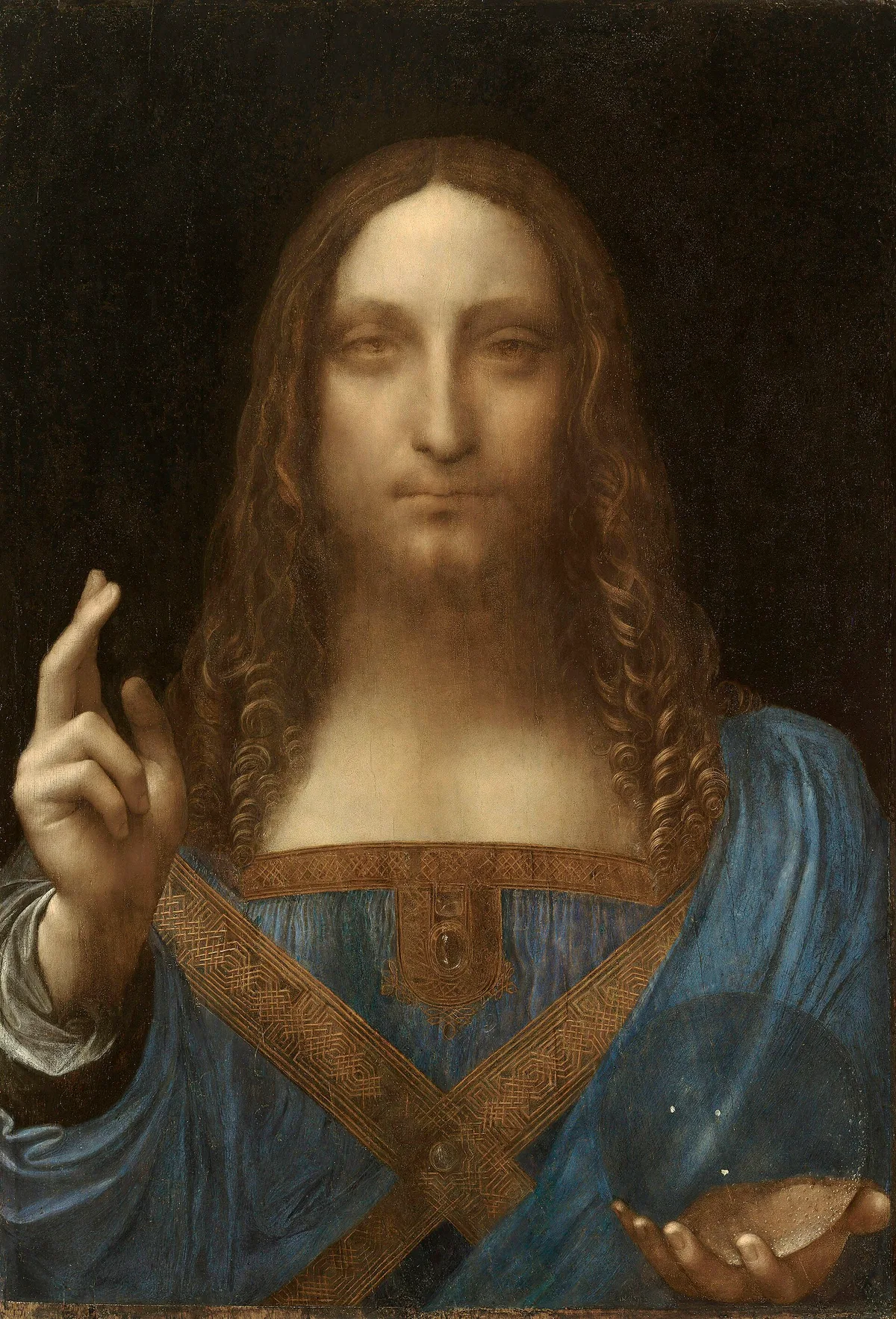
Leonardo da Vinci, Salvator Mundi, c. 1500 — The crystal orb at lower center is perhaps the most famous single demonstration of form in the Western tradition. It is modeled through pure value gradation — highlight to halftone to shadow to reflected light — with no outline, creating a convincing sphere of transparent glass through value alone. The sfumato technique throughout the figure shows the same logic applied to flesh: edges dissolve into shadow rather than being drawn, which is why the face reads as a three-dimensional volume rather than a flat mask.
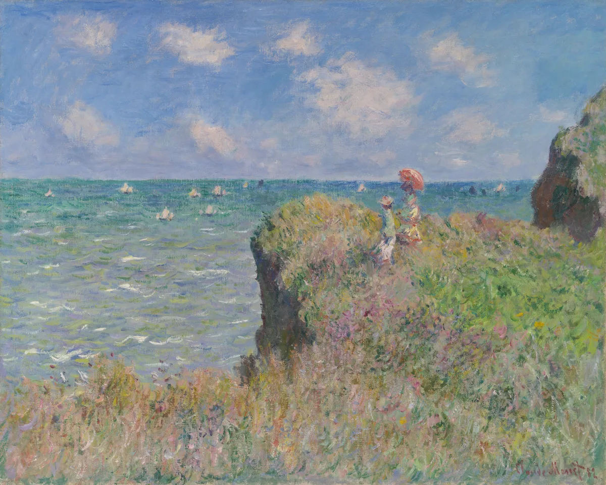
Claude Monet, Cliff Walk at Pourville, 1882 — Monet's handling of space here is a clinic in atmospheric perspective. The foreground grasses are rendered in warm, high-saturation strokes with visible texture; the sea and sky compress into near-flat planes of muted color at the horizon. The two figures — small, loosely painted — establish human scale and push the vast space of the cliff and ocean into relief. The distance is never drawn; its value contrast simply drops and its color cools, and the eye accepts it as far away.
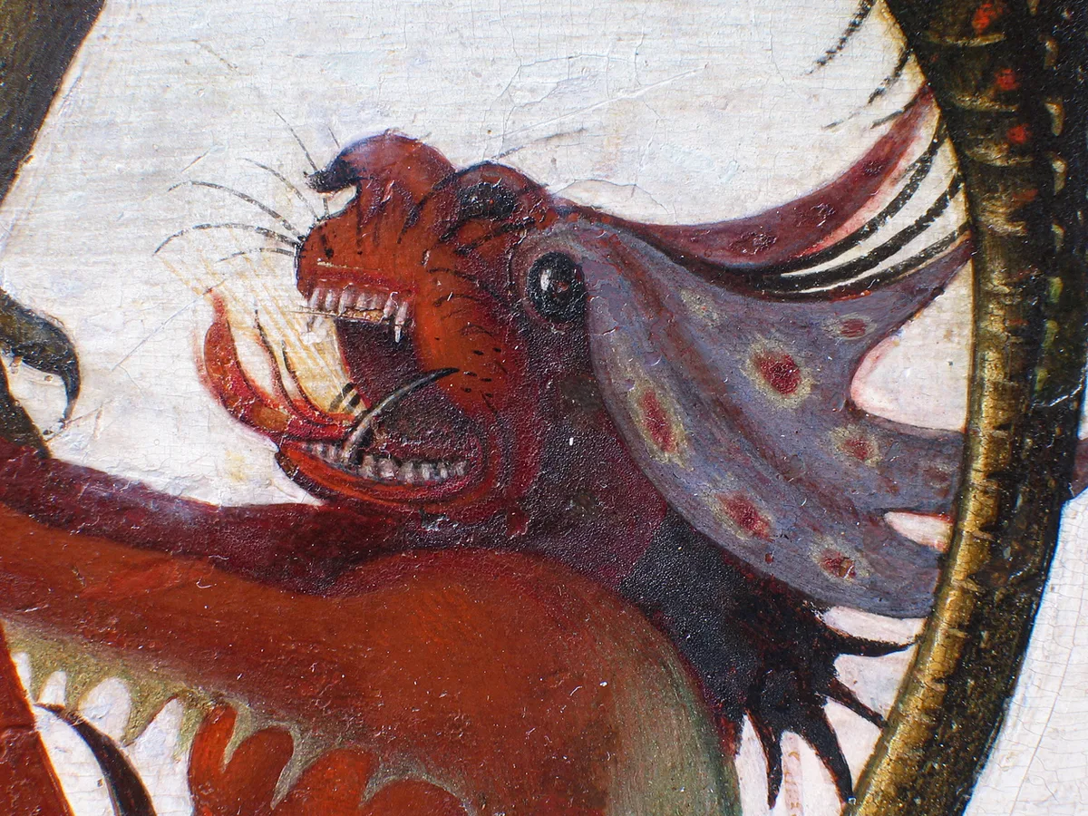
Michelangelo, The Torment of Saint Anthony, 1487 — Painted when Michelangelo was about twelve years old and copied from a Martin Schongauer engraving (Kimbell Art Museum), this work is a showcase of shape in the demon figures. Each creature is built from organic, free-form shapes that feel genuinely strange and alive — no two the same, none borrowed from easy geometric shortcuts.
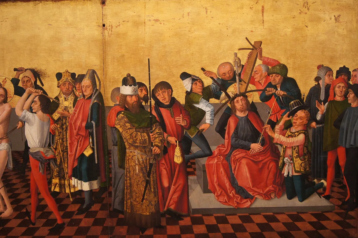
Caspar Isenmann, Colmar Altarpiece (Flagellation, Crowning with Thorns), c. 1462–65 — Isenmann's altarpiece panels are a study in line as structural foundation. The figures are organized by strong vertical and diagonal lines that move the eye from one figure to the next in a deliberate sequence. The checkered floor and flat gold ground set a geometric stage that contains the emotional turbulence of the scene — an early example of how line and shape can simultaneously organize a composition and carry its dramatic meaning. The textile patterns, rendered with careful attention to repeated mark-making, show texture used to distinguish social status: the quality of a garment communicates character before a face does.
When I look at a painting that isn't quite landing, I often start by pulling it into a value view — stripping the color away to see whether the underlying structure is sound. Critico does exactly this: drop your painting in, and you'll see a grayscale read that makes value problems immediate and visible. If your focal area isn't the lightest light or the darkest dark in the composition, the eye will wander regardless of how carefully you've handled color or texture. It's one of the clearest diagnostic tools for checking whether all seven elements are working toward the same end rather than competing with one another.
Frequently Asked Questions
-
What are the seven elements of art? The seven elements of art are line, shape, form, value, color, texture, and space. These are the fundamental visual properties that every painting, drawing, or sculpture is built from — sometimes called the building blocks of visual art.
-
What is the difference between elements of art and principles of art? The elements of art are the what — the actual visual properties present in a work (line, shape, value, and so on). The principles of art are the how — the organizing ideas that govern the way those elements are arranged, such as balance, contrast, rhythm, and emphasis. Elements are the nouns; principles are the grammar.
-
Which element of art is most important for beginners to learn first? Value — how light or dark a passage is — is the element that most experienced painters point to as the highest priority. A painting with correct values will read even if the color is off; a painting with correct color but wrong values will look confused. Converting your paintings to black and white to check the value structure is the most useful habit a beginner can develop.
-
How do the elements of art relate to composition? Composition in art is the arrangement of all the elements across the picture plane. Every compositional decision — where to place the focal point, how to move the viewer's eye, how to create depth — is made through the manipulation of one or more elements. Understanding the elements gives you the vocabulary to make those decisions deliberately rather than by instinct alone.
-
Can a painting use all seven elements at once? Yes — virtually every painting does, whether the painter intended it or not. The goal isn't to use them all consciously at every moment, but to understand each one well enough to notice when one is undermining the others. Jan Steen's The Sick Woman at the top of this post uses all seven simultaneously: line in the figure's silhouette, shape in the interlocking interior spaces, form in the modeled flesh and fabric, value in the warm light on the figure against the shadowed room, color in the contrast between her cool grey jacket and the warm brown room, texture in the varied surfaces of velvet and linen, and space in the shallow, boxed-in interior.
All seven elements are present in every painting you make — the only question is whether you're choosing how to use them or letting them happen by accident. Strong paintings aren't made from a checklist; with practice, these properties become so internalized that the decisions turn intuitive. That internalization starts with deliberate attention: pick one element per session and ask, as you paint, what this specific passage is doing with it.
If you want a concrete place to begin, value is almost always the right first focus. It's the element that holds everything else up, and it's the easiest to check objectively. From there, the golden ratio in art and the rule of thirds are both frameworks for thinking about how these elements get arranged in space — useful next steps once the fundamentals feel solid.