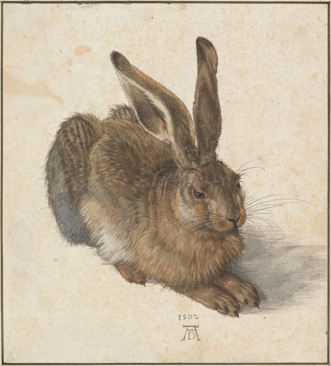
Most watercolor struggles come down to one thing: value. Not color temperature, not brushwork, not the brand of paper. Value — how light or dark each passage sits on the scale from white to black. Understanding the watercolor value scale is the single study that separates paintings that read clearly from those that look muddy or flat, no matter how lovely the color choices were.
This post is about how to see that scale, how to paint it, and how to use it when you're actually standing at the easel with a loaded brush.
What Is a Value Scale?
A value scale is a stepped chart moving from the lightest possible tone — in watercolor, that's the bare white of your paper — to the darkest you can achieve with a fully saturated, opaque pigment. Most painters work with a five-step or nine-step scale. The exact number of steps is less important than the habit: training your eye to perceive where any given wash sits on that continuum.
Value (how light or dark a passage is) is distinct from hue (which color) and saturation (how vivid or muted). A bright cadmium yellow and a deep viridian can share the same value — and when they do, placed side by side they create almost no contrast, even though they're different colors. That's the kind of thing a value scale makes visible before it causes problems in a painting.
For a broader look at why value sits at the foundation of all painting, the post The Value Scale: The Foundation Painters Keep Coming Back To covers the concept across media. What follows here is specific to watercolor — where the medium's own rules make value management both more constrained and, once you understand it, more elegant.
How Watercolor Handles Value Differently
In oil or acrylic, you lighten a tone by adding white paint. In watercolor you lighten it by adding water, which dilutes the pigment and allows more of the paper's white to show through. That one difference has significant consequences.
Your lightest light is already committed. The white of the paper is fixed from the moment you stretch it. Every wash you lay down can only make that area darker, never lighter (short of masking fluid applied before you start, or careful lifting when the paint is still wet). This means value decisions in watercolor run in one direction only — you are always working toward the darks. Lifting is the main exception, and Turner used it boldly: in his watercolor and gouache study The Burning of the Houses of Parliament (c.1834–5, Tate), lights were wiped out of the wet colour to get the shimmer against the red glow of the fire.
Wet pigment dries lighter. A wash that looks like a solid mid-value 4 when wet will often read as a 2 or 3 when dry. Every watercolorist learns this through painful experience. Painting a value scale with your specific paints and paper is the fastest way to calibrate your eye to this shift. There's no shortcut.
Different pigments have different value ranges. A warm yellow like raw sienna can only get so dark before it turns muddy rather than deep. A pigment like phthalo blue or ivory black can reach near-black. Knowing where each color tops out — its maximum dark — means you don't waste time pushing a yellow into shadows it can never convincingly fill.
How to Paint a Watercolor Value Scale
You need only a sheet of watercolor paper, a single pigment (start with a neutral — lamp black or Payne's gray — before trying colors), and a round brush. Working with one color at a time isolates value from hue so you can see the scale clearly.
A Five-Step Scale
Rule off five equal rectangles, roughly 2 cm × 4 cm each. Label them 1 (lightest) through 5 (darkest).
- Step 1: Bare paper. No paint.
- Step 2: A very dilute wash. More water than pigment.
- Step 3: A mid-value wash. Roughly equal parts pigment and water.
- Step 4: A rich, darker wash — noticeably more pigment, less water.
- Step 5: Your darkest possible mix. Full pigment strength, minimal water.
Let each step dry completely before you assess it. Hold the chart at arm's length and squint. The steps should feel evenly distributed — not three steps clustered in the light range with a sudden jump to very dark at the end. Even distribution is harder than it sounds, and the exercise itself builds the muscle memory you need.
A Nine-Step Scale
Once the five-step scale feels easy, expand to nine steps using the same method. The nine-step version is what most instructors mean when they reference a formal value scale. Steps 1 and 9 remain your extremes; the seven middle steps require you to hold tighter control over your dilution ratios.
Working through a nine-step scale with every major pigment in your palette is tedious and worthwhile. You will discover which pigments can actually reach value 8 or 9 (most can't without going granular or muddy), and you will find that some colors only produce usable values in the 2–5 range. That knowledge shapes every color-mixing decision you make afterward.
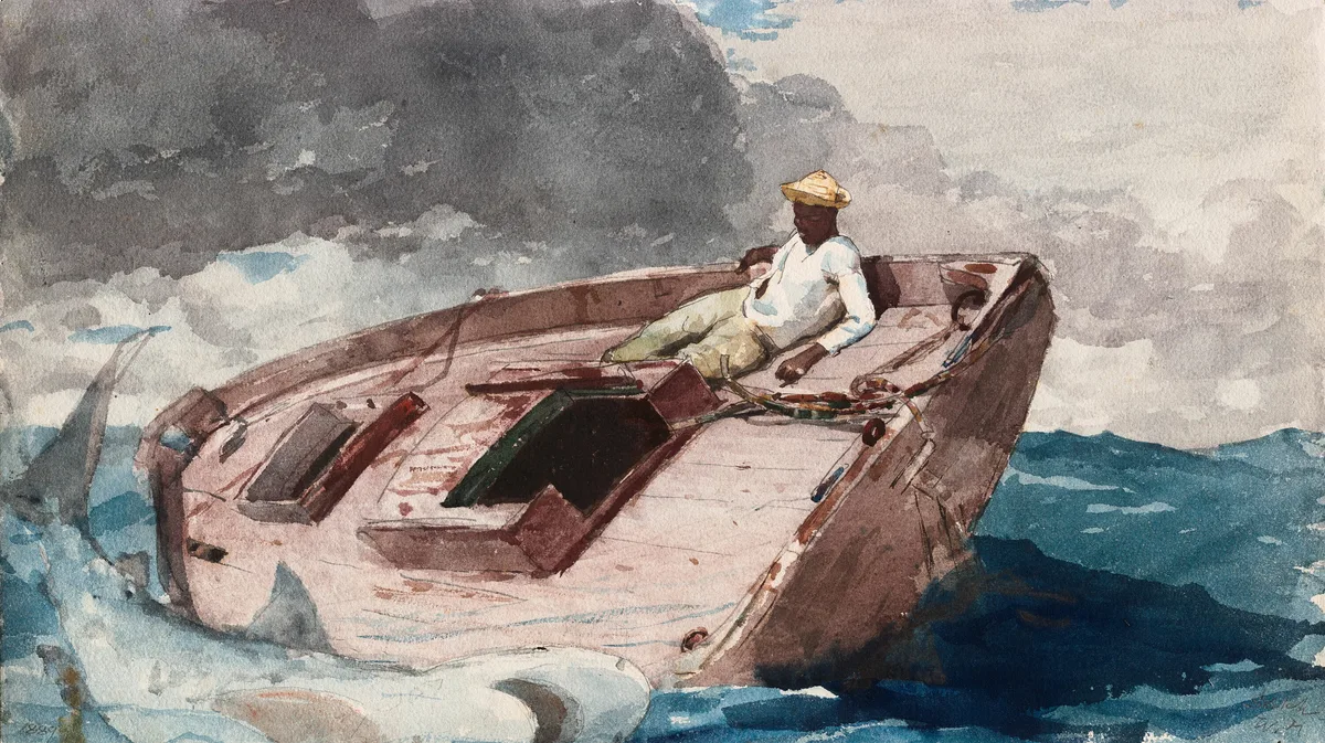
Homer's watercolor The Gulf Stream at the Art Institute of Chicago shows what a full value scale looks like once it's put to work. The lightest lights — the man's white shirt and the pale deck of the boat — sit directly against the darkest passages: the grey storm cloud in the upper left, the shadowed side of the hull, and the deep blue water in the lower right. Squint and the picture reduces to a few clear masses, with one of the brightest lights — the shirt — placed right on the figure. Every step between those extremes is there too, which is why the water and sky still read as space rather than flat pattern.
How Artists Use Value Scales in Practice
A painted value scale isn't just a classroom exercise. Practicing painters return to it in three specific situations.
Mixing Check
Before committing a wash to a painting in progress, dab it onto a corner of the scale chart and let it dry. Compare the dried swatch to your target step. If it's lighter than you need, add pigment. If darker, add water. This takes ten seconds and prevents the most common watercolor error: a shadow wash that dries far too light to read as shadow.
Thumbnail Planning
Before painting, make a small thumbnail sketch — no larger than a business card — and assign each major shape a value number. Which areas are step 2? Which are step 7? Force yourself to commit before the first wash goes down. Deciding the values before you choose the colors is what keeps a painting organized when the washes start moving.
Squint Test on the Finished Piece
Stand back, hold your painting at arm's length, and squint until your eyes are nearly closed. The color information disappears and you're left seeing only value masses. A painting that reads well at this point — clear light areas, clear dark areas, a mid-tone in between — has a sound value structure. One that turns into an indistinct gray soup has a value problem, regardless of how beautiful the individual passages are.
The Emphasis in Art: How Painters Tell You Where to Look post goes deeper on how value contrast drives the viewer's eye to your focal point — worth reading alongside this one.
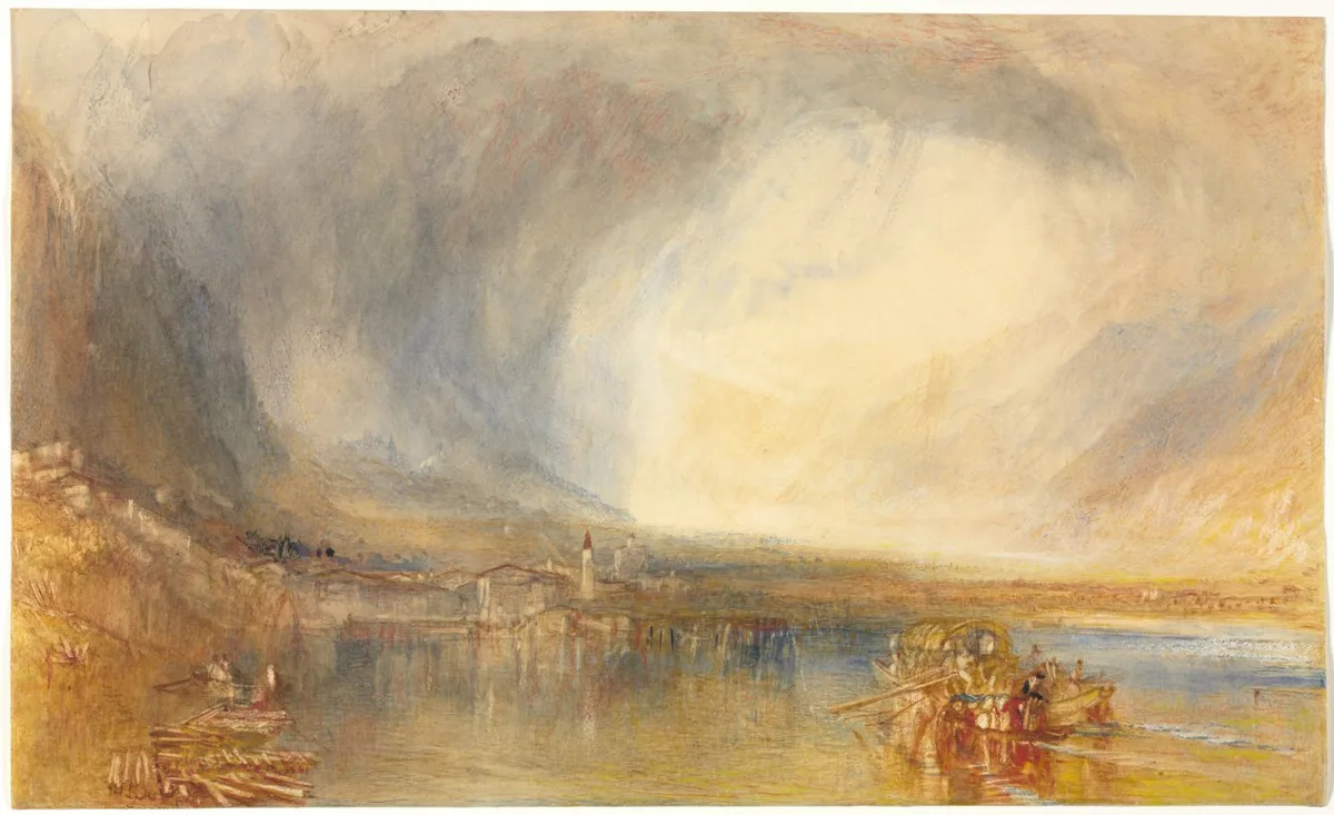
Turner's Flüelen, from the Lake of Lucerne at the Cleveland Museum of Art shows two value ideas at once. The first is edges: the storm cloud, the mountain flanks and the bright opening in the sky bleed into one another with almost no hard boundary, so the change from dark to light happens gradually across the sheet instead of at a line. The second is distance. The far mountains on the right sit only a step or so away from the sky behind them, while the sharpest darks and warmest accents are kept for the near shore — the log pile at lower left and the boat and its figures at lower right. Compressing the values in the distance and saving the full range for the foreground is what makes the far shore feel far.
Making and Using a Grayscale Value Finder
A value finder is a small card with a hole cut through each step of a printed grayscale. You hold it up to your painting and look through one hole at a time — the surrounding gray neutralizes your eye's color adaptation and lets you see the true value of that passage.
You can buy printed value finders, or make one yourself: print a nine-step grayscale on card stock, cut a small hole through each step, and laminate it. Some painters prefer a red or green value finder (a piece of transparent red or green acetate) because it further desaturates the color information, making value easier to isolate.
Digital tools now do the same thing in software — convert your photo to grayscale and compare it to a reference scale — but the physical card has one advantage: you can use it on a wet painting in real time, before the wash dries.
Critico's value-overlay feature effectively does this conversion for you, stripping color from your painting and showing you the value map of what you've actually painted versus what you intended. More on that below.
Diagnose Your Own Work
If your watercolor paintings regularly feel flat, muddy, or "not quite right," run through these checks before reaching for new supplies or trying a different subject.
Check your range. Hold your squinted painting next to your value scale. Does your darkest dark actually reach step 7 or 8? Many watercolor painters are afraid of dark values and never push past step 5. The result is a painting with no real shadow, no drama, no clear sense of light. A painting that lives entirely in the middle values tends to feel inert. If you cannot find a clear dark in your painting, that's the problem.
Check your lights. Did you preserve your whites, or did early washes creep into the lightest areas? Once the paper is covered, you cannot fully recover it. This is why planning — the thumbnail with value numbers — matters before the first brush stroke.
Check your edges at value boundaries. Hard edges read as high contrast; soft edges read as lower contrast even when the value difference is the same. If your painting feels simultaneously overworked and flat, the edge quality at your value transitions may be the culprit. Lost edges between areas of similar value give the painting air; hard edges between areas of similar value create confusion.
Check one color at a time. Take your most used pigment from this painting and wash a quick value scale on scrap paper. Where did that color actually sit in your painting? Was it doing the job you gave it? A color placed at the wrong value step is doing structural damage even if the hue is beautiful.
Master Examples
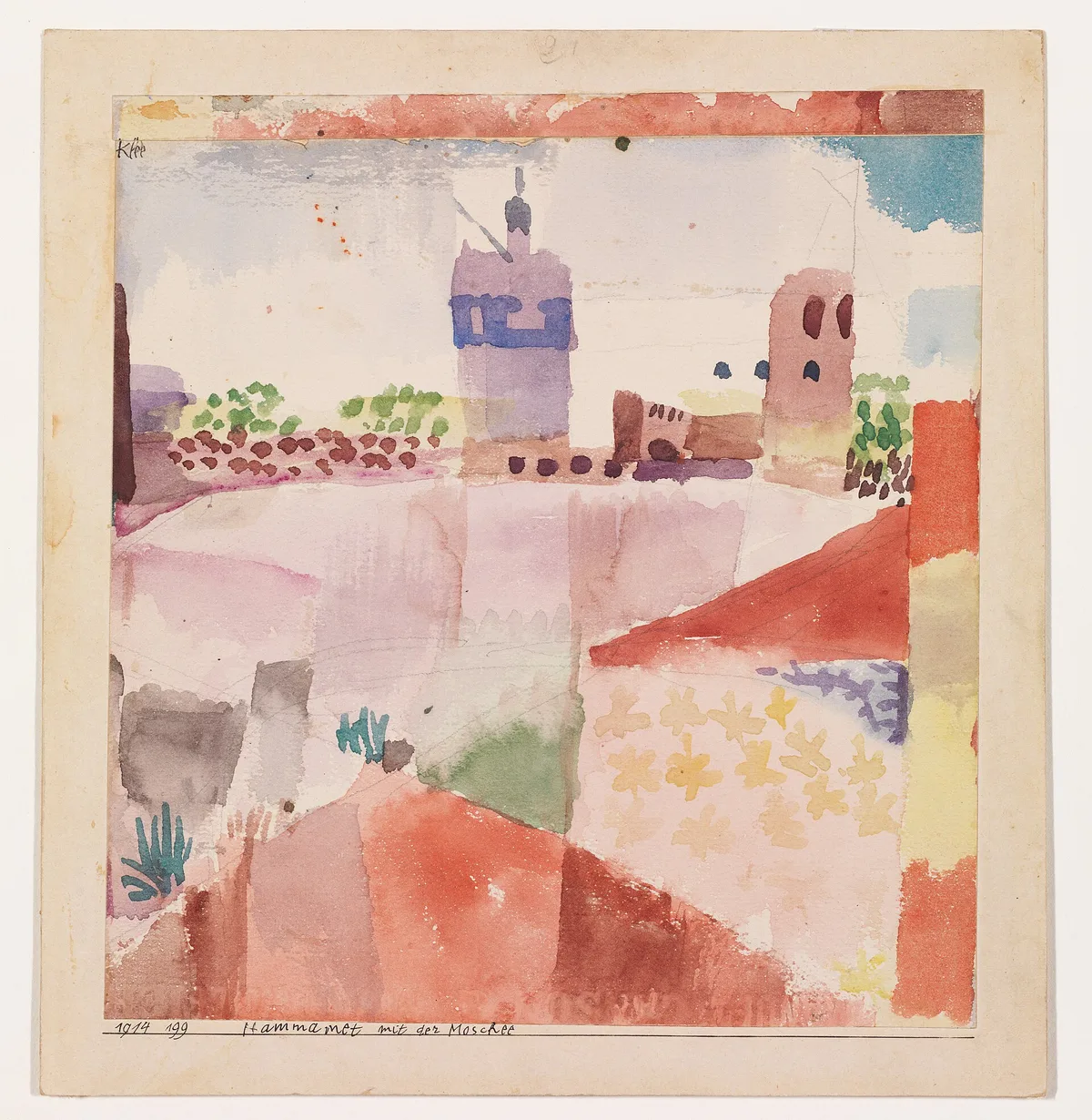
Klee, Hammamet with Its Mosque (1914)
Klee's small watercolor at the Metropolitan Museum of Art is a useful counter-example, because it barely uses the dark half of the scale. The town, the mosque tower and the foreground are laid in as blocks of pink, red, lavender, yellow and green, and many of their edges soften where one wash runs into the next. Almost everything sits between roughly value 1 and value 5 on a nine-step scale; the only real darks are a strip at the left edge and a few small dabs. Squint and much of the sheet flattens out, which is the point — it's a painting about color relationships held in a high key, not about light and shadow. If you work this way, make it a decision: know that you're giving up strong value contrast, and let color do the work instead.
Dürer, Young Hare (1502)
Dürer's Young Hare (Albertina, Vienna — the image at the top of this post) is the opposite: a tightly controlled study where nearly every value is placed on purpose. Most of the sheet around the animal is left close to the paper's own tone, so the hare reads instantly as a mid-to-dark shape against light. Inside the shape, the darkest accents are reserved for a few places — the eye, the tips of the ears, the claws — and a soft grey cast shadow anchors the animal to the ground on the right. It's a good model for anyone who struggles to keep their lights: decide where the paper stays, and protect it.
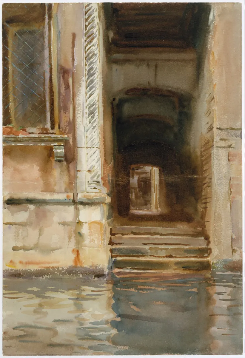
Sargent, Venetian Passageway (c. 1905)
Sargent's sheet at the Metropolitan Museum is a lesson in where to spend your darkest darks. The warm, light walls on the left and the pale stone pillar stay in the upper part of the scale. The passage itself drops to the bottom of it, step by step as it recedes — and at its far end sits one small rectangle of light, the brightest note inside the dark. Because that is the strongest contrast in the picture, the doorway is where the eye goes first. Sargent didn't need detail to make the focal point; he needed the contrast in one place and nowhere else.
Watercolors We Can't Show Here
Some of the best value lessons in watercolor are still under copyright, so we describe them rather than reproduce them. Edward Hopper's The Mansard Roof (1923, Brooklyn Museum) is worth looking up: a house in full sun, where the lit walls sit near the top of the scale and the crisp shadows do most of the structural work. Andrew Wyeth's Master Bedroom (1965) and Charles Burchfield's Ravine in Summer Rain (1917) are two more watercolors to study the same way — find a reproduction, squint at it, and name the value step of each major shape.
See Your Value Map Before It's Too Late
The hardest part of watercolor value work is that you're making decisions about a painting that looks different wet than it will look dry. By the time you can see the true value of a wash, it's already set. Critico's value overlay converts your painting to grayscale and shows you the value map in real time — which passages are reading as lights, which as darks, and where the mid-tones are clustering. If your focal point isn't the highest-contrast area in the value view, you'll see it immediately, while there's still something to do about it. Drop your painting into Critico and switch to the value view. What you see there is what your viewer's visual system is actually reading — color comes second.
Frequently Asked Questions
-
What is a watercolor value scale? A watercolor value scale is a chart of stepped tones — usually five or nine steps — running from the bare white of the paper (lightest) to the maximum dark achievable with a given pigment (darkest). Painting one with each color in your palette shows you both the range that color can reach and how much washes lighten as they dry.
-
How do artists use value scales in their paintings? Most working painters use a value scale in three ways: to check a mixed wash before it goes onto the paper, to plan a thumbnail where each shape is assigned a value number, and to evaluate a finished piece by squinting and comparing what they see to the scale.
-
What is a grayscale value finder and how do I make one? A grayscale value finder is a card printed with a nine-step gray scale, with a small hole punched through each step. You hold it against your painting; looking through a hole isolates that passage from its color context so you can judge its true value. To make one, print a nine-step grayscale on card stock, punch holes, and laminate it.
-
Why do my watercolor washes dry lighter than they look? Watercolor pigment becomes more transparent as it dries because water was holding the pigment particles in suspension; as it evaporates, the particles settle and the paper's white shows through more strongly. Painting a value scale with your specific paints on your specific paper is the only reliable way to calibrate for this shift.
-
How many value steps do I need in a watercolor painting? Most strong paintings use three to five distinct value masses — not necessarily nine. The number of steps in your reference scale doesn't need to match the number in the painting. The scale is a diagnostic tool; the painting uses as many steps as the subject requires, but almost always reads most clearly when the values group into a few clear masses rather than spreading evenly across all nine steps.
Value is the one element you cannot fake in watercolor. Color can be approximate, edges can be loosened, drawing can be impressionistic — but if the value structure isn't there, none of it holds together. The good news is that value is learnable through deliberate, specific practice: paint the scale, plan the thumbnail, squint the finished piece. Do those three things consistently and your paintings will start to read the way you intend them to.
If this is the first time value has clicked as a concept, the post Value in Art covers the broader principles, and Notan Art: The Value Study That Changes How You See takes value reduction to its extreme — a useful companion exercise to the scale work here.