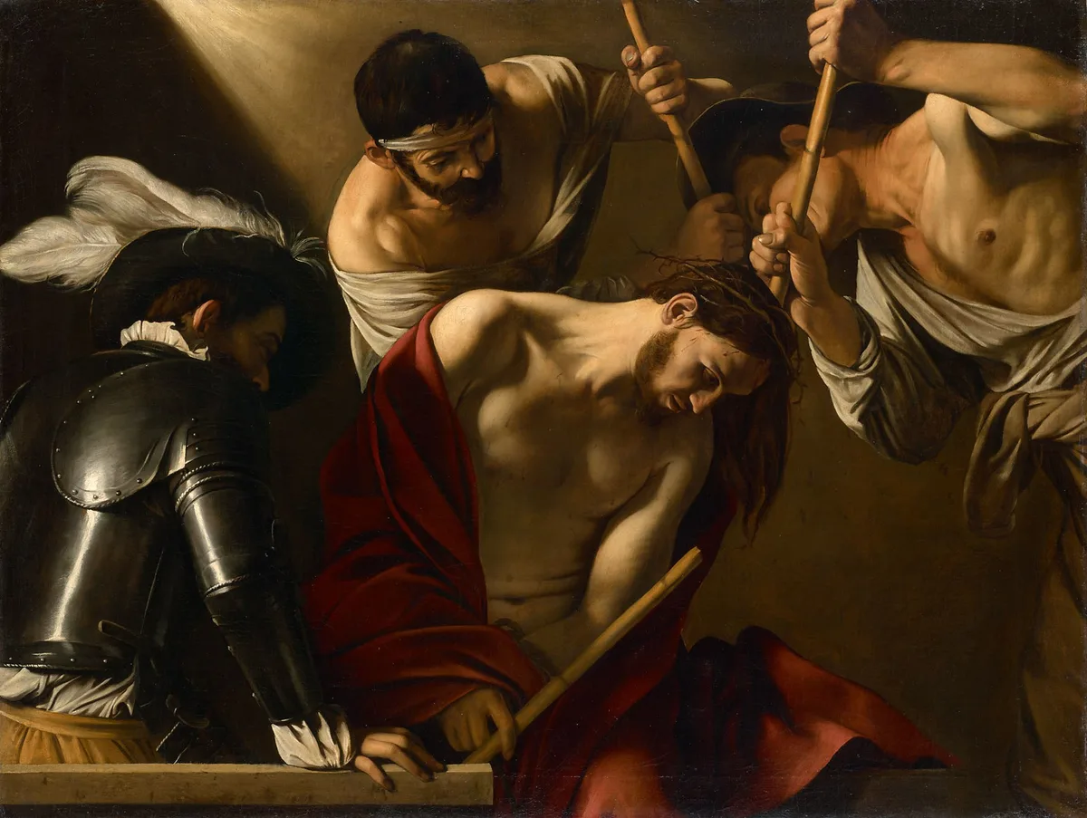
Tone in art is the quality that separates a flat pattern from a three-dimensional world. When a painting makes you feel the weight of a shadowed room or the glare of noon sun on stone, tone is doing that work. It's one of the most fundamental tools a painter has — and one of the most commonly misunderstood, because people often conflate it with color when the two are quite different things.
If your paintings look oddly flat, or the shadows feel unconvincing, or the whole thing seems to fight itself for attention, there's a good chance tone is where the problem lives. This post breaks down what tone actually is, how it functions in a painting, and how to start seeing and using it more deliberately in your own work.
What Is Tone in Art?
Tone in art refers to the relative lightness or darkness of a surface or color. It answers a single question: compared to white at one end of the scale and black at the other, where does this passage sit?
You'll sometimes hear "tone" and "value" used interchangeably, and in practical painting terms, they usually mean the same thing. Value is the more common American term (used in most atelier curricula and in many instructional drawing books). Tone is slightly more common in British and Australian art education. The underlying concept is identical: a scale from light to dark, independent of any particular hue.
What tone is not is color itself. A vivid scarlet and a deep forest green can share the same tone — both may sit in the mid-dark range of the scale — even though they look completely different to the eye. This is the distinction that trips up so many painters early on. Understanding how value operates independently of hue is foundational to understanding tone.
Every element of a painting — sky, shadow, skin, fabric, ground — occupies a position on the tonal scale. Managing those positions relative to each other is tonal control.
Tone in Art: Understanding Light, Dark, and Tone Colour
The Tonal Scale
The simplest way to visualize tone is a grayscale strip: pure white at one end, pure black at the other, with a continuous gradation between. In practice, painters often work with a simplified version — five to nine distinct steps — because the eye doesn't need infinite gradation to read form convincingly. A value scale like this is the foundational tool for training tonal awareness.
What matters is not the absolute value of any single passage, but its relationship to everything around it. A mid-gray passage reads as light against a dark background and dark against a light one. Context is everything.
Tone and Color (Tone Colour)
When painters talk about "tone colour," they're acknowledging that every hue carries an inherent tonal weight. Yellow is naturally high on the scale — even a saturated yellow is relatively light. Violet sits naturally toward the dark end. A color's tone shifts further when you add white (a tint), black (a shade), or gray (a tone, in the technical paint-mixing sense).
The practical consequence: mixing color and tonal adjustments simultaneously is genuinely hard. That's why it pays to isolate them. Getting the values right is usually a more reliable path to a convincing painting than chasing color accuracy: squint at any painting and the tonal relationships still hold the picture together long after the hues have blurred into each other.
One training exercise worth trying: photograph your reference in black and white, or squint until color bleeds away. What you see then is your tonal map — the underlying structure every good painting needs to get right before color goes on.
Global Tone and Local Tone
Global tone (sometimes called overall key) is the dominant register of the whole painting. A high-key painting lives mostly in the light-to-middle range. A low-key painting clusters toward middle-to-dark. Neither is better — each produces a different emotional atmosphere.
Local tone is the inherent lightness or darkness of a specific object regardless of lighting. A white cloth has a higher local tone than a mahogany table. Lighting modifies local tone: the white cloth in deep shadow may sit lower on the scale than the mahogany in direct sunlight.
Understanding both levels lets you make deliberate decisions rather than just copying what you see. You can choose to push the global key darker for drama, or compress the tonal range for a quiet, hazy mood.
Types of Tone in Art
High Key
A high-key painting keeps most of its tones in the upper half of the scale — light, airy, often associated with optimism or delicacy. The shadows still exist but they're relatively pale; there are few or no deep darks. Much of French Impressionism tends toward high key.
Low Key
A low-key painting clusters its tones in the lower half of the scale. Shadows are rich and deep; lights, when they appear, carry enormous power precisely because they're surrounded by dark. The Crowning with Thorns at the top of this post is a canonical example — low-key tonal structure used for emotional and dramatic effect.
High Contrast
High contrast means a wide tonal range deployed in close proximity — bright lights and deep darks sitting near each other with limited mid-tone transition. This creates visual tension and pulls the eye sharply to focal points. It's one of the most reliable tools for directing viewer attention in a composition.
Low Contrast
Low contrast, sometimes called close-value or muted tonal range, keeps all the tones clustered near each other in the mid-range. The result is often atmospheric, gentle, unified. Foggy river scenes, moonlit nocturnes, and the Monet Water Lilies shown later in this post operate here. It can be difficult to pull off — a low-contrast painting with weak drawing has nowhere to hide — but done well, it reads as supremely controlled.
What Is the Effect of Tone on Art?
Tone Creates the Illusion of Form
This is the most basic function: by moving from light to dark across a curved surface, you tell the eye that the surface is turning away from the light source. A circle becomes a sphere; a flat shape becomes a rounded arm. Without tonal gradation, form collapses back into silhouette.
Tone Sets the Emotional Register
There's nothing arbitrary about the association between dark tones and drama, or between light tones and serenity. It maps directly onto human visual experience — we navigate cautiously in low light, we relax in bright open spaces. Painters have exploited this consistently for centuries.
Tone Controls the Viewer's Eye
A high-value-contrast passage attracts the eye before anything else does. Place your lightest light against your darkest dark at the focal point, keep everything else in a narrower tonal range, and the viewer's eye goes exactly where you want it. This is the tonal logic behind most strong focal-point decisions. Degas's Yellow Dancers (In the Wings), shown below, uses pools of light this way, pulling the eye across a complex arrangement of figures.
Tone Unifies a Painting
A painting where every passage competes for tonal dominance feels chaotic. Limiting the tonal range — choosing a key and staying inside it — is one of the fastest ways to make a painting feel resolved. The concept of notan (the Japanese study of dark-and-light design) is the formal discipline built around this insight: before anything else, decide your large dark shapes and your large light shapes, and let everything else be subordinate.
Tone in Art Drawing: Tonal Drawing Techniques
Drawing is where most painters first learn to think tonally, because without color as a distraction, tone is all there is. A few approaches worth knowing:
Hatching and cross-hatching build tone by layering parallel lines at different densities. The closer the lines, the darker the value reads. Dürer's engravings show how far this can go: in Melencolia I, dots, curved lines and cross-hatching build grey tones between the white of the paper and the darkest shadows.
Blending and stumping — smoothing graphite, charcoal, or conte with a finger or paper stump — produce continuous tonal gradations that read naturally on organic forms like skin and fabric.
Wash drawing (ink or diluted watercolor laid in graduated washes) trains you to think in large tonal masses first, which is excellent preparation for oil painting: you're forced to commit to a tone across a broad area before you can fiddle with details.
The core skill in all of these is learning to see the tone of a surface rather than its color or its "named" identity. A shadow on white paper is not gray — it might be anywhere from a very light warm cream to a near-black depending on the light conditions. The eye wants to read "white paper" and correct away from what's actually there. Tonal drawing trains you out of that habit.
Diagnose Your Own Work: Tonal Self-Checks
When a painting feels off but you can't identify why, these are the checks worth running before anything else.
Squint test. Squint at your painting until your eyes are nearly closed. Color information largely disappears; what you see is your tonal structure — the large masses of light and dark. If the painting loses its readable structure when you squint, the tones are fighting each other. If a clear pattern of two or three major values remains, the structure is sound.
Photograph in black and white. Your phone camera's monochrome mode is one of the most useful diagnostic tools available. Convert your reference photo and your in-progress painting to black and white and compare them side by side. Discrepancies that were invisible in color become obvious immediately.
Check your focal point's contrast. Is your highest tonal contrast happening where you want the viewer's eye to land? If not, the painting will feel aimless regardless of how well-rendered individual passages are. Critico's value overlay makes this check instantaneous — it strips color and shows you the tonal map of your uploaded painting so you can see exactly where contrast peaks.
Count your values. Beginners often use too many. Try to resolve your painting in three tonal zones — light, middle, dark — before you add any refinement. If you can't see a three-value structure in your painting, you haven't simplified enough.
Check your shadow hierarchy. All shadows in a scene lit from one source should sit in a consistent tonal range relative to the lights. If one shadow is dramatically lighter or darker than others in the same light condition, it will read as a mistake rather than a choice.
Master Examples: Tone in Famous Paintings
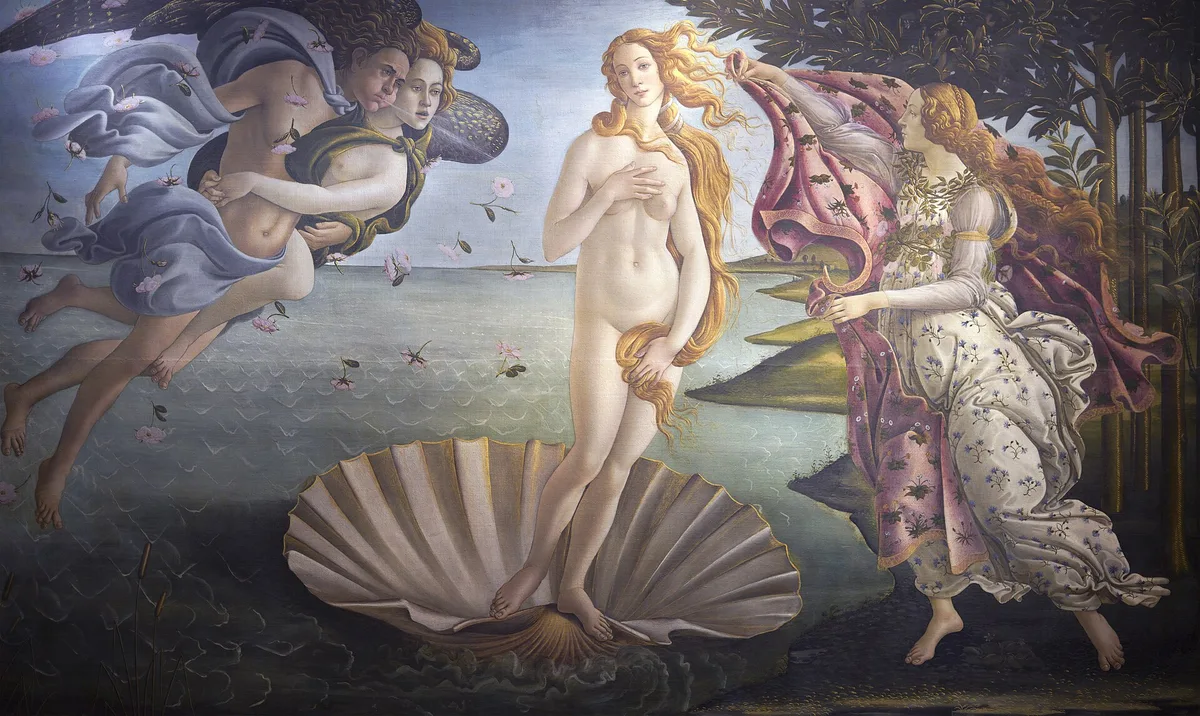
Botticelli, The Birth of Venus, c. 1484–86 (Uffizi, Florence): Much of the painting lives in a compressed, high-key tonal range — pale figures against a pale sky against a pale sea — and the result is an almost dreamlike delicacy that perfectly suits the mythological subject. The limited tonal contrast is not a weakness; it's what gives the painting its ethereal quality.
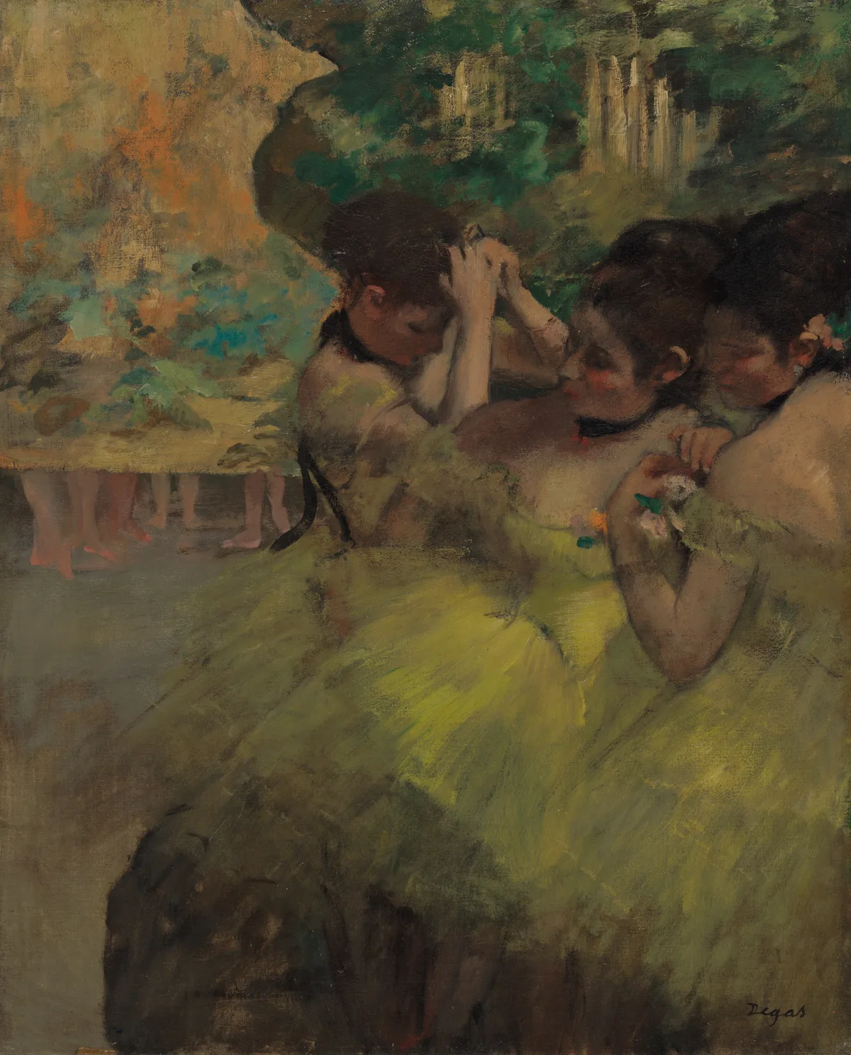
Degas, Yellow Dancers (In the Wings), 1874–76 (Art Institute of Chicago): Degas lets light pick out the dancers' yellow skirts and bare shoulders, using tone — not color alone — to draw the eye to the figures.
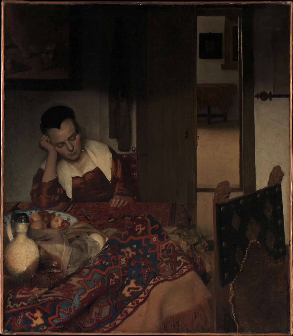
Vermeer, A Maid Asleep, ca. 1656–57 (Metropolitan Museum of Art): Vermeer's domestic interiors are masterclasses in what controlled mid-tone range can achieve. Here, the light from the left window bathes the scene in a quiet, diffused warmth — the tonal transitions are gradual and soft, and the emotional result is intimacy and stillness rather than drama. Notice that the doorway opens onto a lighter room behind her, while the darkest darks sit in the chair and the door panel — just enough contrast to anchor the space without breaking the quiet mood.
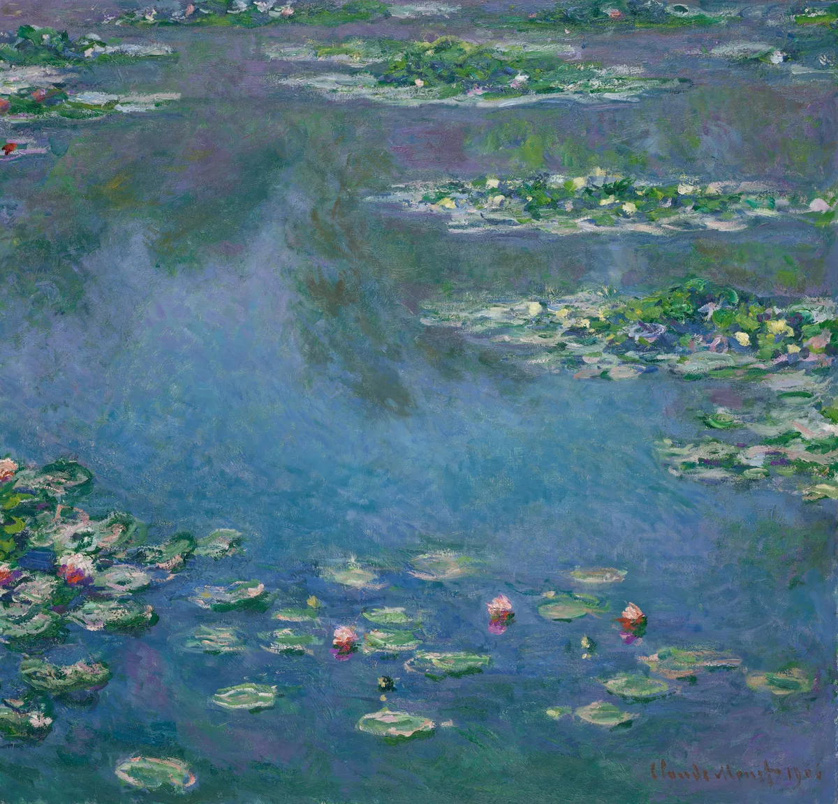
Monet, Water Lilies, 1906 (Art Institute of Chicago): This canvas has no strong tonal contrast. The entire surface operates in a compressed mid-to-light range, with no true black anywhere. What holds the painting together is color variation operating within a very narrow value window — a genuinely difficult act of tonal restraint that most painters underestimate until they try to replicate it.
Try It on Your Own Work
The fastest way to internalize tonal thinking is to test it against a painting in progress rather than against a finished masterwork. Upload your painting to Critico and use the value view — it renders your painting as a grayscale map, stripping all color information instantly. You'll see immediately whether your focal point carries the strongest contrast, whether your shadow family is consistent, and whether the overall key of the painting matches the emotional register you're after.
Frequently Asked Questions
Frequently Asked Questions
-
What is tone in art? Tone in art refers to the relative lightness or darkness of a color or surface — where it sits on the scale from pure white to pure black. It's often used interchangeably with "value," particularly in American art instruction.
-
What is the difference between tone and value in art? They describe the same property — lightness or darkness — with tone more common in British and Australian art education and value more common in American curricula. In practical painting terms, the words are interchangeable.
-
What is the effect of tone on art? Tone creates the illusion of three-dimensional form, sets a painting's emotional register (high-key for lightness and serenity, low-key for drama and weight), and controls where the viewer's eye travels by concentrating contrast at the focal point.
-
What are the three types of tone in art? The three most commonly cited tonal categories are lights, mid-tones, and darks. Some instructors expand this to five or nine steps for more nuanced modeling, but nearly all tonal decisions can be organized around those three foundational zones.
-
How do I improve my tonal control in painting? The most effective habits are: squinting at your subject to reduce color information, photographing your work in black and white to compare tonal structure, working from a simplified three-value plan before adding detail, and using a tool like Critico to see your painting's value map without the distraction of color.
Final Thoughts on Tone in Art
Tone is the skeleton of a painting. Color, texture, and edge quality are all read on top of it — but if the tonal structure underneath is confused, none of those other qualities can save the work. The painters who tend to have the most consistent success across different subjects and lighting conditions are, almost without exception, painters who've learned to see and control tone independently of color.
The good news is that tonal awareness is trainable. A few months of deliberate squinting, black-and-white photography checks, and value-only studies will change how you see faster than almost any other focused practice. And once you can read the tonal logic in a Vermeer interior or a Caravaggio crowd scene, you'll start applying that same logic — instinctively — to your own compositions. That's when painting gets significantly easier and significantly more interesting.
For a deeper look at how tone fits into the broader structure of a picture, the posts on value in art, the value scale, and notan are worth reading in sequence — they build directly on what's covered here.