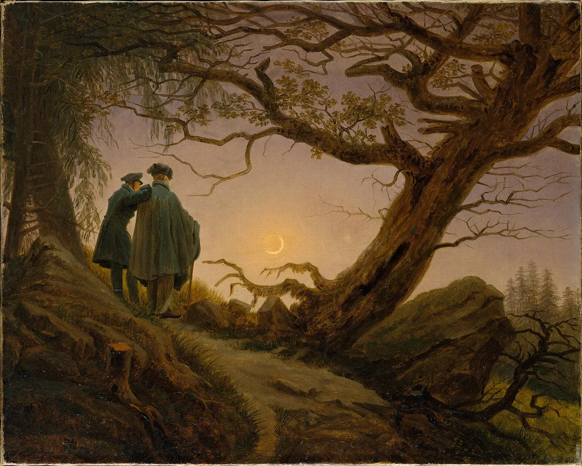
When a painting stops you in your tracks — when you lean in before you've even read the label — composition is usually the reason. Friedrich's Two Men Contemplating the Moon does this quietly but completely. The two figures stand on a rise at the left, small against the sky. A gnarled oak and a rocky path angle upward toward the light. Nothing is accidental. Every element has been placed so that your eye travels exactly where the composition sends it.
That controlled inevitability is what the rules of composition are about. They are not bureaucratic checklists. They are a compressed record of what painters and later photographers discovered, over centuries, about how human eyes move across a flat surface. Knowing them does not restrict you — it gives you a vocabulary, so that when a painting feels off, you can name what's wrong and fix it.
What Are the Rules of Composition?
Composition, at its core, is the arrangement of visual elements within a frame — shapes, values, lines, spaces, masses — to direct attention and create meaning. The "rules" of composition are recurring structural strategies that tend to produce that sense of inevitability. They are guidelines distilled from practice, not laws handed down from theory.
Most of them appear in both painting and photography, because both disciplines deal with the same fundamental problem: a flat rectangle, a viewer's wandering eye, and something the artist wants to say. Where painting and photography diverge is in the act of selection. A photographer finds and isolates what's already there; a painter invents the scene from scratch. That difference matters: painters can (and should) rearrange anything in service of the composition, while photographers must develop a sharp eye for existing structure. The compositional vocabulary, however, is largely shared — and understanding it in one medium deepens your fluency in the other.
For a deeper grounding in what composition actually means before we get into the individual rules, the post on composition in art is a good place to start.
The Core Concept: What Composition Actually Does
Before listing techniques, it helps to understand the mechanism they're all serving. A composition does three things simultaneously:
It controls entry. The viewer's eye enters the frame somewhere — usually at the highest contrast point, or near the top left (for readers in left-to-right cultures). A strong composition anticipates that entry point and uses it.
It creates a path. Once the eye is in, lines, value gradients, and edges guide it through the image in a sequence the artist has planned. In Edgar Degas's ballet scenes, the eye moves from dancer to dancer across the stage.
It delivers a rest. The path leads somewhere — a focal point, a center of interest — where the viewer can settle and absorb what the painting is actually about. Without a rest, the eye bounces and the painting feels restless.
Every compositional rule below is a specific way of managing one or more of these three functions. When you evaluate your own work, ask: where does the eye enter? Where does it go? Where does it land?
For more on that landing point specifically, see Focal Point in Painting: Guiding the Viewer's Eye.
Painting vs. Photography Composition: What Carries Over and What Doesn't
The conversation around composition rules often splits between painting and photography communities, as if they were separate disciplines. They're not — they're the same conversation in different rooms.
What carries over perfectly: the rule of thirds, leading lines, the golden ratio, negative space, balance, rhythm, and the use of value contrast to create a focal point. These are geometry and psychology — they apply to any rectangle.
What differs: in painting, you control everything. You can move a tree, eliminate a building, change the light source, shift the horizon. In photography, you control framing, timing, depth of field, and light — but the world is non-negotiable. This makes compositional awareness more urgent for photographers in the moment, and more revisable for painters after the fact. Neither has an easier job; they're just different kinds of problem-solving.
10 Rules of Composition to Follow
These are the structural strategies that appear most consistently across centuries of painting and across the top photographic traditions. They are not a hierarchy — use the ones that serve the image in front of you.
1. Rule of Thirds
Divide your frame into a three-by-three grid. The four points where the grid lines intersect are natural resting points for the human eye. Placing your subject, horizon, or key element on or near one of those intersections tends to feel more dynamic than centering it.
Look at Friedrich's Two Men Contemplating the Moon at the top of this post. The moon sits close to the centre, but the two figures stand near the left third line and the oak's trunk crosses the right one. The result is a tension across the frame that feels alive.
The rule of thirds is a simplified approximation of older, more complex systems (the golden ratio, dynamic symmetry). Its virtue is speed and clarity. For a detailed look at how master painters actually applied the underlying grid logic, see Rule of Thirds Examples: How Master Painters Actually Used the Grid. And if you want to check your own work against the grid in real time, Critico's rule-of-thirds overlay tool can show you exactly where your focal points land.
2. The Golden Ratio
The golden ratio (approximately 1:1.618) is a mathematical proportion that appears in natural forms — nautilus shells, leaf spirals, the proportions of the human face. Painters from the Renaissance onward have used it, though whether they did so consciously or intuitively is a genuine debate worth acknowledging.
The practical form most painters use is the golden spiral (sometimes called the Fibonacci spiral): a curve that tightens toward a point, with the implied instruction to place your main subject at the tight end. Hokusai's The Great Wave off Kanagawa (c. 1831) is the most cited example — the curl of the wave traces the spiral, and the distant Mount Fuji sits at its center.
If you want to go deep on what this tool actually does and doesn't do for painters, The Golden Ratio in Art: What Painters Actually Need to Know handles the nuance without the mythology.
3. Leading Lines
Lines — whether literal (a path, a river, a fence) or implied (a row of figures, a sequence of values) — are the most direct tool for moving a viewer's eye from the edge of the frame toward the focal point.

In Michelangelo's Torment of Saint Anthony — painted when he was about twelve, copying a Schongauer engraving — the outstretched limbs and wings of the demons form radiating lines that all point inward toward Saint Anthony. The chaos of the composition is actually organized chaos: every figure is a leading line aimed at the center of interest. The eye has nowhere to go but toward the saint.
Leading lines don't have to be diagonal. Horizontal lines (a shoreline, a table edge) create calm; verticals (columns, trees) create stability or grandeur; diagonals create energy and movement. Curves move the eye slowly and gracefully. Choose the character of your line as deliberately as you choose its direction.
4. Diagonals and Triangles
A diagonal breaks the static stability of horizontal and vertical elements and introduces motion. A triangle — formed by three visual masses arranged in a triangular relationship — is one of the most stable and satisfying compositions in Western painting.
Renaissance painters often organized figures in triangular arrangements. In Raphael's The School of Athens (1509–11), Plato and Aristotle form the apex of a large implied triangle, with groups of philosophers descending to either side. The triangle gives a large, complex scene a clear hierarchy: the eye finds the peak and knows where it stands.
Diagonals can also create instability deliberately. Théodore Géricault's Raft of the Medusa (1818–19) tilts the entire composition on a rising diagonal from the dead at lower left to the frantically signaling survivor at upper right — creating a sense of desperate momentum that no horizontal arrangement could achieve.
5. Negative Space
Negative space is the area around and between subjects — the "empty" zones of a composition. Handled well, it is not empty at all: it gives the subject room to breathe, creates balance, and can carry meaning in its own right.
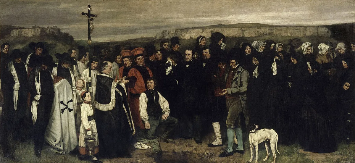
Courbet's A Burial at Ornans (1849–50) is an object lesson. The canvas is nearly twenty-two feet wide, and a low band of flat, grey sky runs across the top — negative space that functions as the emotional weight of the painting. The sky presses down on the row of mourners. That strip of emptiness communicates grief and indifferent nature in a way that no amount of detail could. The painting hangs in the Musée d'Orsay; you can see the full work on Wikimedia Commons.

When I look at student paintings that feel "cramped," the first thing I check is whether negative space has been cut too short. A subject pushed to the edge of the frame with no breathing room behind it creates unintended tension — unless tension is what you want.
6. Framing Within the Frame
Using elements within the scene — a doorway, a window, an arch, tree branches — to create a secondary frame around the subject is one of the oldest devices in Western painting. It focuses attention, adds depth, and anchors the subject in its environment.
Hiroshige's Plum Estate, Kameido, from his One Hundred Famous Views of Edo series, is a well-known example: a dramatically cropped plum branch in the foreground frames the distant blossoms and the landscape beyond, creating layers of depth in what is essentially a flat design tradition.
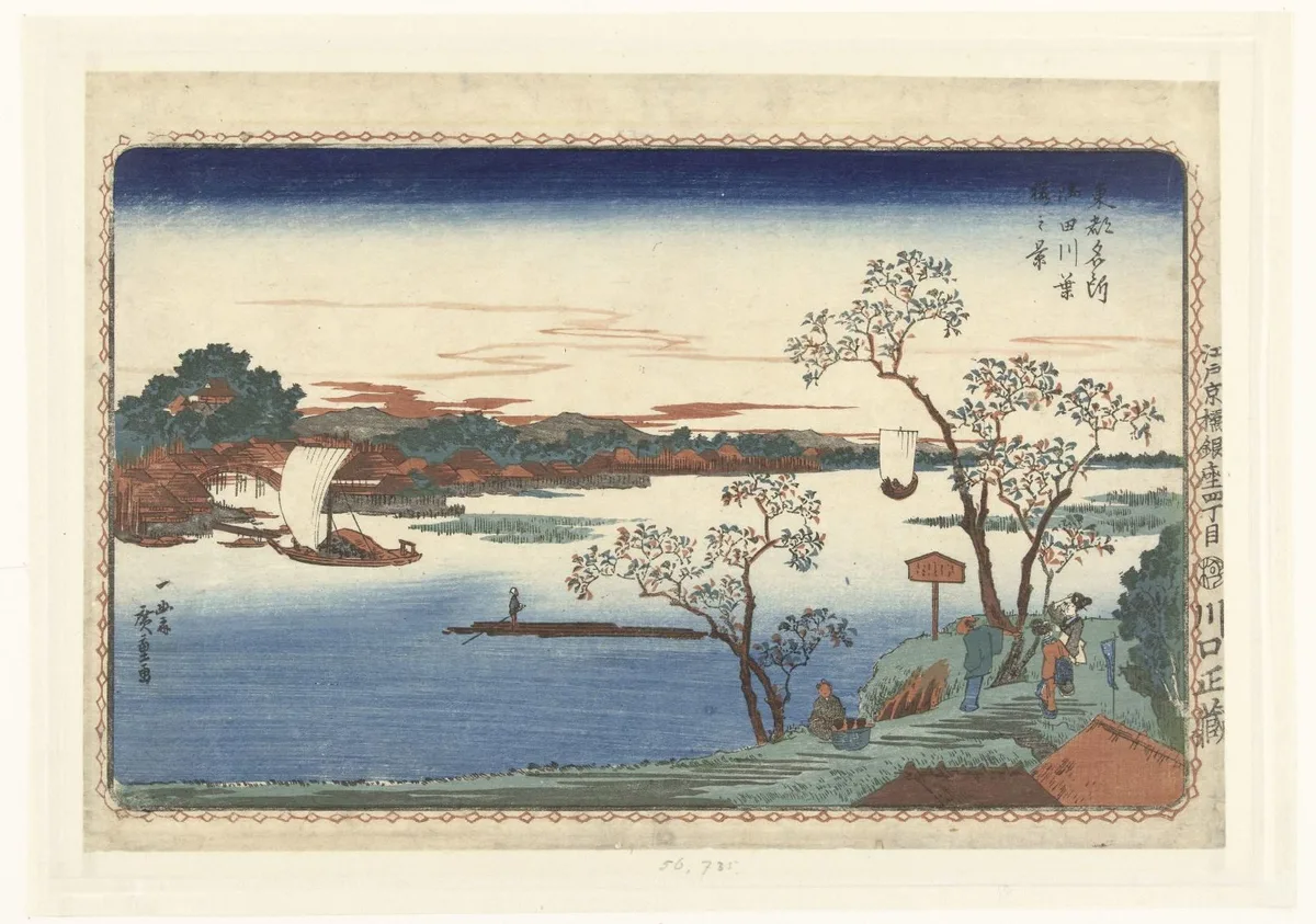
The technique works because it mimics how we actually see: we often look through something to see something else, and that layering reads as natural depth. In landscape painting, overlapping tree branches are the most common version — but any foreground element that partially encloses the subject can perform this function. View this work in the Rijksmuseum's collection.
7. Symmetry and Balance
Symmetry — near-mirror arrangement of elements on either side of a central axis — projects stability, grandeur, and calm. It is the compositional grammar of altarpieces, formal portraits, and architecture paintings for exactly this reason.
But strict symmetry can read as static. The more useful concept is visual balance: a large mass on one side of the frame balanced by a smaller but more visually active element on the other (a bright color, a strong value contrast, a human figure). This gives the composition equilibrium without rigidity.
Jan van Eyck's Arnolfini Portrait (1434) holds this balance beautifully. The couple are roughly centered but not symmetrical — the man stands slightly forward, the woman slightly behind, and the mirror, window, and chandelier distribute visual weight across the canvas so that it feels settled without being static.
8. Rule of Odds
A group of three objects reads more naturally than a group of two, and a group of five more naturally than four. Two elements create a binary — they compete with each other. An odd number implies a center, which the eye can use as a rest point, with the remaining elements flanking it.
This principle applies to any repeated element: trees in a landscape, figures in a scene, boats on water. When you find yourself with an even number of similar elements, consider whether removing one — or adding one — might resolve an unintentional tension.
9. Value Structure and Contrast
Value (how light or dark a passage is) is arguably the most powerful compositional tool available, because the human eye is drawn to contrast before it registers anything else. The highest-contrast point in a painting is almost always perceived as the focal point — regardless of where it sits in the frame.
A clear value plan — establishing your lights, darks, and mid-tones before you paint — is one of the most important compositional decisions a painter makes. Notan, the Japanese design principle of organizing a composition into interlocking light and dark masses, is a direct application of this thinking. For a practical introduction, see Notan Art: The Value Study That Changes How You See and The Value Scale: The Foundation Painters Keep Coming Back To.
Think of the value structure as a painting's bones — the underlying architecture that everything else is dressed over. If the bones are wrong, no amount of color or detail will fix the painting.
10. Simplification
Every element in a frame competes for attention. Simplification — removing what doesn't serve the composition — is as much a compositional act as placing a leading line. The painters who can simplify without the painting feeling thin are usually the ones who understand what they're actually trying to say.
Rembrandt's late self-portraits demonstrate this with uncomfortable clarity: the background is almost nothing — a warm dark — and the face emerges from that darkness with monumental presence. The simplification is not laziness; it makes the face the subject, and everything else noise.
When I work with students on paintings that feel "busy," the problem is almost always an unwillingness to let passages dissolve into each other. Not every edge needs to be stated; not every object needs its full local color. Simplification is a decision about what matters.
Composition Building Blocks: The Elements Behind the Rules
The rules above are applications of a smaller set of underlying building blocks. Knowing these helps you understand why a rule works — and what to do when none of the rules seem to apply.
Line — the most basic element. Lines direct the eye, define edges, and create mood (horizontal: calm; vertical: strength; diagonal: energy; curved: grace).
Shape — the two-dimensional form of an object. Before you paint a tree, you're painting a shape. Designing with shapes rather than objects is how painters think about notan and value structure.
Value — lightness and darkness. The skeleton of any composition. Get value right and the painting works even in greyscale.
Color — hue, saturation, and temperature. Color draws attention, creates temperature relationships, and can advance or recede in space. Warm colors advance; cool colors recede — though this is contextual, not absolute.
Texture — actual or implied surface quality. In painting, texture is often used to add interest to large quiet passages or to draw attention to key areas.
Space — the illusion of depth, created through overlapping, scale change, atmospheric perspective, and value shifts.
Form — the three-dimensional quality of an object, created in two dimensions through value modeling.
These building blocks are the raw material. The rules of composition are specific ways of organizing them.
Diagnose Your Own Work: Self-Checks for Composition Problems
When a painting feels wrong but you can't locate the problem, work through these checks in order:
1. Squint test. Squint until the image blurs to abstract shapes and values. Does a clear focal point emerge — one area that's lighter or more contrasted than everything else? If not, the value structure is competing with itself. This is the most common single cause of a painting that "feels flat." For a deeper look at why this happens, see Emphasis in Art: How Painters Tell You Where to Look.
2. Check the corners. Four things your eye will get stuck on: a high-contrast object in a corner, a line that exits the frame at a corner exactly, a bright light near the edge, and a tangent (where two edges barely touch). Walk around all four corners of your canvas and look at each one separately.
3. Count your value zones. A painting with five or six competing value levels rarely holds together. Most successful paintings have three to four. If yours has more, look for passages you can merge — let the shadows become one shape, let the lights become one shape.
4. The entry point. Cover the painting with your hands and slowly reveal it from the top. Where does your eye go first? Is that your intended focal point? If not, something else is pulling harder — probably a stray value contrast or a line aimed at the wrong place.
5. Flip it. Hold the painting up to a mirror, or photograph it and flip horizontally on your phone. Asymmetries and imbalances that you've stopped seeing become immediately visible when the image is reversed.
6. Remove one element. If something in the painting is bothering you but you can't identify it, cover it with your thumb. If the painting immediately feels better, that element is either in the wrong place or competing with your focal point. Consider removing it, simplifying it, or moving it.
Master Examples: Named Works and What They Teach
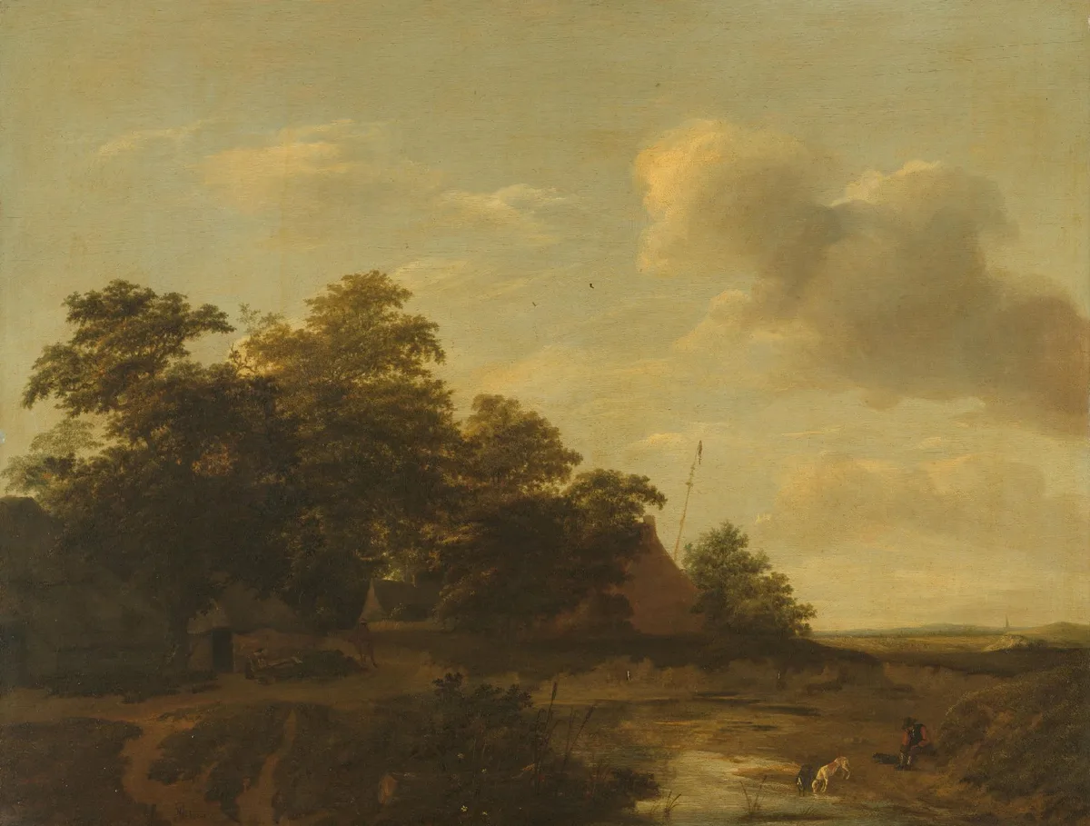
Jan Vermeer van Haarlem (I), Landscape with a Farm, 1648. The horizon sits low — roughly on the lower third line — giving the sky more than half the canvas. That sky is not decorative filler; it is negative space carrying the mood of the scene, a strategy Dutch landscape painters perfected long before anyone gave it a name. View the full work at the Rijksmuseum.
Vermeer (of Delft), The Milkmaid, c. 1657–58. The figure is placed at the left-center of the frame, with open negative space to the right. The window light creates the highest contrast point on the jug and the stream of milk — which is both the literal and compositional focal point. A painting this simple holds together because every value decision reinforces one clear center of interest.
Caravaggio, The Supper at Emmaus, 1601. The disciples' outstretched arms create strong horizontal lines radiating outward from the central figure of Christ — classic leading lines that force the eye back to the center whenever it wanders. The dark background eliminates competing information entirely, a radical simplification for its time.
Hokusai, The Great Wave off Kanagawa, c. 1831. The curl of the wave traces a near-perfect golden spiral. The boats in the trough and the distant Fuji provide the rest points — a masterclass in using a complex, turbulent composition that nevertheless has a clear path and a clear destination.
Rembrandt van Rijn, Self-Portrait with Two Circles, c. 1665–69. The figure is not centered — it sits slightly left of center, and the two partial circles on the right wall create a near-symmetrical frame behind it. The background is nearly a single value — a warm, undifferentiated dark — so the face, slightly lighter, emerges as the only thing that matters. The simplification is devastating in its confidence.
See the Composition in Your Own Work
Critico can apply compositional overlays — the rule-of-thirds grid, the golden spiral, a value-structure view — directly to a painting you upload. What surprises most painters is not that their focal point is in the wrong place. It's that the highest-contrast passage in the painting is in the wrong place, pulling the eye somewhere the painter never intended. Seeing it laid bare, with the overlay showing the grid and the value analysis showing where contrast actually lives, makes the fix obvious. Critico does not tell you what to paint — it shows you what your painting is doing, which is a different thing entirely.
Frequently Asked Questions
-
What are the basic rules of composition? The most consistently useful rules are the rule of thirds, leading lines, value contrast to establish a focal point, the use of negative space, and simplification. These apply whether you're painting or photographing, and understanding why each one works matters more than memorizing the list.
-
Do the rules of composition apply to both painting and photography? Yes — the underlying geometry and visual psychology are the same. The difference is that painters invent the scene and can rearrange anything, while photographers must recognize and frame existing structure. Both benefit from the same compositional vocabulary.
-
How is the rule of thirds different from the golden ratio? The rule of thirds divides the frame into a three-by-three grid and places key elements near the intersection points. The golden ratio (approximately 1:1.618) is a mathematical proportion found in natural forms; the golden spiral is its practical form in composition. The rule of thirds is a simplified approximation of the underlying proportional logic the golden ratio describes. Both point the painter toward similar decisions, just with different levels of precision.
-
What is the most important rule of composition? If you could only internalize one principle, it would be this: establish a clear focal point through value contrast, and make sure nothing else in the frame competes with it at the same intensity. Every other rule serves this one goal. A painting with a muddled value structure will fail no matter how carefully its leading lines are arranged.
-
When should you break the rules of composition? Break a rule when you understand what it normally achieves and have a specific reason to refuse it. Centering a subject can create profound stillness or confrontational symmetry — but only if the rest of the composition is handled with equal deliberateness. The painters who break rules effectively are invariably the ones who know them best.
Composition is one of those things that rewards time spent looking as much as time spent painting. Study a painting you love and try to trace the path your eye takes through it — where it enters, where it moves, where it rests. Then look at your own work with the same attention. The gap between those two experiences is usually where the most useful lessons live.
The rules in this post are starting points, not destinations. Use them to understand what's happening in paintings that work, and to diagnose what's going wrong in paintings that don't. Then, gradually, they become less like rules and more like instinct — the kind of instinct that produces that quiet feeling of inevitability that stopped you in front of Friedrich's moonlit path in the first place.