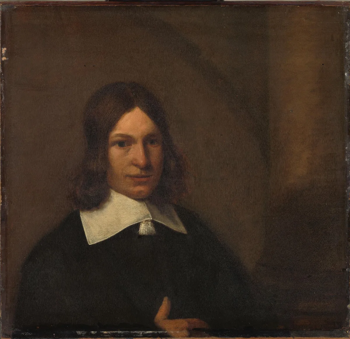
Three values. That is all this portrait needs. A near-black garment, a warm mid-tone background, and one lit face pulling your eye from across the room. Before this painting was ever painted, someone understood that structure — and a value study is how you work it out in advance.
Learning how to do a value study is one of the most useful skills you can build as a serious hobbyist. It costs you almost nothing in materials and time, and it answers the question that haunts so many paintings-in-progress: why does this feel off? Often the answer lives entirely in the values — not the colour, not the drawing.
What Is a Value Study?
A value study is a small, quick rendering of your subject using only light and dark — no colour, no detail, no fussing. You're mapping how light is distributed across the scene into a limited number of tones: usually two, three, or five. The goal is not a finished drawing. It's a decision document. You are deciding where the lights go, where the darks go, and — crucially — where the strongest contrast will live, because that is where the viewer's eye will land.
If you want to understand value as a concept more deeply, or learn how a full value scale works, the posts on value in art and the value scale in art cover that ground. This post is about the process of actually making the study.
Materials for a Value Study
Keep it simple. Elaborate materials defeat the purpose.
- Pencil and paper: a soft pencil (4B or 6B) on cheap cartridge paper. You can fill large areas fast and erase if needed.
- Marker or brush pen: a single mid-tone grey marker alongside a black pen gives you three values instantly — white of the paper, grey, black.
- Gouache or watercolour: mix a single mid-tone grey wash. Three values again: unpainted paper (light), one wash (mid), two washes or near-black (dark).
- Digital: a small canvas in greyscale, three swatches. Works well for checking a photograph reference.
- Size: small. Thumbnail size — 3 to 5 centimetres — forces you to think in masses rather than details.
Whatever you pick, work small and work fast. Fifteen minutes maximum. If you are still fussing at thirty minutes, you have slipped into making a drawing rather than a study.
How to Do a Value Study Step by Step
Step 1 — Squint at Your Reference
This is the single most important technique in the whole process. Squinting blurs detail and collapses the mid-tones, leaving you with the broad light and dark masses. Hold your reference at arm's length and half-close your eyes until faces become pale ovals, shadows merge, and the scene simplifies into patches.
What you see when you squint is your value structure. Anything you could not see while squinting — a small highlight, a texture, a subtle reflected light — is a detail, not a structure. Save it for the painting. Do not put it in the study.
Step 2 — Group Everything into Three Values
Three values is the right starting point for most studies: light, mid-tone, and dark. Assign every area of your scene to one of those three buckets. No negotiating. If something is ambiguous, pick the nearest bucket and commit.
- Light: the areas directly hit by your light source, plus the sky if it reads as light.
- Mid-tone: everything that is neither the lightest light nor the darkest dark. In most scenes this is the largest zone.
- Dark: shadows, deep darks, anything below mid-tone.
The reason three values works so well is that it is the minimum number needed to show form, depth, and a focal point simultaneously. Two values (the basis of notan) gives you bold graphic structure but limited nuance. Five values gives you richer modelling but also more decisions, more places to go wrong, and a slower study.
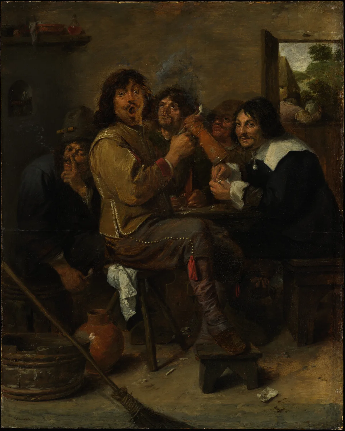
Brouwer's The Smokers is a useful study in how grouping works. The five figures are crammed into a murky brown interior. Most of the painting sits in the mid-to-dark range — the ground, the walls, the shadows between figures all read as one connected dark mass. The lighter ochre jacket of the central figure and the pale shirt of the figure at right provide the main lights, while the bright rectangle of the open window at upper right punctuates the composition. If you squinted at this scene from across a room, you would read it as: dark ground with a few light accents. That is a three-value structure.
Step 3 — Connect Your Shapes
The most common beginner mistake is painting shadows as isolated islands — a shadow under the nose, a shadow under the chin, a shadow beside the doorframe — each one floating separately. Connected shapes read as a single, unified dark (or light). Disconnected shapes read as spots and confusion.
In your study, physically connect shapes that belong to the same value zone. Push the darks until the shadow under the jaw links to the shadow on the neck links to the shadow on the collar. This connected shape of dark is called a shadow mass, and it does enormous structural work. The same principle applies to lights.
Step 4 — Place Your Strongest Contrast at the Focal Point
Whatever you want the viewer to look at first should have the greatest value contrast in the composition. Light next to dark, dark next to light — the sharper the jump, the more forcefully the eye is drawn there. This is why the lit face in the portrait at the top of this post holds your attention: it is the brightest area set against the darkest area, and nothing else in the painting competes.
Once you have placed that contrast at your intended focal point, check that nothing elsewhere in the composition accidentally steals it. A bright highlight in a corner can wreck a focal point even when the corner is irrelevant to your subject. This is the core of emphasis in art, and it is much easier to adjust in a small study than on a half-finished canvas.
2-Value, 3-Value, and 5-Value Studies
2-Value Study
Black and white only, no grey. Every area is one or the other. This is the notan approach: maximum graphic clarity, extreme simplicity. It is excellent for testing whether a composition has bold, readable structure, but it cannot show subtle form or delicate mood. Use it as a first pass when you are not sure whether a composition is worth developing.
3-Value Study
The practical workhorse. Light, mid, dark — each one flat, no gradations within the zone. Three values is enough to show form, enough to set up a clear focal point, and fast enough to do several before committing to canvas. This is the study most painters mean when they say "I did a value study."
5-Value Study
More refined. You gain two extra steps — a light mid-tone and a dark mid-tone — which lets you model form more convincingly and suggest softer light. The trade-off is time and complexity. A 5-value study is sometimes worth doing when the painting involves subtle transitions (portrait skin in diffuse light, for example) but skip it until the 3-value version is already working.
For most purposes: start with 3, and only move to 5 if the 3-value study reveals that you need more nuance.
Value Studies in Watercolour
Watercolour has its own logic here because you cannot easily darken a passage you have left too light. This makes the pre-painting value study even more important than it is in oil or acrylic.
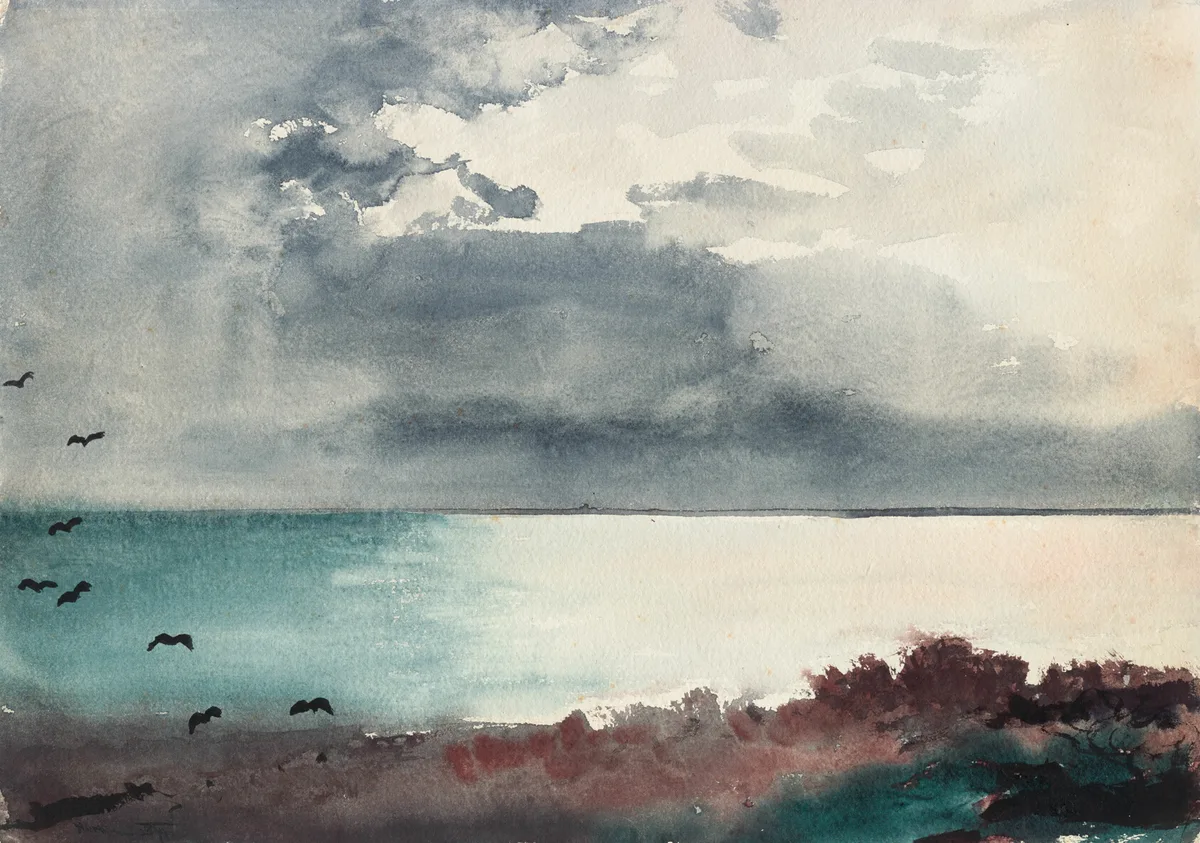
Homer's Breaking Storm, Coast of Maine shows exactly the kind of decision a value study forces in watercolour. The composition is almost brutally simple in its value logic: a large dark storm cloud mass takes up the top two-thirds, the pale water surface reads as the lightest zone, and silhouetted birds punch as dark accents against that light. The warm burgundy scrub at lower right holds a mid-tone position without competing with the cloud. If you tried to paint this without first knowing which zone everything belonged to, you would likely overwork the water — adding texture and detail until it lost its luminosity against the dark above it.
For a watercolour value study, mix a single wash of neutral grey at a mid-tone value. Wet-on-dry gives you a clean wash; wet-on-wet softens edges where you want atmospheric passages. Use the white of the paper as your light and layer a second wash or a near-black for the darks. Work small — postcard size — and let it dry before assessing whether the value relationships read as you intended.
Diagnose Your Own Work
When a value study does not look right, these are the places to check:
Too many values. If your "3-value study" has six different greys, you are not making decisions — you are copying the reference photographically. Go back and physically sort every area into one of three piles. Anything that does not fit cleanly gets rounded to the nearest.
The lights are all the same brightness. Your focal point needs to be the lightest light (or the darkest dark, depending on your scheme). If your background sky and your subject's face are both reading as "light," you have lost your hierarchy. Knock the sky down half a value.
The shadows are fractured. Pick three spots in your study and ask: are the shadows here connected to each other, or are they isolated spots? If they are isolated, physically connect them with a pencil line and see whether that gives you a stronger reading.
The study looks fine but the painting doesn't. This usually means you drifted from the study while painting — lightening a shadow here, adding a detail there — until the value relationships shifted without you noticing. Keep the study visible throughout the painting session and check back against it every fifteen minutes.
Nothing reads as the focal point. Squint at the study. Where does your eye go first? If the answer is "nowhere in particular," the contrast at your intended focal is not strong enough, or a competing contrast somewhere else is pulling the eye. Deepen the darks immediately around the focal, and lighten or unify anything else that is competing. The focal point in painting post goes deeper on this if you need it.
Master Examples
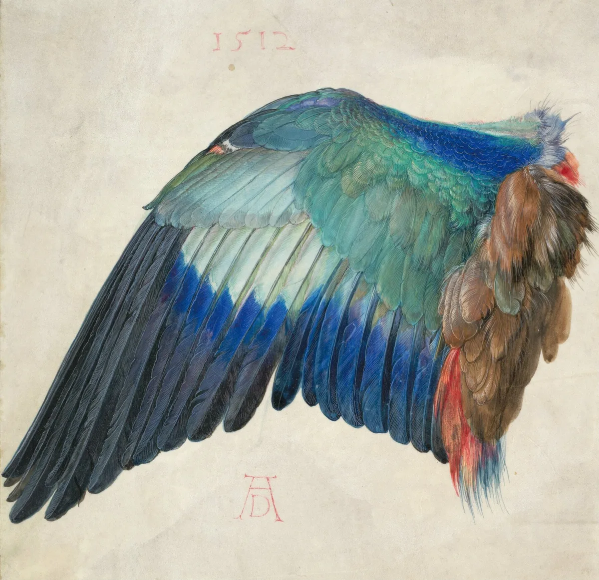
Dürer's Wing of a European Roller is a study in the most literal sense: observation rendered with controlled value decisions. The dark charcoal flight feathers at the base anchor the composition's darkest zone. Moving up, pale ivory feather shafts read as luminous mid-tones. The blue-green coverts at the upper section and the rust-brown tufts at right introduce colour, but the value structure underneath is clear and organised: dark at the base, lighter toward the upper wing. Because each zone is distinct and connected, the wing reads instantly as a three-dimensional form despite the flat parchment ground.
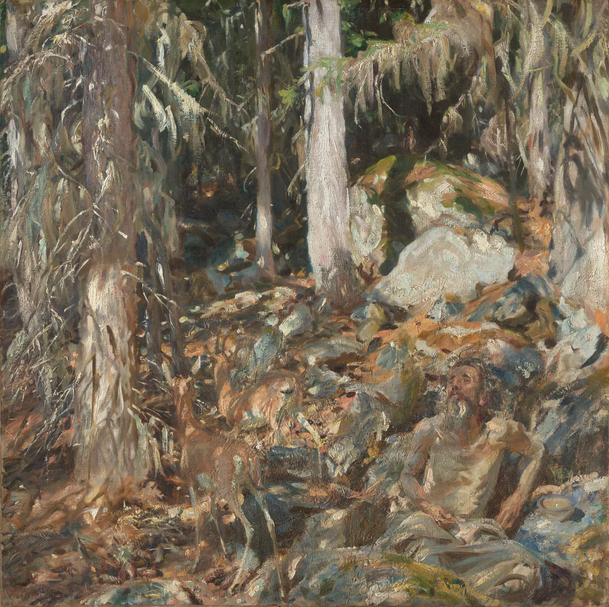
The Hermit is the hardest kind of subject to paint: a figure set against a complex background of similar tone and colour. Sargent's solution was exact value control. Almost the entire canvas sits in a middle-value zone of ochres, greys, and cool greens. The reclining hermit's pale face and bare arm are the only passages of genuine light-against-dark contrast — and so the eye finds the figure immediately despite the visual noise surrounding it. A value study of this scene would reveal the problem quickly: without that deliberate value separation at the face, the figure simply disappears. That is a decision you want to make before you start a large canvas, not discover halfway through.
Check Your Own Study with Critico's Value View
Critico's value view does the squinting for you. Upload your reference photograph — or a photograph of your value study — and switch to the 3-tone view. The tool posterises the image into three flat zones, showing you exactly how light, mid-tone, and dark are distributed. It is the same check you perform by squinting, but more reliable when you have been staring at a painting for two hours and your eyes are no longer fresh. Painters searching for a value study app or a way to do a value study online will find this useful as a quick diagnostic step alongside their physical study. The point is not to replace the manual process — squinting and drawing forces you to understand the structure — but to give you a second opinion when you are not sure whether what you have drawn is working.
Frequently Asked Questions
- What is a value study in art? A value study is a small, quick rendering of your subject in light and dark only — no colour — that maps how tones are distributed across the scene. The goal is to decide where lights and darks will fall before you begin the painting, so structural problems can be solved cheaply on a thumbnail rather than expensively on canvas.
- How many values should I use in a value study? Start with three: light, mid-tone, and dark. Three values is enough to show form, depth, and a focal point, and it is simple enough to complete quickly. Two values (black and white only) tests bold graphic structure. Five values adds more modelling nuance but takes longer. Most painters begin with three and only add values if the study reveals they need more.
- How long should a value study take? Aim for ten to fifteen minutes. A value study that takes thirty minutes or more has usually become a detailed drawing rather than a structural decision-making tool. Keep it small — thumbnail size — and resist the urge to refine edges or add texture.
- Can I do value studies in watercolour? Yes, and they are especially important in watercolour because you cannot easily recover a shadow you have left too light. Mix a single mid-tone grey wash, use the white of the paper as your light, and layer a second wash or near-black for your darks. Work at postcard size or smaller.
- How do I know if my value study is working? Squint at it from arm's length. Your eye should go immediately to the area of strongest contrast — your intended focal point. If nothing stands out, or if your eye is pulled to the wrong place, adjust the contrast at the focal point before you begin painting. Critico's 3-tone value view can also help you read the distribution of tones when your own eyes are too accustomed to the image to judge objectively.
A value study takes fifteen minutes. The painting it protects might take fifteen hours. That ratio alone makes the habit worth building. Start with your next subject, work at thumbnail size, group everything into three values, and see what decisions become obvious before you ever load a brush.