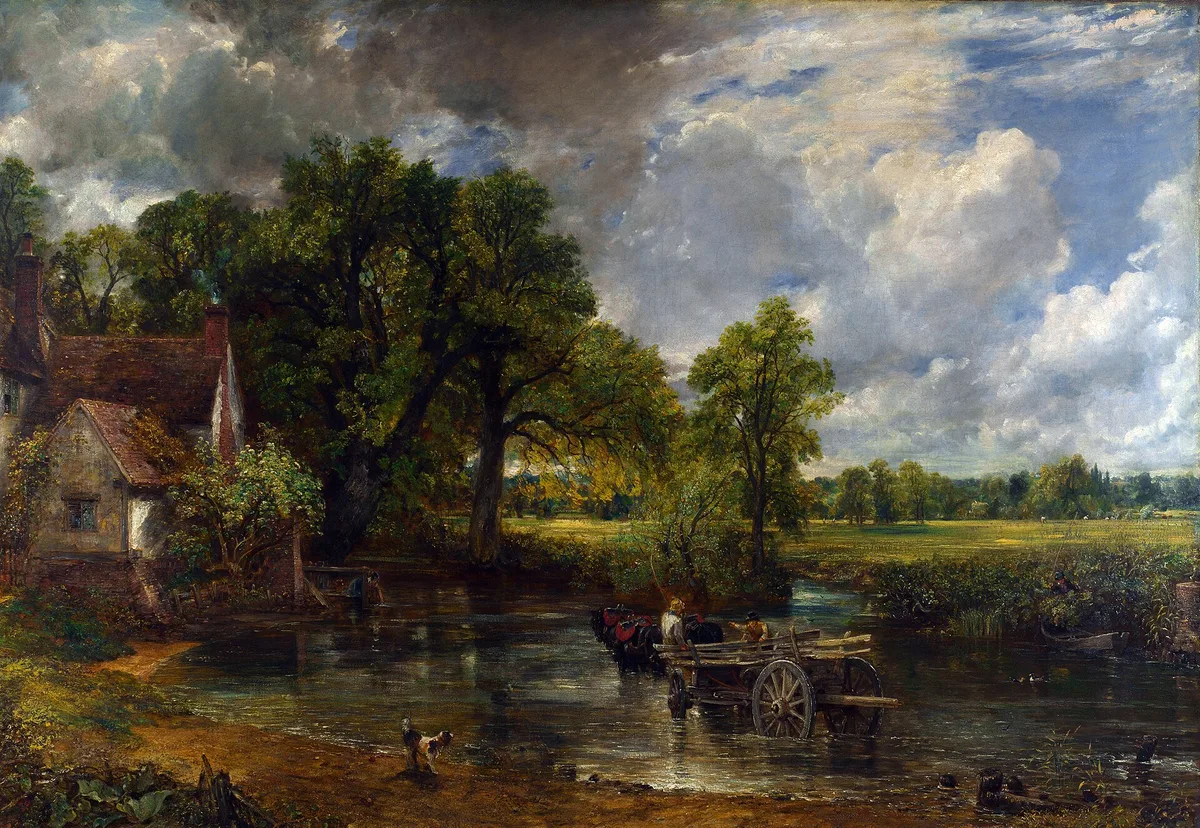
If your landscape paintings feel like stage flats — everything pressing against the picture plane at the same distance — you are almost certainly missing one or more of the methods below. Knowing how to create depth in a painting is not a single trick; it is a set of tools that work together, and once you can name them you can diagnose exactly which one is absent.
Constable's The Hay Wain uses all seven of the methods covered here, and we will return to it throughout. But these tools apply regardless of subject: interiors, portraits, still lifes, and abstractions all benefit from a painter who understands how the eye reads space.
What Is Depth in Painting?
Depth in painting — sometimes called pictorial depth or the illusion of space — is the sense that some parts of the image are closer to the viewer and others are farther away, even though the canvas is physically flat. It is not the same as three-dimensional form (the roundness of a single object). Depth is relational: it describes how objects sit relative to each other in space. A painting with no depth reads as a pattern; a painting with convincing depth reads as a window.
7 Methods for Creating Depth in a Painting
1. Overlap
The simplest and most reliable cue. When one shape partially covers another, the brain immediately reads the covering shape as closer. It works in any medium, at any scale, with zero drawing skill required — you simply need to let things overlap rather than floating them in isolation.
In The Hay Wain, the horse-drawn cart overlaps the river's surface, the dark tree masses overlap the distant meadow, and the cottage overlaps the tree line at left. Each overlap adds another layer of recession. When a painting feels flat, the first question is often: are my objects touching but not overlapping? Two shapes that merely touch share the same perceived depth plane. Let one slide in front of the other and they immediately separate.
Medium note: this works identically in oil, acrylic, and watercolor. In watercolor, reserve light-valued foreground shapes first so darker distant passages can read behind them.
2. Scale Change
Objects appear smaller as they recede. Repeating a similar element at different sizes — figures, trees, boats, windows — immediately implies distance. The size ratio matters: a distant figure that is only slightly smaller than a foreground one creates a modest sense of depth; one that is a quarter the size creates a dramatic sense of distance.
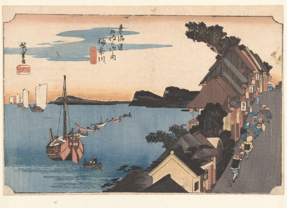
Hiroshige's Kanagawa: View of the Embankment shows this with particular clarity. The figures descending the road at the right vary noticeably in size — larger near the viewer, smaller toward the harbour — and the boats on the water diminish similarly from the large pink-hulled vessel in the left-center to the small sailing craft near the horizon. Because this is a woodblock print with no atmospheric haze to speak of, scale change and overlap are doing almost all the spatial work.
Medium note: in acrylic, you can glaze thin colour over distant repeated elements to push them back further. In watercolor, paint distant repeated shapes with a single wet wash rather than multiple strokes — the reduced detail reinforces the scale reduction.
3. Value Range by Distance
Value (the lightness or darkness of a passage) compresses as objects recede. The foreground of most outdoor scenes contains the widest value range — both the darkest darks and the lightest lights. The distance contains a narrower band, closer to middle grey. Ignoring this and painting the distance with the same full value range as the foreground flattens everything immediately.
The river in The Hay Wain demonstrates this precisely. The foreground mud and water contain rich, dark values. The sunlit meadow in the middle distance is bright, but not as dark in its shadows. The far tree line on the horizon compresses further still — it reads as a quiet, mid-toned band with little internal contrast. The full value range from near-black to near-white only appears in the foreground.
This is closely tied to the principles in value in art, and if that concept is new to you, that post covers it in more depth.
Medium note: this principle is critical in watercolor because there is no correcting a too-dark distance passage — plan it as a light, low-contrast wash from the start. In oil and acrylic, add a touch of white and a complementary colour to any distant mix to simultaneously lighten and neutralise it.
4. Edges: Sharp Near, Soft Far
Sharp edges attract attention and read as close. Soft, lost edges recede. This is partly how the eye actually works — peripheral vision is genuinely less sharp than central focus — and partly a convention painters have used for centuries.
In practice: paint foreground shapes with decisive, clean transitions. As you move toward the distance, let edges blur. This does not mean everything in the distance is out of focus; it means the transitions between shapes are softer, with less abrupt value or colour change at the boundary.
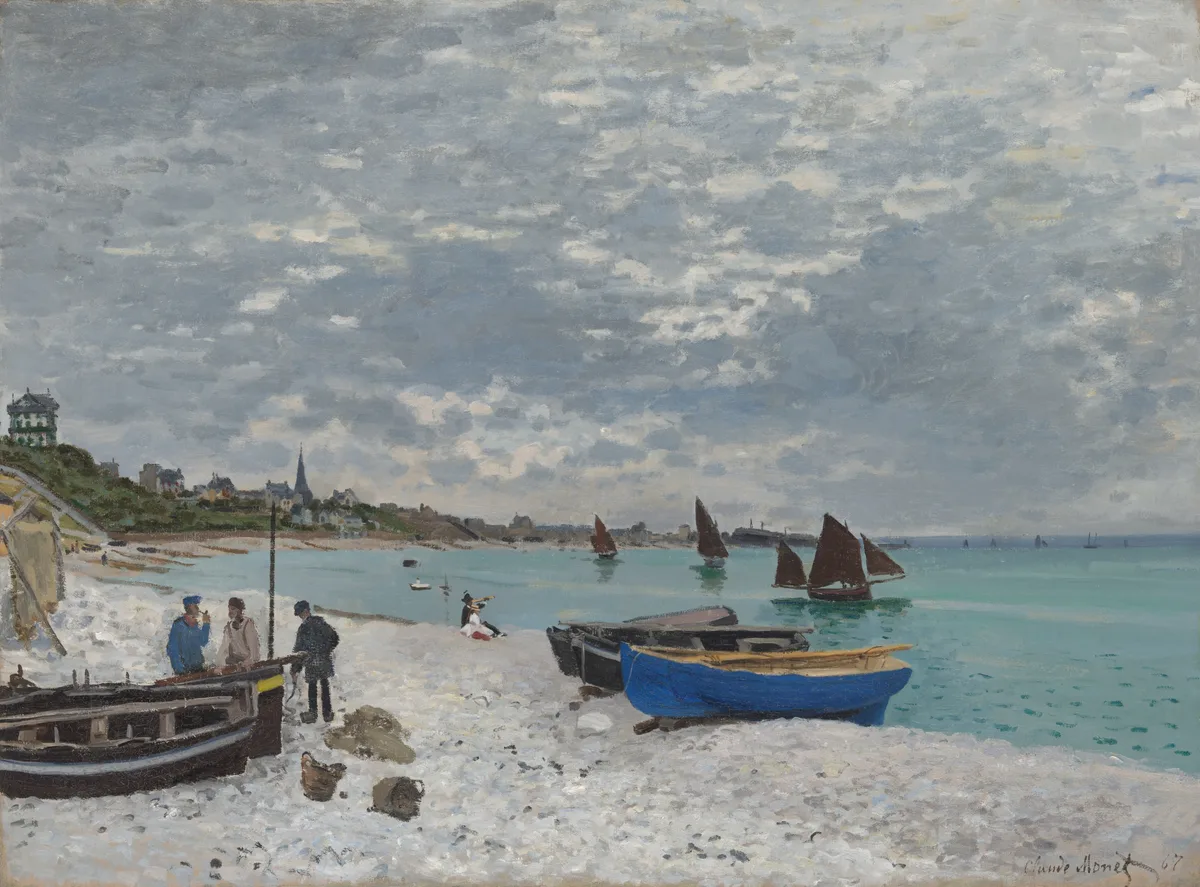
Monet's Beach at Sainte-Adresse is a useful example. The dark hull and wooden planks of the foreground boats have crisp, distinct edges — you can read individual boards. The figures on the beach have readable silhouettes. The sailing vessels in the middle distance are already handled with looser strokes. By the time your eye reaches the town and church spire at the far left, the forms dissolve into broadly applied paint with no hard boundaries at all.
Medium note: in watercolor, use wet-into-wet technique for distant passages to keep edges soft. In oil, blend edges while still wet; in acrylic, work quickly or use a touch of retarder medium to keep edges workable before softening them.
5. Color Temperature Shift
Warm colours (reds, oranges, yellows) tend to advance toward the viewer. Cool colours (blues, blue-greens, blue-greys) tend to recede. This is partly optical — the eye focuses slightly differently on different wavelengths — and partly perceptual convention from centuries of landscape painting. Distance takes on a blue-grey cast as the atmosphere intervenes; foregrounds in sunlight often carry warmer reflected light.
You do not need to make the foreground orange and the distance blue — that is heavy-handed. A subtler approach: as you mix colours for distant passages, add a small amount of a cooler hue. As you mix foreground colours, push them slightly warmer. The difference only needs to be perceptible, not dramatic.
Medium note: in watercolor, a standard approach is to let a dilute ultramarine blue wash underlie distant landmasses. In oil and acrylic, cadmium-family yellows and oranges in the foreground against distant mixes containing cerulean or cobalt blue is a reliable, controllable combination.
6. Detail Falloff
We do not see fine detail at a distance. A brick wall ten feet away shows individual mortar lines, chips, and colour variation. At three hundred feet it reads as a flat, uniform surface. Painting distant objects with the same level of detail as foreground objects forces everything to the same perceived distance.
This is related to edges but distinct from it. Edges are about transitions between shapes. Detail falloff is about what you paint inside a shape. A distant tree is not a tree with soft edges — it is a shape of colour with no internal leaf detail at all. A distant figure is a value mass with a head-shaped top, not a person with visible features and clothing folds.
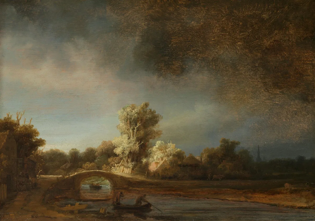
Rembrandt's Landscape with a Stone Bridge is instructive here. The small figures in the foreground boat are handled with just enough mark-making to read as people, but they carry no fine detail. The lit tree canopy at the center is treated as a luminous mass rather than individually described leaves. The thatched buildings behind it are even more broadly painted. Rembrandt concentrates descriptive specificity precisely where he wants the eye to linger — at that central burst of warm light — and simplifies everything else.
Medium note: in oil, the old advice is to paint thin and lean in the distance, fat and textured in the foreground. Texture physically catches light, which draws the eye. In acrylic, avoid texture mediums in distant passages. In watercolor, fewer strokes means less detail — let the wash do the work.
7. Atmospheric Perspective
This is the most written-about depth method, so this post will keep it brief. Atmospheric perspective (also called aerial perspective) describes how the air itself — dust, moisture, particles — progressively desaturates, lightens, and cools colours as distance increases. Mountains on the horizon go blue-grey; the sky near the horizon appears lighter than directly overhead.
For a full treatment of this technique with more examples, see the dedicated post on atmospheric perspective.
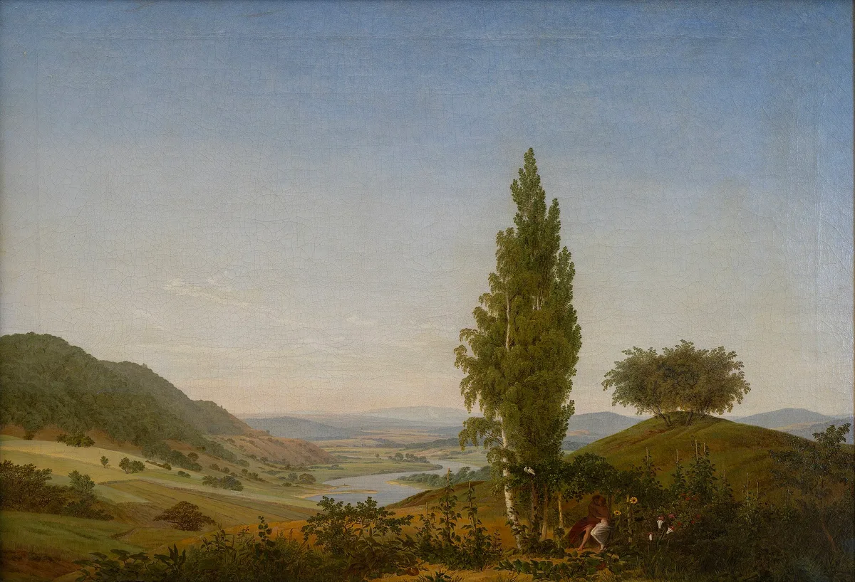
Friedrich's Summer (Landscape with Lovers) shows the principle working at full stretch. The foreground vegetation is a saturated warm green and ochre. The middle-ground valley and river are noticeably cooler and less vivid. The distant hills and mountains on the horizon have become a soft, desaturated blue-grey — barely distinct from the sky above them. Friedrich uses almost no haze or mist, yet the distance reads as remote because the colour temperature shift and value compression are handled with such control.
Medium note: atmospheric perspective is perhaps easiest to manage in oil, where you can remix and adjust wet colour in place. In watercolor, plan your distant washes first, keeping them pale and blue-leaning; warmer, more saturated passages come forward in subsequent layers.
Diagnose Your Own Work
When depth is not reading, one of these questions usually locates the problem:
Is everything the same level of detail? Step back from your canvas — literally step back — and squint until detail disappears. If the distance still looks as complex as the foreground, simplify it.
Are your darks too dark in the distance? The darkest dark in most outdoor scenes belongs in the foreground. If you have a rich near-black in the far distance, it will snap forward and compete.
Are your objects floating rather than overlapping? If you can see all the way around every shape without it touching another, there are no spatial layers. Introduce overlap, even if it means adjusting the composition.
Is your distant colour too warm or too saturated? A vivid red barn on the horizon will always fight to come forward. Neutralise and cool distant colours, even when you know the object's local colour is warm.
Do your edges look the same throughout? If you used the same brushstroke pressure and speed across the whole canvas, your edges will be uniform. Reserve the most confident, decisive strokes for the foreground.
For a broader look at how these decisions fit into the overall structure of a painting, the post on composition in art covers the spatial organisation of the picture plane directly.
Three Master Examples at a Glance
Constable's The Hay Wain (see the hero image above): stacks all seven methods simultaneously. Overlap: the cart sits in front of the water. Scale: the small dog mid-foreground establishes scale relative to the cart and trees. Value range: the shadowed foreground mud contains the painting's deepest darks; the horizon compresses to a narrow mid-tone band. Edges: crisp on the cart's wheel, dissolved where the far meadow meets the sky. Colour temperature: the foreground reflections carry warm ochres; the far tree line is a cooler green. Detail: individual planks on the cart, but no leaf description in the distant trees. Atmospheric softening in the far field completes the set.
Hiroshige's Kanagawa: View of the Embankment: a woodblock print has no wet edges to blur and no glazed atmosphere to mix, yet this image reads with genuine depth. Hiroshige achieves it almost entirely through scale change (diminishing figures, boats, and buildings along the diagonal street) and overlap (the embankment's roofline sits in front of the water, the water in front of the distant headland). This is a useful reminder that two well-handled methods can be enough. The Rijksmuseum's collection page shows a high-resolution scan worth studying.
Friedrich's Summer (Landscape with Lovers): one of the purest demonstrations of atmospheric perspective in Romantic landscape painting. The colour temperature shift from warm foreground to cool, grey-blue horizon is systematic — you could almost chart the hue angle changing as your eye travels from the ochre earth to the vanishing mountains. The small figures at the base of the tall poplar establish human scale against a valley that clearly extends for many miles. The Wikimedia source offers a clean, colour-accurate reproduction.

For more paintings that demonstrate how depth and focal point work together — since depth is partly what makes a focal point feel near rather than just bright — that post offers further examples.
Stripping colour away and viewing a painting in greyscale is one of the fastest diagnostic moves available. Critico does this with a single click. In the value view of The Hay Wain above, the depth structure becomes immediately legible: the foreground holds the full value range from near-black to near-white, the middle distance narrows noticeably, and the far horizon compresses into a quiet, pale band. If your own painting's value view shows the same compressed mid-tones scattered uniformly across all distances, that is where to start.
Frequently Asked Questions
- What is the most important technique for creating depth in a painting? There is no single most important method — they work together. That said, controlling value range by distance (keeping your full value range in the foreground and compressing it toward the horizon) tends to have the most immediate impact on painters who are new to thinking about depth, because it affects the whole painting at once rather than isolated passages.
- How do I create depth in an acrylic painting? All seven methods in this post apply to acrylic. The medium-specific notes worth remembering: avoid heavy texture mediums in distant passages (texture brings things forward), work quickly on edges while paint is still open, and add a touch of white and a cool colour to any distant mix to simultaneously lighten and neutralise it. Acrylic's fast drying time can actually help here — you can paint distance passages quickly as flat washes and let them dry before adding foreground detail on top.
- How do I add depth to a watercolor painting? Plan your spatial layers before you start: light, cool, low-contrast washes establish the distance; warmer, more saturated, higher-contrast passages come forward in subsequent layers. Use wet-into-wet technique for soft distant edges. Reserve light shapes in the foreground so crisp, high-contrast edges can read against them. The biggest mistake in watercolor depth is painting the distance with too much detail and too much contrast — keep it simple and understated.
- Why does my oil painting look flat even though I have a foreground and background? The most common cause is uniform edges — if every passage was painted with similar brushwork, the eye treats everything as the same distance. The second most common is equal value contrast throughout: check whether your distance contains any darks as strong as your foreground darks. A quick test: photograph the painting and convert the photo to greyscale. If the distance and foreground look equally contrasty in the grey image, narrow the value range in the distance.
- How do I show depth without using atmospheric perspective? Overlap, scale change, value compression, edge control, detail falloff, and colour temperature shift are all independent tools that work without atmospheric haze. Hiroshige's woodblock prints show that even in a flat, graphic medium — with no blended atmosphere — overlap and scale change alone can create a convincing sense of distance.
Depth is not a mystery or a talent some painters are born with. It is a set of specific decisions — about which shapes overlap, how large distant elements are relative to near ones, how compressed the value range is at the horizon, how sharp or soft the transitions are, how much detail you describe, how warm or cool you push your distant mixes. Work through the seven methods one at a time on your next painting and you will see which one has been missing.