When a landscape painting feels flat, the culprit is almost always the same: every part of it is painted with equal certainty. The foreground tree and the distant mountain are both crisp, fully saturated, and dark-edged — and so the eye refuses to believe they're miles apart. Atmospheric perspective is the tool that fixes this, and once you understand its three core shifts, you'll see them everywhere.
Also called aerial perspective, atmospheric perspective describes the way the air between you and a distant object physically changes how that object looks. It's not a stylistic choice — it's a perceptual fact, and painters who ignore it produce landscapes that feel like theater backdrops rather than space you could walk into.
What Is Atmospheric Perspective?
Atmospheric perspective (also known as aerial perspective) is the effect of the atmosphere on the appearance of objects as they recede into the distance. Dust, water vapor, and particles in the air scatter and absorb light. The more air between you and something, the more that scattering interferes — making distant objects appear lighter in value, cooler in color, lower in contrast, and softer at their edges than objects close to the viewer.
It's distinct from linear perspective, which creates depth through the convergence of lines and the diminishing size of objects. Atmospheric perspective creates depth through changes in tone, color temperature, and edge quality. The two work together, but they operate through entirely different means. Linear perspective is geometry; atmospheric perspective is physics.
The Three Shifts That Create Distance
Every effect of atmospheric perspective comes down to three things changing as a plane recedes: value range, color temperature, and edge quality. Get all three working in the same direction and depth becomes convincing almost automatically.
Value Range Narrows
This is the most important shift, and the one most painters underestimate. Up close, you can see a full range from near-black to near-white within a single object — the shadow side of a foreground tree can be very dark, its sunlit bark quite bright. As that same tree type recedes toward the horizon, the shadow lightens more than the light does. The result is that the value range compresses: distant things occupy a narrower band of the value scale, clustered toward middle-light.
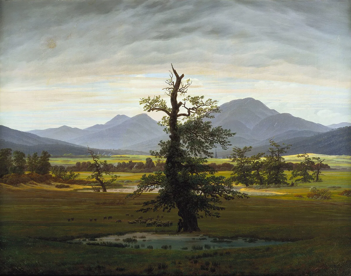
Look at Friedrich's The Lonely Tree. The oak in the foreground has real dark weight — the trunk and shadowed foliage sit in the lower third of the value scale. The mountains behind it are a consistent, compressed blue-grey: no near-blacks, no bright lights, just a relatively narrow mid-range band. The luminous horizon band between them is even lighter and more neutral. Friedrich has stacked three distinct value registers, one per plane, and the recession reads without any need for overlapping forms to explain it.
A useful way to check this in your own work is to squint until you lose detail. In a painting with convincing atmospheric recession, the distant planes should merge into a single soft mass — no dark notes poking through from the background. Understanding value before you tackle atmospheric perspective will make this shift much easier to control.
Color Cools and Greys
The air scatters short-wavelength (blue) light more than long-wavelength (red and orange) light. This is the same physics behind a blue sky. The practical consequence for a painter is that everything far away picks up a blue-grey cast. Warm earth tones cool. Greens turn grey-green. Browns go towards blue-violet. The further something recedes, the more it surrenders its local color to the color of the air itself.
Notice this clearly in Friedrich's mountains: what are presumably dark rock forms have become a flat, desaturated blue-violet, with virtually no trace of whatever warm colors the rock would show close up. The hills in the middle distance hold a little more of their green, but they're already cooler and greyer than the foreground marsh grasses.
This cooling also means that color relationships shift. Two colors that read as warm/cool contrast in the foreground will both move toward cool-grey in the distance, losing that contrast. Saturation — the purity of a color — drops steadily as planes recede.
Edges Soften
A sharp, hard edge tells the eye that two planes are close and clearly differentiated. At distance, scattered light blurs boundaries. The edge where a mountain meets the sky becomes a soft gradation rather than a definite line. Individual forms within a distant mass — the separate trees in a far treeline, the windows of a distant building — lose their definition and merge.
This softening of edges is partly why very tight, detailed painting of distant passages kills depth. If the far mountain has the same edge quality as the foreground rock, the brain places them on the same plane.
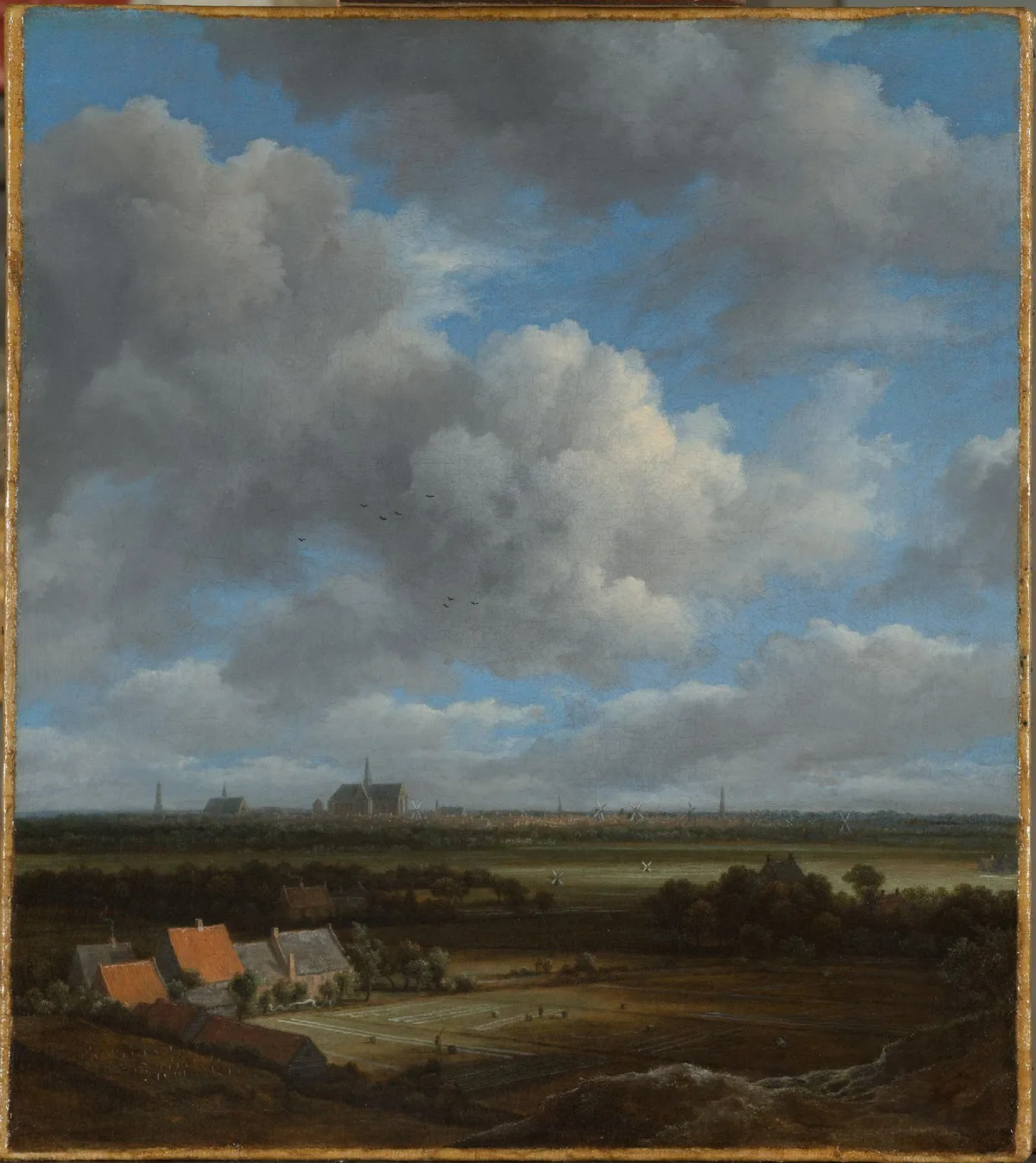
Ruisdael's View of Haarlem makes this edge shift legible across a flat Dutch landscape where there are no mountains to dramatize it. The orange-tiled farm roofs at the lower left are hard-edged and warm. The distant Haarlem skyline — its church towers and windmills visible just above the polder — is dissolved into a soft, low-contrast grey-blue line. Ruisdael had no dramatic topography to work with, so the recession has to carry entirely through these atmospheric shifts, and it does.
Atmospheric Perspective in Art History
Painters discovered this effect long before they could explain the physics. Leonardo da Vinci wrote about it in his notebooks, noting that distant mountains look blue and almost the same hue as the air itself. You can see it in the background of his The Virgin of the Rocks (not shown in this post; Louvre): through the openings in the dark grotto, the far rock spires turn pale blue-grey and soft-edged. It became a central preoccupation of landscape painting from the Renaissance onward.
The Dutch Golden Age painters, Ruisdael among them, systematized it in the flat lowland panorama — a genre where atmospheric recession had to do all the heavy lifting that overlapping forms and elevation changes do in mountain landscapes. The Romantic painters of the early nineteenth century pushed it toward expressiveness: Friedrich and Turner weren't just recording atmospheric effects, they were using them to generate emotional weight.
By the time of the Impressionists, the interest had shifted from depth illusion to the perceptual quality of light itself — but the underlying shifts remain. Monet's haystacks, which we'll return to below, are less about convincing spatial recession than about capturing the exact color temperature of a specific light, yet the atmospheric shifts are still present and accurate.
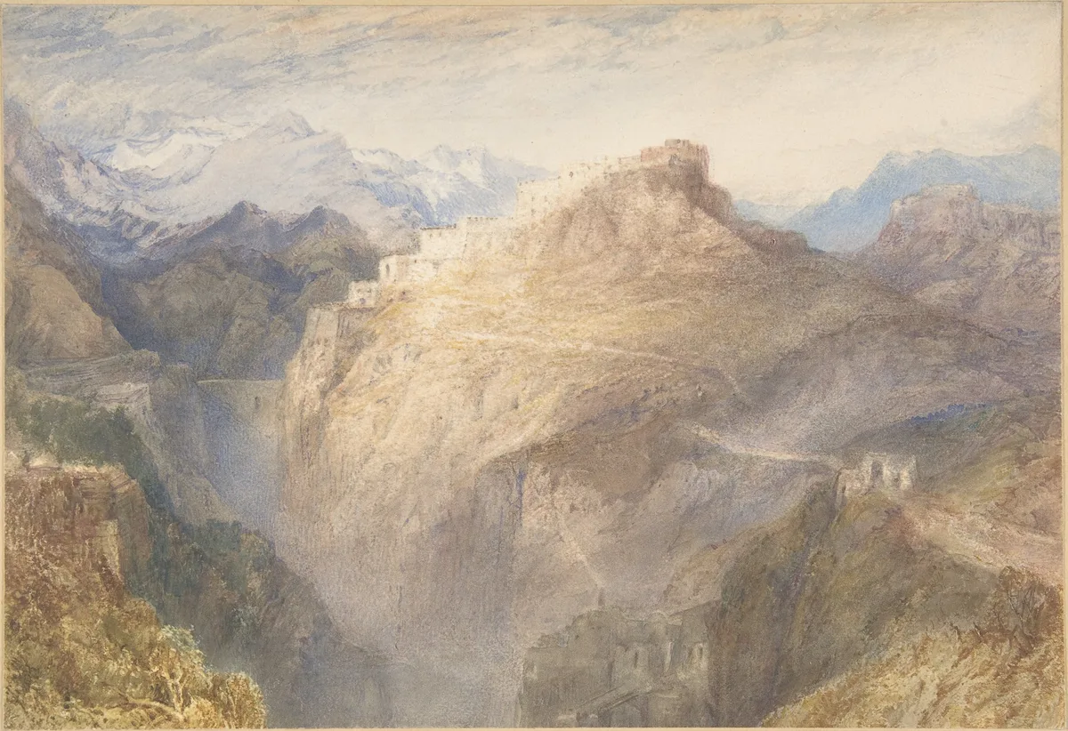
In this Turner watercolor, all three atmospheric shifts operate at once and at high intensity. The warm ochre of the sunlit cliff face in the middle distance is vivid and relatively high in contrast. The snow-capped peaks receding behind it are rendered in a soft blue-grey wash with almost no internal detail — edges lost, values compressed into a narrow mid-light range, color stripped back to near-neutral blue. Turner was working in watercolor, where the medium's natural softness at dilute washes made these transitions easy to achieve, but the underlying logic is identical in oil or pastel.
Diagnose Your Own Work
If your landscapes feel flat — everything equally close, equally insistent — run through these three checks before touching the canvas again.
Check your darkest darks. Are there any true darks in your distant planes? There shouldn't be. If your far mountains have shadows as dark as your foreground rocks, the recession will collapse. Lighten those distant darks until they're clearly in a different value tier from the foreground.
Check your background colors. Mix a color for something in the distance and hold the brush up against your reference or your foreground passages. Is the background color genuinely cooler and greyer, or are you painting the same green you used in the foreground, just smaller? Distance needs more grey, more blue, less of the local color's saturation.
Check your edges. Take a photograph of your painting and reduce it to a small thumbnail on your screen. Do the far passages blur into soft masses? If individual forms are still popping out with hard edges at thumbnail size, those edges need softening in the actual painting.
Check whether your value ranges are stratified. The foreground should occupy the widest value range. The middle distance, a narrower range. The far distance, narrower still. If all three planes are competing for the same values, the depth will flatten. This is the same principle that governs tone and value structure in any painting — getting planes to read separately is a value organization problem first, a color problem second.
One last diagnostic: step away from your painting and look at it from across the room. The things that jump forward uninvited are usually passages where you've accidentally given a distant plane too much contrast, too warm a color, or too hard an edge.
Master Examples
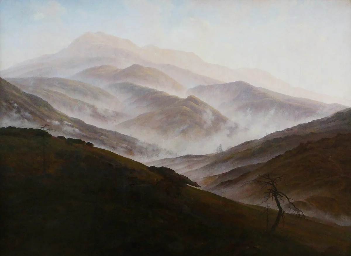
Friedrich, Riesengebirge Landscape with Rising Mist (c. 1819/20). The foreground slope is close to black, and the rocks and the bare tree on its crest stand out as sharp silhouettes. Behind it the ridges step back one at a time, each a little paler and flatter than the one in front, with mist filling the valleys between them. By the farthest peak the mountain has become a pale lilac-grey shape only slightly darker than the sky. Because every ridge sits on its own value step, you can read the distance as a sequence of layers: near things dark and distinct, far things light and merged.
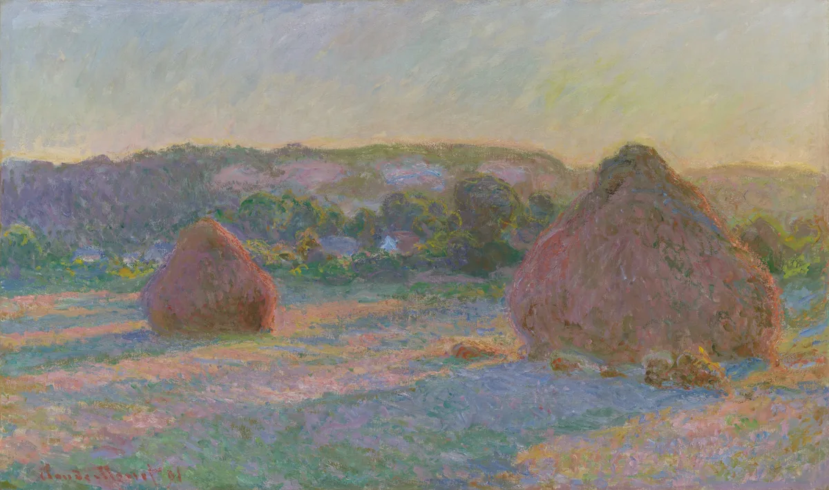
Monet, Stacks of Wheat (End of Summer) (1890–91). The two haystacks are warm, reddish-brown, and textured — they have mass and presence. The tree line and hills behind them are painted in soft, broken touches of muted violet-green, considerably lower in value contrast and cooler in temperature. There are no hard edges on anything in the distance. Even within this relatively shallow landscape, Monet applies every atmospheric shift correctly: the distant planes are lighter in shadow value, cooler in hue, and softer-edged than the foreground masses. See the full work at the Art Institute of Chicago.
The Hudson River School painters — Thomas Cole, Frederic Church, Albert Bierstadt — applied atmospheric perspective at epic scale, pushing vast panoramas of the American wilderness through multiple recession planes, each governed by these same three shifts. Their canvases are worth studying because the sheer size of the distances involved makes the atmospheric changes almost diagrammatic in their clarity.
See It in Value
Critico's 5-tone value view reduces a painting to five posterized tones, which makes the value stratification of atmospheric perspective immediately legible. In the view above, Friedrich's Lonely Tree shows exactly what you're looking for: the foreground marsh and tree trunk occupy the darkest tone; the mountains behind them are locked into a compressed mid-light band with no dark notes; the luminous horizon strip between them is the lightest zone in the painting. Three planes, three distinct value tiers, no distant darks bleeding through. When you run your own landscape through this view, you want to see the same structure — foreground claiming the widest range, distance compressed toward the light end.
Frequently Asked Questions
- What is atmospheric perspective in art? Atmospheric perspective (also called aerial perspective) is the way the air between a viewer and a distant object changes that object's apparent value, color, and edge quality. As distance increases, shadows lighten, colors cool and grey, and edges soften — because dust, vapor, and particles in the atmosphere scatter light and reduce contrast.
- What is the difference between atmospheric perspective and linear perspective? Linear perspective creates depth through the geometry of converging lines and diminishing object size. Atmospheric perspective creates depth through changes in tone, color temperature, saturation, and edge sharpness. Both can operate in the same painting, but they work through different means — linear perspective is mathematical, atmospheric perspective is optical.
- How do you paint atmospheric perspective in a landscape? Apply three shifts simultaneously as planes recede: raise the value of shadows (darks lighten more than lights); cool the color temperature and reduce saturation (warm earth tones move toward blue-grey); and soften edges (hard lines give way to gradual transitions). Keep your darkest darks and most saturated colors in the foreground only.
- Which artists are known for atmospheric perspective? Leonardo da Vinci used it in his painted backgrounds as early as the late 1400s. The Dutch Golden Age painters, including Jacob van Ruisdael, systematized it in panoramic landscapes. Caspar David Friedrich and J.M.W. Turner pushed it toward emotional expressiveness in the Romantic era. The Hudson River School painters applied it at panoramic scale across the nineteenth century.
- Does atmospheric perspective apply to mediums other than oil painting? Yes — the same value, color, and edge shifts apply in watercolor, pastel, gouache, colored pencil, and drawing. Turner used it powerfully in watercolor. In drawing, atmospheric perspective means keeping distant marks lighter in pressure and softer in line quality than foreground marks, even without color shifts.
When I look at a landscape that isn't working, atmospheric perspective is almost always part of the diagnosis. Not the whole story — composition and focal point matter too — but a painting where every plane competes with equal insistence gives the viewer nowhere to stand. Getting the three shifts right — value compression, color cooling, edge softening — gives the landscape air. Actual, physical-feeling air, not just the idea of it.
Upload your own landscape to Critico and run the 5-tone value view. If your distant planes are holding darks that belong in the foreground, you'll see it immediately.