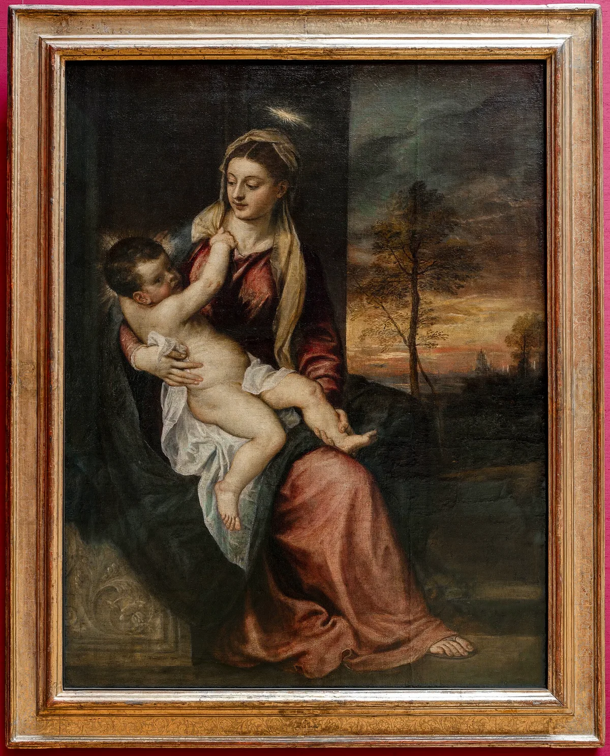
When a painting stops working, value is almost always the first thing I check. Not color, not composition — value. How light or dark every passage is, and how those passages relate to each other. Get value right and a painting reads from across the room. Get it wrong and it stays muddy no matter how carefully you mix your colors.
If you've been painting for a little while and something keeps feeling off, this is the concept worth sitting with. Value in art is the single most powerful tool you have for creating contrast, directing the eye, and making a painting feel three-dimensional — and it's also the one most painters underuse.
What Is Value in Art?
Value is how light or dark a color is, measured on a scale from pure white to pure black. Every color you see — a cadmium red, a burnt sienna, a cerulean blue — sits somewhere on that scale. A pale yellow and a pale lavender can share almost the same value even though they're completely different hues. A deep navy and a dark forest green can be so close in value that they merge when you squint.
That squint test is real, by the way. Painters use it constantly. When you half-close your eyes at a painting, color information drops away and you see only the value structure — the skeleton underneath the paint.
In painting, "value" refers specifically to this light-dark dimension, separate from hue (which color family) and saturation (how intense or muted a color is). You can change a color's value without changing its hue at all: add white to make a tint, add black to make a shade, or add grey to desaturate without significantly shifting lightness.
Why Value Matters More Than Color
Painters new to the craft often reach for color first — mixing the right hue, chasing the right temperature. But color is read through value. A carefully mixed shadow tone is invisible if it's too close in value to the light area next to it. The eye perceives form, depth, and focal points largely through value relationships, not hue.
Value structure makes or breaks a painting before a single color decision matters. Andrew Loomis's Creative Illustration (1947) is organized around that order: tone gets its own section before color does. Working a painting out in monochrome first — settling the value structure before you mix a single hue — is one of the most useful disciplines you can practice.
The practical consequence: if you photograph your painting and convert it to greyscale, the result should still read as a coherent, interesting image. If it goes flat and grey and undifferentiated, the color wasn't carrying as much as you thought.
This is also why the value scale — a simple numbered or stepped chart from white to black — is one of the first tools serious painters internalize. Knowing where your colors fall on that scale before you mix them is not a beginner exercise. It's professional discipline.
The Three Dimensions of Color: Hue, Value, and Saturation
To be precise about value, it helps to understand the three dimensions every color occupies:
Hue
Hue is the color family — red, yellow, blue, green, orange, violet. When we say "what color is that?" we're usually asking about hue. It's the least important of the three dimensions for structural painting decisions.
Value
Value is the light-dark position. On a standard ten-step scale, 0 is white and 10 is black (or the reverse, depending on who made the chart). Most realistic paintings operate in a compressed range — roughly steps 2 through 8 — and reserve the extremes for accents.
Saturation
Saturation (also called chroma or intensity) is how pure or muted a color is. A fully saturated red is fire-engine bright. Desaturate it and it becomes a brick tone, then a grey-red, then a near-neutral. Saturation and value interact: highly saturated colors often read lighter or more prominent than their actual value position would suggest, which is one reason saturation management is a more advanced topic.
For now, the critical point: when you're reading or discussing what is value in art, you're talking specifically about that light-dark axis — not the color itself.

How Value Creates Form, Depth, and Focal Points
Value does three distinct jobs in a painting, and understanding each separately makes you a more deliberate painter.
Form: Making Flat Paint Look Round
A circle is flat. A sphere looks three-dimensional because it has a light side, a shadow side, a core shadow, a halftone transition zone, reflected light, and a cast shadow — all rendered as different values. Value is the language form speaks.
When painters talk about modeling (building up the illusion of volume), they're almost entirely talking about value. The exact hues matter less than where the lights and darks fall and how abruptly or gradually they transition.
Depth: Separating Near from Far
Value also creates spatial recession. In atmospheric perspective, distant objects lose contrast — their darks lighten and their lights darken until everything in the far distance converges toward a medium grey. Landscape painters often use this aggressively; the foreground elements often have the sharpest value contrast, pulling them forward in space, while the distance bleeds into a luminous middle tone.
In portrait painting, slightly reducing the value contrast on edges that recede — the far side of a face, the underside of a chin — gives a convincing sense of three-dimensional space without any perspective tricks.
Focal Points: Telling the Eye Where to Go
The human eye is drawn to the area of highest contrast in a painting. If your darkest dark sits directly against your lightest light, that's where attention goes first. Painters use this as a directional tool: place your maximum value contrast at your focal point, and the viewer's eye will find it without any conscious effort.
Rembrandt's Man in Oriental Dress (above) is a clean example. The white turban and the lit face beneath it sit in the zone of sharpest value transition — light surfaces emerging from near-black shadow. Everything else in the painting occupies a narrower, less dramatic value range. The focal point is not stated; it is made, through value contrast alone.
This relationship between value and emphasis is explored in more depth in Emphasis in Art: How Painters Tell You Where to Look.
The Value Scale in Practice
A value scale is a tool — usually a strip of evenly stepped tones from white to black, with anywhere from five to ten steps. Holding one next to your painting or your reference lets you assess where individual colors actually sit, rather than where you think they sit.
One of the most common beginner errors is painting shadows that are too light. In natural light, the difference between the lightest light and the darkest shadow is often six to eight steps on a ten-step scale. Beginners frequently compress shadows into the midtone range, which produces a flat, airless result. Push those darks down. The painting will suddenly have air in it.
The value scale also makes it possible to plan a painting's structure before you mix a drop of color. Many painters — particularly those working in the notan tradition — do a small black-and-white study first, establishing where the major light and dark masses will fall. If the design reads as a compelling arrangement of dark and light shapes, the color pass has a strong foundation to build on. If it doesn't, adding color won't fix it.
For a full treatment of the scale itself, see The Value Scale: The Foundation Painters Keep Coming Back To. For the notan approach to value structure, Notan Art: The Value Study That Changes How You See goes deeper on the two-tone planning method.
Diagnose Your Own Work: Is Value the Problem?
Before adjusting color or composition, run these checks on a painting that isn't reading the way you want it to:
1. Photograph it and desaturate. Open your phone's photo app, convert the image to black and white, and look at it for thirty seconds. Does a clear focal point emerge? Are there distinct light, midtone, and dark areas? Or does everything collapse into an undifferentiated grey mass? If it's the latter, value is your problem — not color.
2. Squint at the original. Half-close your eyes until your vision blurs. The major value masses should simplify into two or three clear shapes. If they don't — if the painting breaks up into a scatter of competing tones — the value structure lacks coherence.
3. Find your lightest light and your darkest dark. Hold a piece of white paper next to your lightest passage. Hold a piece of black paper next to your darkest passage. If the lightest passage isn't close to the white paper, you've compressed your highlights. If the darkest passage is visibly lighter than the black paper and isn't intentionally atmospheric, your darks are too timid.
4. Check your focal point. Where does the highest value contrast live in your painting? Is that where you want the viewer's eye? If not, either increase contrast at your intended focal point or reduce it everywhere else that's competing.
5. Count your value zones. A common structural approach is to work with three to five distinct value zones (not twenty). If your painting has values scattered across the full scale with no clear grouping, simplify. Merge lights into fewer, connected light shapes; do the same for shadows. The painting will feel more decisive.
Master Examples: Value at Work in the Canon
Value is not a modern pedagogical concept — painters have understood and exploited it for centuries. Here are four canonical examples, each demonstrating a distinct use of value.
Rembrandt van Rijn, Man in Oriental Dress, 1635 — The white turban and the lit face beneath it are the zone of maximum value contrast: light surfaces set against deep shadow. All other elements — the garments, the background — occupy a narrower, more compressed value range. The composition demands no interpretation; the eye goes where Rembrandt put the contrast. See the Rijksmuseum's record for a high-resolution view.
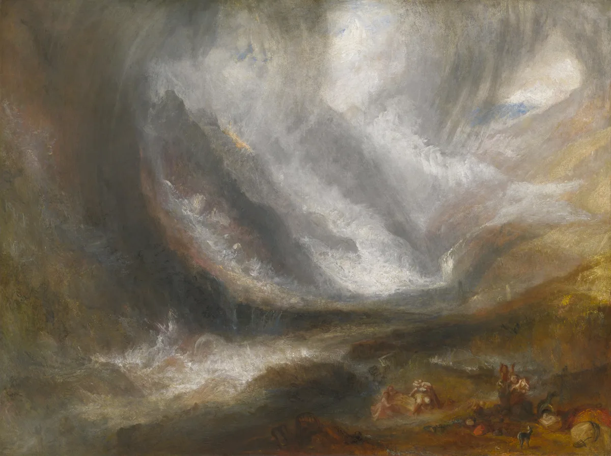
J.M.W. Turner, Valley of Aosta: Snowstorm, Avalanche, and Thunderstorm, 1836–37 — Turner builds deep space here with value and atmosphere rather than linear perspective. AIC holds this work; their collection page includes conservation details worth reading.
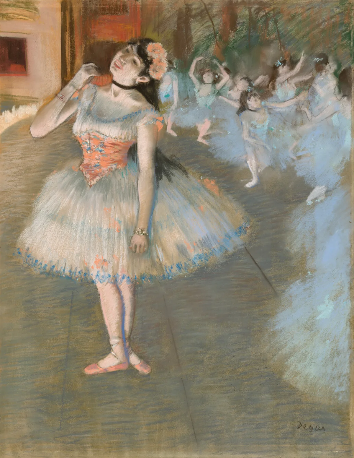
Edgar Degas, The Star, 1879/81 — Degas places the dancer's white tutu at the highest value against a stage floor that drops several steps darker. The supporting dancers in the background are held at low contrast and low saturation — they exist, but they don't compete. It's a precise, controlled value decision that makes the solo dancer read immediately, without any graphic outlining. AIC's collection page has a fine image.
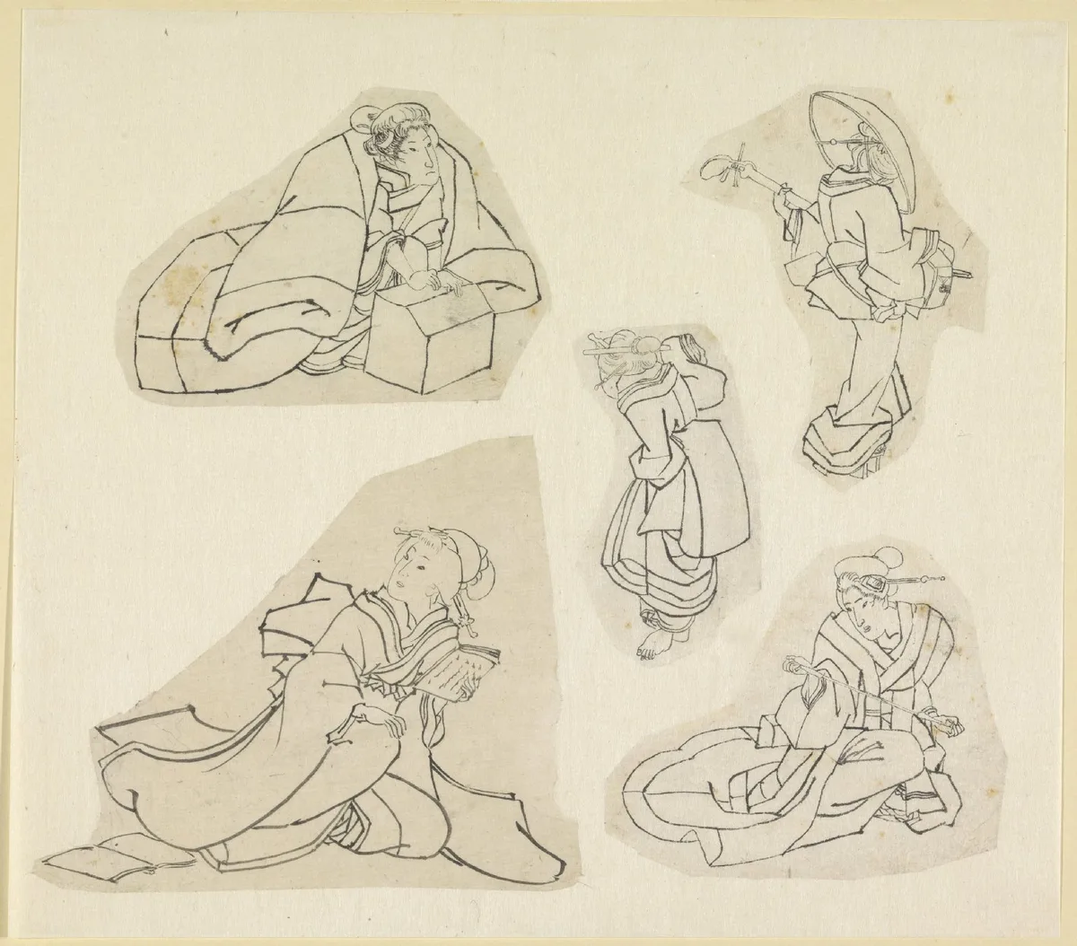
Katsushika Hokusai, Vijf vrouwenfiguren (brush drawings) — These drawings work without value modeling at all: each figure is built from dark ink outlines on pale paper, with no shading. The contrast between line and paper does the work Western painters often give to tonal gradation. It's a useful reminder that value structure can operate through clear separation of line and ground, not just through soft transitions. The Rijksmuseum's record has this sheet in high resolution.
Try It with Critico
One of the most useful things Critico does is show you where your value contrast actually lives — not where you think it does. Drop a photo of your own painting into the tool and switch to the value view. The overlay strips out hue and saturation and renders your painting in its true value structure. You'll see immediately whether your focal point has the strongest contrast in the frame, whether your shadows are too light, and whether your value masses are reading as coherent shapes or scattering.
Frequently Asked Questions
-
What is value in art, simply explained? Value is how light or dark something is — a scale running from pure white to pure black. Every color in a painting has a value position, and managing those positions is how painters create form, depth, and focal points.
-
Is value the same as tone in painting? Yes, essentially. "Tone" and "value" are used interchangeably in most painting instruction. Some British teaching traditions prefer "tone," while North American painting instruction more commonly says "value." They refer to the same light-dark dimension of color.
-
Why do painters say value is more important than color? Because the eye perceives structure, form, and spatial depth primarily through value relationships, not hue. A painting with correct value structure will read clearly even in black and white. A painting with beautiful color but weak value structure will look flat and muddy no matter how accurate the hues are.
-
How do I check value in my own paintings? The fastest method is to photograph the painting and convert the image to black and white on your phone. If the focal point is clear and distinct value masses are visible, your value structure is working. If everything collapses into a similar grey, the values are too compressed or too scattered. Squinting at the original painting does the same thing more quickly.
-
What is a value scale and how do I use one? A value scale is a strip of evenly spaced tones from white to black, typically with five to ten steps. Hold it next to your reference or your painting to identify where specific passages actually fall on the light-dark scale. It's the most direct tool for catching the common error of painting shadows too light or highlights too weak.
Value is not a complicated idea — it's just light and dark. But understanding how deliberately painters use it, and training yourself to see it separately from color, changes how you look at every painting you encounter and every canvas you make. Start with the squint test on your current work. If the value structure holds up under half-closed eyes, you have something to build on. If it doesn't, that's your next painting problem to solve — and a clear one.