
When a painting isn't working, most of us feel it before we can name it. Something's off — too busy, too flat, somehow inert — but the harder you stare, the harder it is to say why. Learning how to critique your own work is the skill that closes that gap. Not fault-finding for its own sake, but a structured way of reading a painting the same way a thoughtful viewer would: starting with the largest shapes, moving toward the details, asking one question at a time.
This framework won't make critique easy, but it will make it methodical. And method is what separates useful self-assessment from the circular frustration of just knowing something's wrong.
What Does It Mean to Critique a Painting?
A critique, in the painting sense, is a systematic examination of how well the visual elements of a work support its intention. It's distinct from opinion ("I don't like this palette") and from description ("there's a tree at the left"). A good critique identifies relationships: how value (the lightness or darkness of a passage) supports or undermines the focal point, how edge quality directs or scatters attention, how the temperature of a shadow either holds space or flattens it.
The goal isn't to produce a verdict. It's to produce a diagnosis — specific enough that you know what to try next.
The Five-Layer Critique Framework
Work through these layers in order. Each one builds on the one before it, and jumping to details before you've settled the large-scale questions is how critiques go in circles.
Layer 1: The Thumbnail Test — Value Structure First
Squint at your painting until the detail disappears. What you're left with is your value structure (the overall pattern of lights and darks), and that pattern tells you almost everything about whether the composition will read at a distance.
Ask: Is there a clear light mass, a mid-tone mass, and a dark mass? Do they form a readable pattern — roughly three to five distinct value groupings, not a scattered mosaic? A strong composition can usually be reduced to a simple notan pattern (a two-value sketch of light against dark). If your squinted thumbnail looks like static, the value structure needs simplifying before anything else matters.
The canonical test here is Rembrandt's The Night Watch (1642, Rijksmuseum). Even in a postage-stamp reproduction, the lit central figures punch out of the dark crowd with no ambiguity. The value design does its job at every scale.
Layer 2: Focal Point and Eye Movement
Once the value structure holds, check whether your eye lands where you intended — and whether it stays in the picture.
The focal point (the passage of greatest visual interest, usually where contrast, detail, and edge sharpness converge) should be deliberate, not accidental. Trouble usually shows up in one of two ways: either there's no dominant focal point (the eye wanders without landing), or there are competing focal points of equal weight that split attention.
Trace the path your eye takes through the painting. Does it loop back to the focal point, or does it drift to a corner and fall off the edge? Compositional devices like leading lines, value gradients, and lost edges all exist to manage this movement. If your eye is escaping through the upper-right corner, ask what's pulling it there — usually a stray highlight or an edge that's too sharp for its importance.
For a deeper look at this question, Focal Point in Painting: Guiding the Viewer's Eye walks through the mechanics in detail.
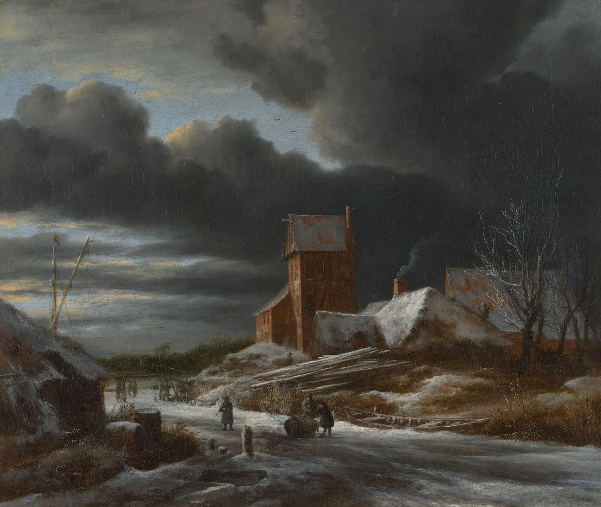
Ruisdael's Winter Landscape (c. 1665) is a useful study here. The pale luminous sky occupies the largest light mass in the composition; the dark silhouetted trees in the foreground create a hard edge that frames it. Your eye enters from the bottom, travels up the trunk line, and settles in the sky. The path is almost inevitable — which is the point.
Layer 3: Edges — Lost, Hard, and Everything Between
Edges are where most intermediate painters lose control without realizing it. A painting with every edge rendered at the same crispness will look airless and over-worked, even if every value and color is correct.
The rule of thumb: hard edges come forward and attract attention; soft, lost edges recede and allow passage. Your sharpest edge should be at or near the focal point. Everything else should be softer in proportion to how far it is from that point — in space, in value importance, and in narrative importance.
Run your eye along every major edge in your painting. Ask: Is this edge sharper than it needs to be? Does it pull attention toward a passage that doesn't deserve it? Backgrounds are the most common culprit — a well-observed distant treeline rendered with the same crisp edges as the foreground figure will compete for attention and flatten the sense of depth.
This connects directly to how Emphasis in Art: How Painters Tell You Where to Look uses contrast to create hierarchy — edge contrast is one of the primary tools.
Layer 4: Color Temperature and Harmony
Color problems are often diagnosed last but are actually the layer where the most time gets wasted, because people try to fix color before sorting out value and edges. Fix layers 1–3 first.
Once those hold, check temperature: are your lights warm and shadows cool, or vice versa — and are you consistent? In direct outdoor light, shadows typically shift cooler (sky light, which is blue) while lit passages warm up. In interior or artificial light, the reverse is common. Either system works; inconsistency doesn't.
Check harmony by looking at the dominant temperature of the whole canvas. Every painting benefits from a temperature bias — leaning warm or cool overall — with accents from the opposite temperature. A canvas that's neither warm nor cool, just gray in every passage, reads as unresolved.
Layer 5: Intent vs. Execution
The last question is the hardest: does the painting do what you wanted it to do?
This requires you to remember what you intended before the painting started pulling you in unexpected directions — which is why experienced painters sketch, thumbnail, and set an intent in words before they pick up a brush. If you know you wanted to convey the weight and stillness of an overcast midwinter afternoon, ask whether a viewer coming in cold would feel that. Not whether they'd guess the scene, but whether they'd feel the mood.
This is also where you assess the handling itself. Did the technique you used match the feeling you were after? The swirling, loaded brushwork in Delacroix's Christ Asleep during the Tempest is the test case: in a smooth, controlled finish the same scene would lose its force — the turbulence is in the marks, not just the subject.

Diagnose Your Own Work: A Practical Checklist
Run through these checks in sequence on your current painting. Be honest, and do them in order — don't skip to color if you haven't resolved value yet.
Value structure
- Can you identify three to five clear value groupings when you squint?
- Is the lightest light touching (or very near) the focal area?
- Is the darkest dark also near the focal area, creating maximum contrast there?
Focal point
- Where does your eye land first? Is that where you intended?
- Are there competing focal points of equal value contrast or edge sharpness?
- Does your eye loop back into the painting, or does it drift off an edge?
Edges
- Is the sharpest edge in the painting at or near the focal point?
- Are your background edges softer than your foreground edges?
- Are there any edges in unimportant passages that are crisper than they need to be?
Color and temperature
- Is there a consistent warm/cool system in your light and shadow?
- Does the painting have an overall temperature bias, with accents from the opposite temperature?
- Are any passages a flat, temperature-neutral gray that could be pushed warmer or cooler?
Intent
- Can you state in one sentence what you were trying to convey?
- Would a viewer arriving cold get that feeling without explanation?
- Does the handling — brushwork, texture, finish — serve the mood or work against it?
If you'd like a more focused look at the value piece of this checklist, The Value Scale: The Foundation Painters Keep Coming Back To goes deep on exactly that question.
Master Examples in Critique
Applying the framework to established works is the fastest way to internalize it. Here are three more paintings worth running through the layers.
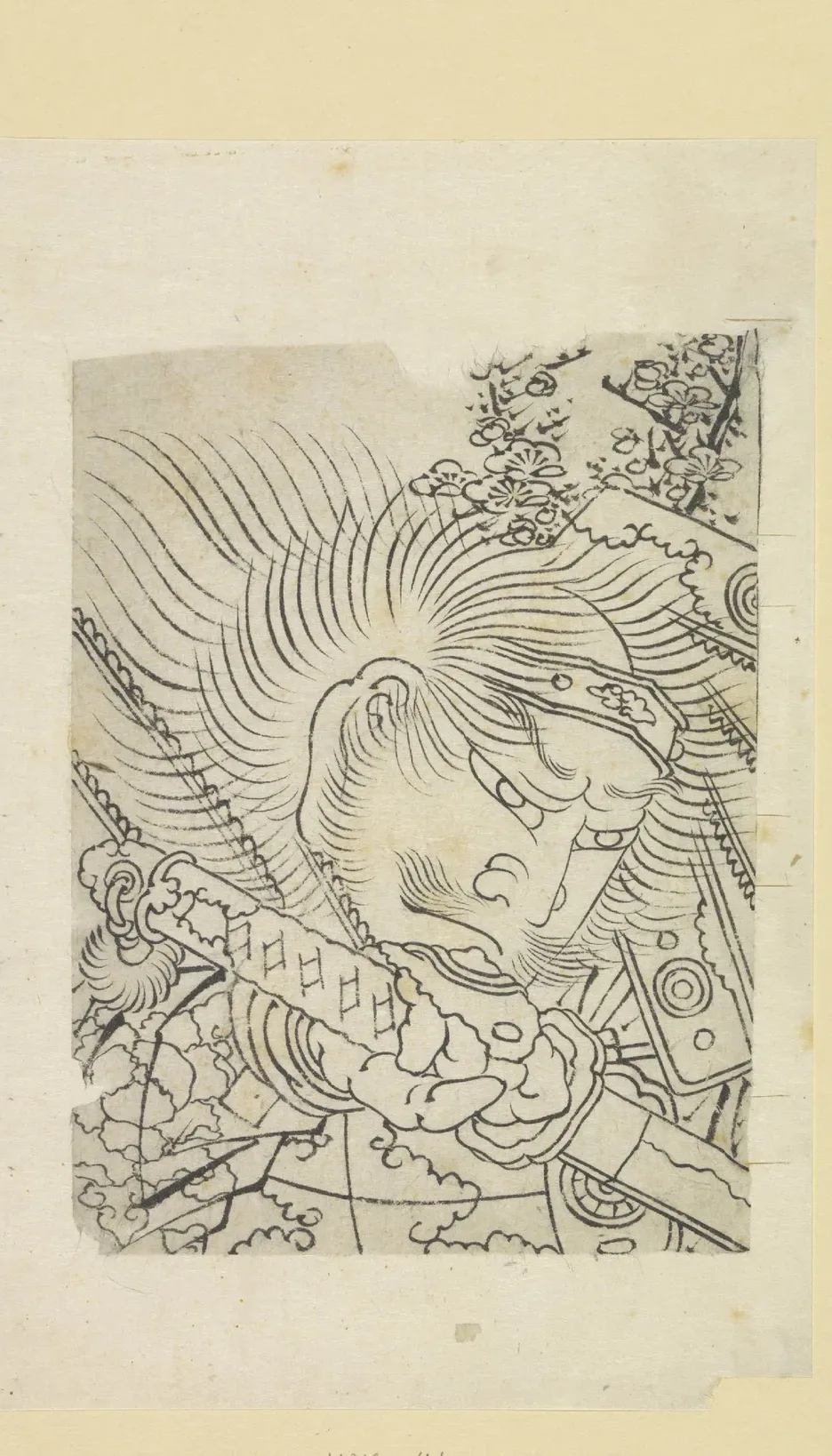
Hokusai, Head of a Samurai under Cherry Blossoms (brush and ink drawing, Rijksmuseum): This brush drawing uses radical value simplification — there is almost no mid-tone here, just a bold dark shape against a lighter ground with the blossoms as decorative incident. The thumbnail test resolves in under a second, which is exactly why the image has stayed arresting for over a century. It's a lesson in what happens when you commit to notan — the two-value structure — instead of hedging toward mid-tone mud. See also Notan Art: The Value Study That Changes How You See for a full treatment of this approach.
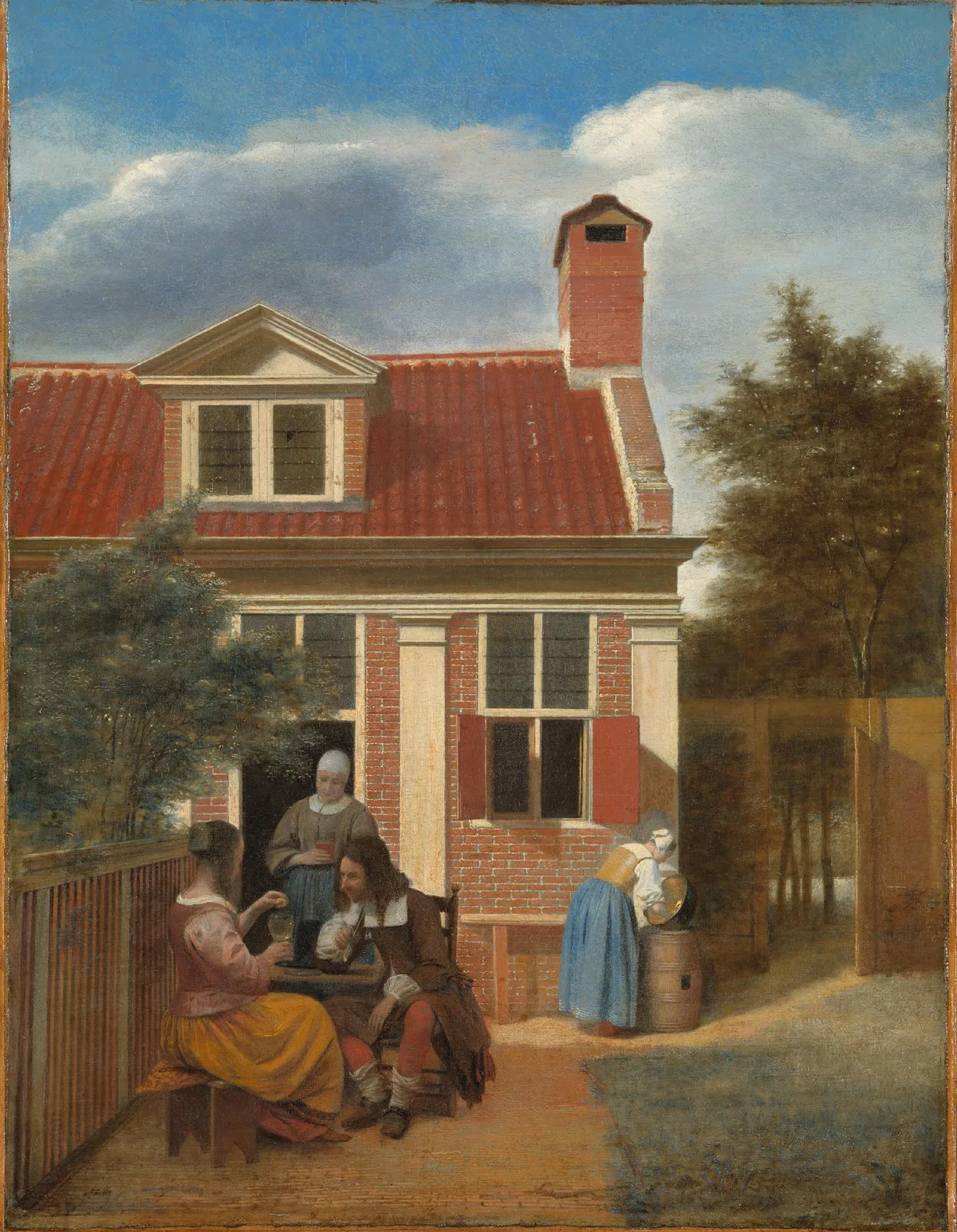
Pieter de Hooch, Three Women and a Man in the Courtyard behind a House (c. 1663–65, Rijksmuseum): De Hooch is a masterclass in edge management and spatial layering. Notice how the passage through the doorway into the interior is handled with softer edges and a distinct value shift — you feel the depth without being told about it. His focal figures are crisply lit, but everything in the middle and far distance loses edge by careful degrees. Run the edge checklist on this painting and you'll find it passes every item.
Caspar David Friedrich, Eismeer (1823–24, Hamburger Kunsthalle, via Wikimedia Commons): Return to the hero image. The painting's mood — the crushing indifference of nature, the scale of ruin — is legible without a title. The diagonal thrust of the ice floes creates an unstable, vertiginous composition that would fail the "restful" test and pass the "overwhelming weight" test. This is Layer 5 in action: the composition serves the feeling, and the feeling is the point. Critiquing it without first asking what it's trying to make you feel would lead you to call the composition "unbalanced" and miss that the imbalance is doing the work.

See It Clearly with Critico
Running your painting through the framework above takes practice, especially the early layers. Critico is designed to speed up the part that painters find hardest: seeing their own work objectively. Drop a photo of your painting into Critico, and it returns a structured critique covering value structure, focal point, edge quality, and color temperature — the same sequence as the five-layer framework. It won't replace the judgment you build over years, but it will tell you clearly where the large-scale problems are before you spend another hour chasing details.
Frequently Asked Questions
- What does it mean to critique your own painting? Critiquing your own work means systematically examining how well your visual choices — value, edges, focal point, color — support what you were trying to achieve, rather than just deciding whether you like the result.
- How do I know if my painting's focal point is working? Squint at the painting and notice where your eye lands first. If it doesn't land near where you intended, look for unintended contrast or sharpness pulling it elsewhere. The Focal Point in Painting post covers the mechanics in detail.
- Why should I critique value before color? Color problems are often symptoms of value problems. If your lights and darks aren't creating a clear, readable pattern, adjusting hue and saturation won't fix it — you'll just be moving the confusion around. Settle value first, then address color.
- How is critiquing a painting different from critiquing creative writing? In writing, critique typically addresses structure, voice, clarity, and whether the prose serves the story's intent. In painting, the equivalent questions are about value structure, composition, edge quality, and whether the technique serves the mood. Both disciplines share the core idea: diagnosis before prescription, and intention before judgment.
- How often should I formally critique my own paintings? Most working painters find it useful to run a structured critique at two points: once at the block-in stage (before committing to color) and once after the painting feels "done." The mid-painting check catches structural problems while they're still correctable; the final check asks the honest intent question.
Critique is a discipline, not a verdict. The five-layer framework — value structure, focal point, edges, color temperature, intent — gives you a way into any painting that isn't quite working, including your own. Start at the largest scale and move toward the detail. Ask one question at a time. And when you're not sure what your eye is doing, a tool that strips away the color and shows you the structure can be the clearest mirror you have.