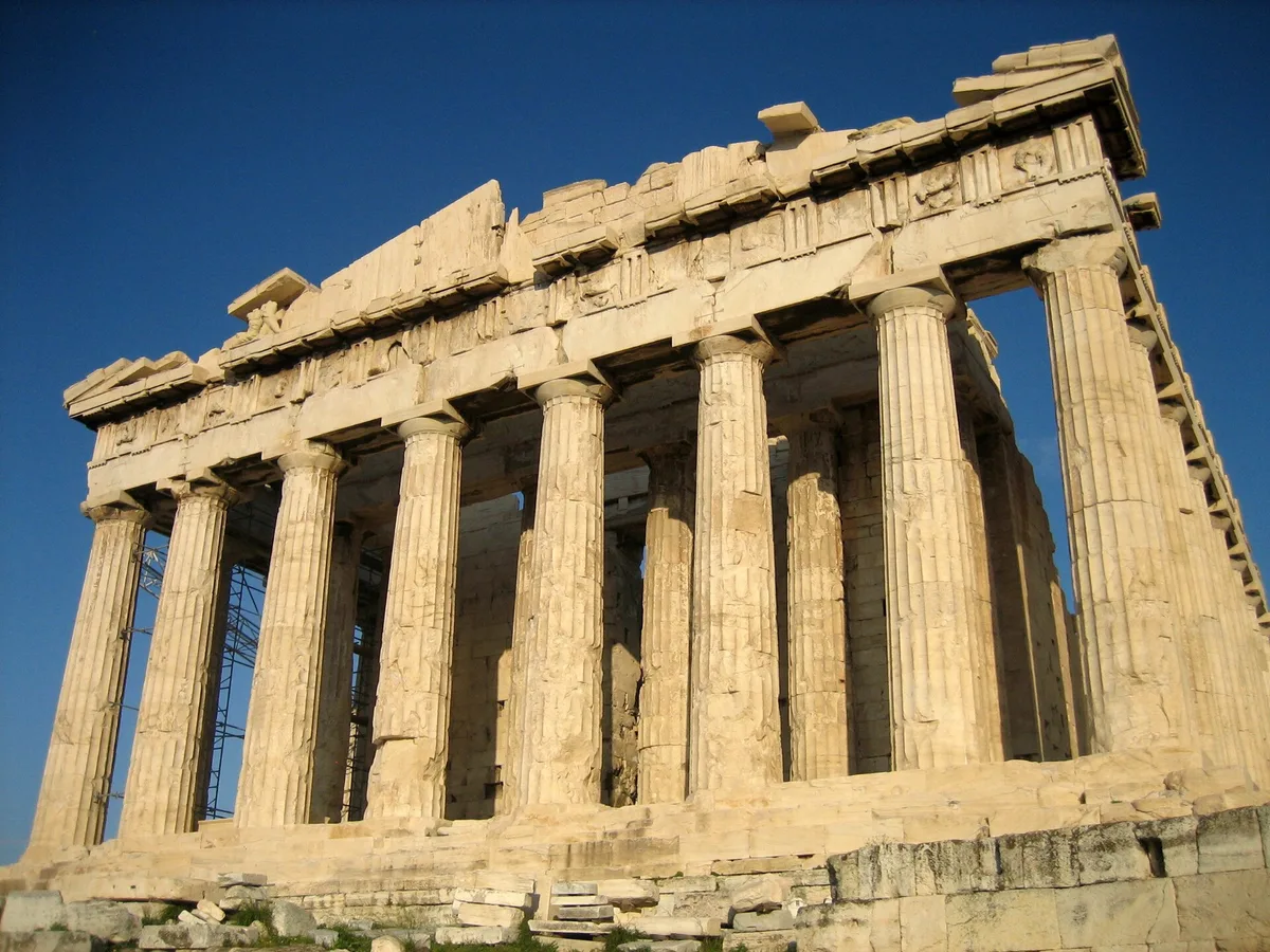
The golden ratio in architecture is one of those ideas that turns up everywhere — in breathless listicles about the Parthenon, in architectural theory courses, in the sketchbooks of painters trying to make sense of proportion. It also turns out to be more contested than most of those sources let on. If you've been told that Greek temples were designed around phi (φ ≈ 1.618), or that Le Corbusier's buildings "use the golden ratio," the honest answer is: sometimes yes, often probably not, and almost always it's more complicated. That complexity is actually the useful part — for painters as much as architects.
This post untangles the real history, looks at where the ratio genuinely shows up and where the claim is shakier, and ends with something concrete: how thinking about proportion at all — golden or otherwise — can improve the way you compose a painting.
What Is the Golden Ratio?
The golden ratio is a relationship between two lengths: the larger part (a) relates to the smaller (b) in the same proportion as the whole (a + b) relates to the larger. Algebraically: a/b = (a + b)/a ≈ 1.618. This number, phi (φ), is irrational — it never resolves into a neat fraction, which gave it an almost mystical reputation in Renaissance and Baroque intellectual circles.
A golden rectangle has sides in that ratio. A golden spiral (the curve that art teachers love to overlay on photographs) is constructed by repeatedly cutting golden rectangles into squares, then drawing a quarter-circle through each square. The spiral is closely related to the Fibonacci sequence — 1, 1, 2, 3, 5, 8, 13, 21 — where each number divided by the previous one approaches phi as the sequence lengthens.
What phi is not, despite the mythology: a universal law of beauty, a deliberate secret embedded in every monument of Western civilization, or a reliable predictor of aesthetic pleasure. The psychological research on whether people reliably prefer golden-ratio rectangles to other near-square rectangles is genuinely mixed. Keep that in mind as we look at the buildings.
Early History: What the Evidence Actually Shows
The claim most often repeated is that the Great Pyramid of Giza encodes phi. The argument rests on the ratio of the pyramid's slant height to half its base — a ratio that does come close to 1.618. The problem is that there is no documentary evidence the ancient Egyptians were aware of this number as a mathematical concept. The near-coincidence may follow naturally from the construction method: Egyptian builders specified slopes as a seked — the horizontal run per cubit of rise — and a seked of 5½ palms per 7-palm cubit (a run-to-rise of 11:14) produces phi-adjacent proportions automatically, without anyone intending them.
The Parthenon is the most famous case, and also the most mythologized. The claim that its façade fits neatly inside a golden rectangle isn't ancient — it traces to Adolf Zeising, a 19th-century German psychologist who argued in the 1850s that phi was a universal law of beauty running through nature and art, and cited the Parthenon as supporting evidence. There's no documentary evidence any Greek architect worked from phi as a design principle. What Athenian builders were demonstrably doing, with real precision, was something else: careful 19th-century surveys of the Parthenon — starting with John Pennethorne's 1844 theories and confirmed by Francis Cranmer Penrose's exhaustive 1851 measurement campaign — showed that its "straight" lines aren't straight at all. The columns lean slightly inward, the platform curves almost imperceptibly upward toward the center, and these are deliberate refinements that correct for how a rigidly straight building would look distorted at a distance. That's real, measured, and arguably more impressive than a hidden ratio would be — it just isn't about phi. None of it is visible in a photograph like the one at the top of this post, which is rather the point: the refinements work precisely because the eye doesn't notice them. Golden rectangles drawn over the façade, meanwhile, depend heavily on where you choose to start and stop the rectangle — at the lowest step or the stylobate, the cornice or the vanished peak of the pediment — which is why the Parthenon-phi claim remains contested rather than settled. Even the name is later than the legend: Luca Pacioli called the ratio the divine proportion in 1509, and the term "golden section" only appears in the 1830s.
Medieval Architecture: Gothic Proportion Without Phi
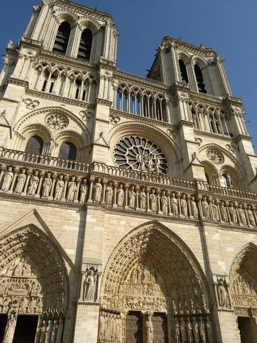
Medieval cathedral builders worked with proportional systems, but the tools they left evidence of are practical geometry, not phi. The best-known is ad quadratum: rotating a square 45 degrees inside a larger square and using the result to set the next dimension, which produces ratios based on √2 (about 1.414) rather than 1.618. Modern scholars have proposed ad quadratum and related schemes as the basis for the plans and elevations of Gothic cathedrals, including Chartres and Notre-Dame de Paris — but these are reconstructions from measurements, not records left by the builders, and they remain debated.
Notre-Dame's west façade is a good place to see why such analyses are tempting. It is organized as stacked horizontal bands — the three portals at the bottom, the rose window in the middle, the open gallery and the twin towers above — and the vertical divisions repeat from band to band. Golden rectangles have been drawn over it too, with the same problem as the Parthenon: the result depends on which edges you choose. What the façade shows without any overlay is a consistent system of divisions applied across the whole front, and that consistency is what makes it feel ordered. The ratio itself matters less than the commitment to one.
Renaissance: Where the Connection Gets Real
The Renaissance is where you find genuine, documented interest in phi as an explicit design principle. Luca Pacioli's De Divina Proportione (1509), illustrated by Leonardo da Vinci, named and celebrated the ratio and argued for its divine and aesthetic significance. Whether architects immediately translated this into buildings is a separate question, but the intellectual context was firmly established.
Leon Battista Alberti wrote extensively on proportion in architecture — his De Re Aedificatoria argues that buildings should be governed by ratios derived from music and from the human body. The Vitruvian tradition (Vitruvius being the Roman architect whose writings survived the medieval period and became the Renaissance bible of architecture) tied ideal proportion to the human form, which is exactly what Leonardo was visualizing in his Vitruvian Man drawing.
Le Corbusier and the Modulor
The most clearly documented case of a 20th-century architect deliberately building around phi is Le Corbusier. In the 1940s he developed the Modulor — a proportional system based on the golden ratio and the dimensions of an idealized 6-foot human figure. He used it systematically in the Unité d'Habitation in Marseille (completed 1952): the dimensions of the apartments, the ceiling heights, and the facade grid all reference Modulor values. This is not a retrofit projection — Le Corbusier documented the system in two books and applied it as a practical design tool. Whether the resulting buildings are more beautiful than they would have been without it is, again, genuinely arguable.
Does the Golden Ratio Really Make Buildings More Beautiful?
The honest answer is that no one has demonstrated this convincingly under controlled conditions. The studies that claim people prefer golden-ratio rectangles tend to be poorly controlled — participants are often choosing between very different shapes (very squat vs. very elongated vs. near-square), and near-square proportions in general tend to score higher. When the comparison is tightened to rectangles all near phi, preferences scatter.
What does seem to matter is internal consistency. Buildings that feel harmonious — the Pantheon in Rome, Palladio's Villa Rotonda, the better Modernist buildings — tend to have dimensions that relate to each other in predictable ways, whatever the underlying ratio. The ratio is a system for achieving that consistency, not a magic property of 1.618 itself.
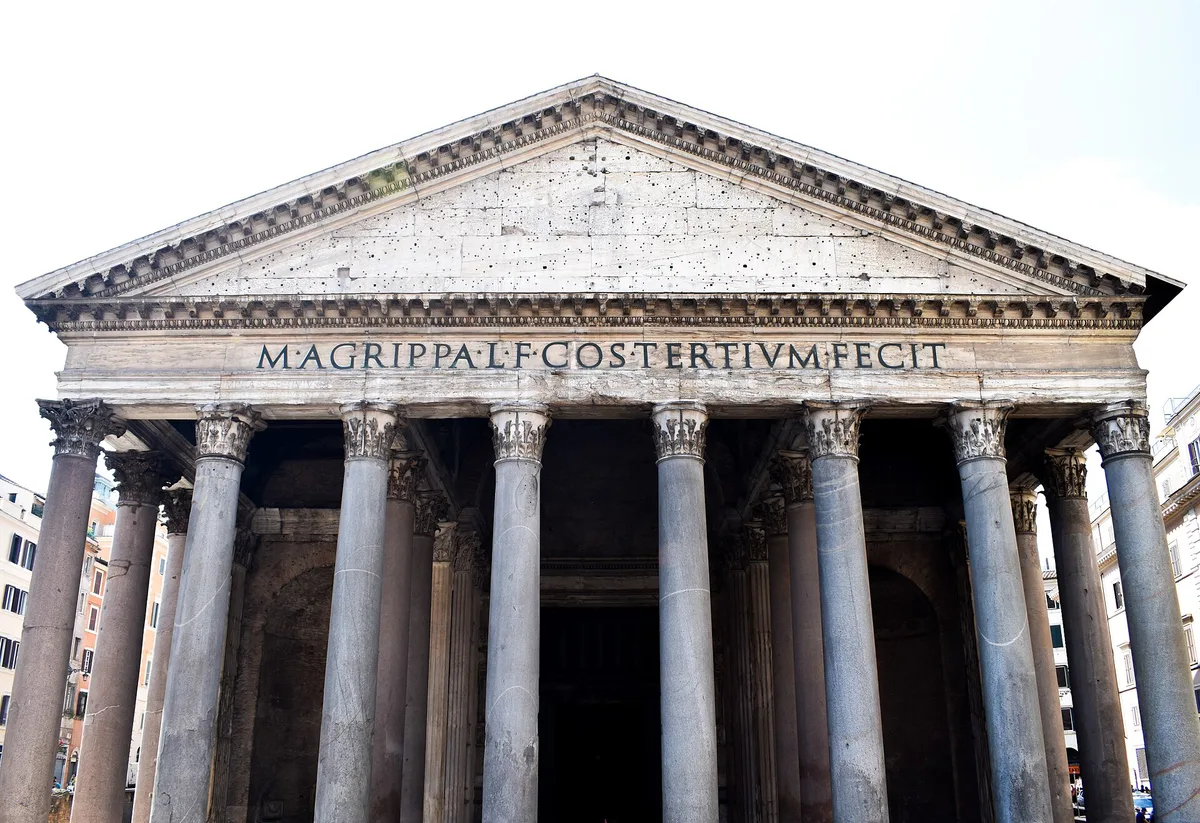
The Pantheon is a clear example of a building whose harmony comes from a simple, consistent geometry rather than phi. The portico in the photo is a classical temple front — columns, frieze, pediment — but the famous proportion is inside: the rotunda's dome is as wide as the distance from the floor to the oculus at its top, so a complete sphere would fit within the space. That 1:1 relationship is easy to feel when you stand inside, and it has nothing to do with 1.618.
For painters, this reframes the question usefully. You are not hunting for a hidden frequency that triggers pleasure in the viewer. You are asking: do the proportions in my composition relate to each other in a way the eye can follow?
Applying These Ideas to Your Own Paintings
If you paint architectural subjects — or if you're simply trying to understand how proportion works in composition — here are specific self-checks.
Check your major divisions. In a painting of a building or an interior, where does your horizon line sit? Where do the dominant verticals fall? These are your primary proportional decisions. Try dividing your canvas with a golden rectangle overlay (Critico's golden spiral tool can generate this for any canvas size) and see whether your key lines already echo those divisions — or deliberately cut against them.
Look for internal echoes. In a strong architectural composition, a proportion that appears at large scale (the ratio of wall to window) often reappears at a smaller scale (the ratio of window width to window height). This is the principle Alberti was after. If your painted building feels flat or incoherent, check whether your proportions are echoing each other or fighting each other.
Don't mistake coincidence for cause. If you overlay a golden spiral on your painting and a curve roughly passes near your focal point, that's interesting — but it doesn't confirm the painting works because of phi. The painting works (or doesn't) because of value structure, focal point clarity, and edge control. Proportion is one tool among several, and it operates on the same level as the others.
Use the ratio as a starting constraint, not a post-hoc justification. The productive way to use phi is before you begin — to proportion your canvas, to locate the primary horizon, to decide where the dominant vertical sits. After the painting is done, overlaying grids to confirm you "used" phi is mostly rhetorical.
Master Examples: Proportion in Painting
The same idea — consistency over a magic number — applies on canvas. Two paintings worth pulling up next to this post (they're discussed in text here; the Fibonacci sequence in art post shows both):
Raphael, The Alba Madonna, c. 1510. Raphael's circular tondo format is itself a proportional choice — the circle containing a triangle of figures. The three heads describe a triangle whose geometry keeps the eye circulating without a single dominant pull. This is proportion operating at the compositional level, not at the level of a single ratio: the relationship between the circle's diameter and the triangle's height, the spacing of the three figures within the field. Study it for how internal shapes echo the outer boundary — the National Gallery of Art's collection page has high-resolution detail views worth spending time with. You can read more about this kind of compositional thinking in Composition in Art.
Leonardo da Vinci, Mona Lisa, c. 1503–19. The Mona Lisa is one of the most over-analyzed paintings in existence, and golden ratio overlays have been projected onto it by enthusiasts for generations. What's more instructive is simpler: when you look at it, notice where Leonardo placed the figure within the panel. Her eyes sit well above the mathematical center; her hands anchor the lower third; the landscape behind her is divided by a horizon that falls at different heights on each side of the figure, a spatial device that makes her feel simultaneously interior and vast. Whether those choices hit phi precisely is less interesting than the fact that they were choices — made by someone who had read Pacioli, illustrated De Divina Proportione, and thought harder about proportion than almost anyone alive. For more on how Leonardo and his contemporaries thought about directing the viewer's attention, see Emphasis in Art: How Painters Tell You Where to Look.
Try It on One of Your Own Paintings
Drop one of your architectural paintings — or any composition you're unsure about — into Critico. The golden spiral overlay will show you where your eye is actually being led versus where the spiral suggests a natural resting point. If your focal element sits well inside the tight curl of the spiral, your composition is probably working. If it sits on the outer edge or falls off the curve entirely, that's useful diagnostic information: not proof you've broken a law, but a prompt to ask whether your focal point is as clear as you intended.
The goal is not to make your painting "use the golden ratio." The goal is to understand why the eye travels where it does.
Frequently Asked Questions
Frequently Asked Questions
-
Did the ancient Greeks use the golden ratio in the Parthenon? The Parthenon's proportions come close to golden-ratio relationships, but there is no documentary evidence that its designers worked from phi as a mathematical concept. The near-match may result from practical construction conventions. The claim is plausible but contested among architectural historians.
-
What is the golden ratio in architecture, exactly? In architecture, the golden ratio refers to designing dimensions — room lengths and widths, façade divisions, window proportions — so that the larger dimension relates to the smaller in the ratio 1.618:1, the same ratio as phi (φ). In practice, it's used as a proportioning system to create visual harmony across a building's parts.
-
Did Le Corbusier actually use the golden ratio? Yes, explicitly. Le Corbusier developed the Modulor system in the 1940s — a proportional scale based on phi and the human figure — and applied it in documented, measurable ways to buildings including the Unité d'Habitation in Marseille.
-
Does the golden ratio really make buildings more beautiful? The psychological evidence is weak. Controlled studies have not convincingly demonstrated that people reliably prefer golden-ratio proportions over other near-square proportions. What does seem to matter aesthetically is internal consistency — dimensions that relate to each other in a coherent system, whatever ratio underlies them.
-
How is the golden ratio relevant to painters, not just architects? Painters use the golden ratio primarily as a compositional tool: proportioning the canvas, placing the horizon, locating the dominant focal area. The golden spiral is the form most useful to painters — it suggests where the eye naturally wants to come to rest, which can inform where you place the most important element in a composition.
A Proportioned Close
The golden ratio in architecture is real, documented, and genuinely useful — and it is also one of the most over-claimed ideas in the history of aesthetics. The Parthenon probably wasn't consciously designed around phi. Le Corbusier definitely was. The Gothic cathedral builders were doing something equally sophisticated with √2 and ad quadratum geometry. In each case, the underlying commitment was not to a magic number but to a system — a way of making the parts of a building (or a painting) feel as though they belong to the same family.
That commitment is what's worth taking from this history. Pick a proportional system. Apply it consistently. Then look hard at what you've made — with fresh eyes, and with whatever tools help you see it clearly.